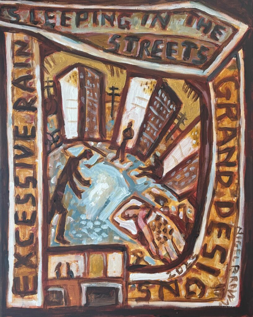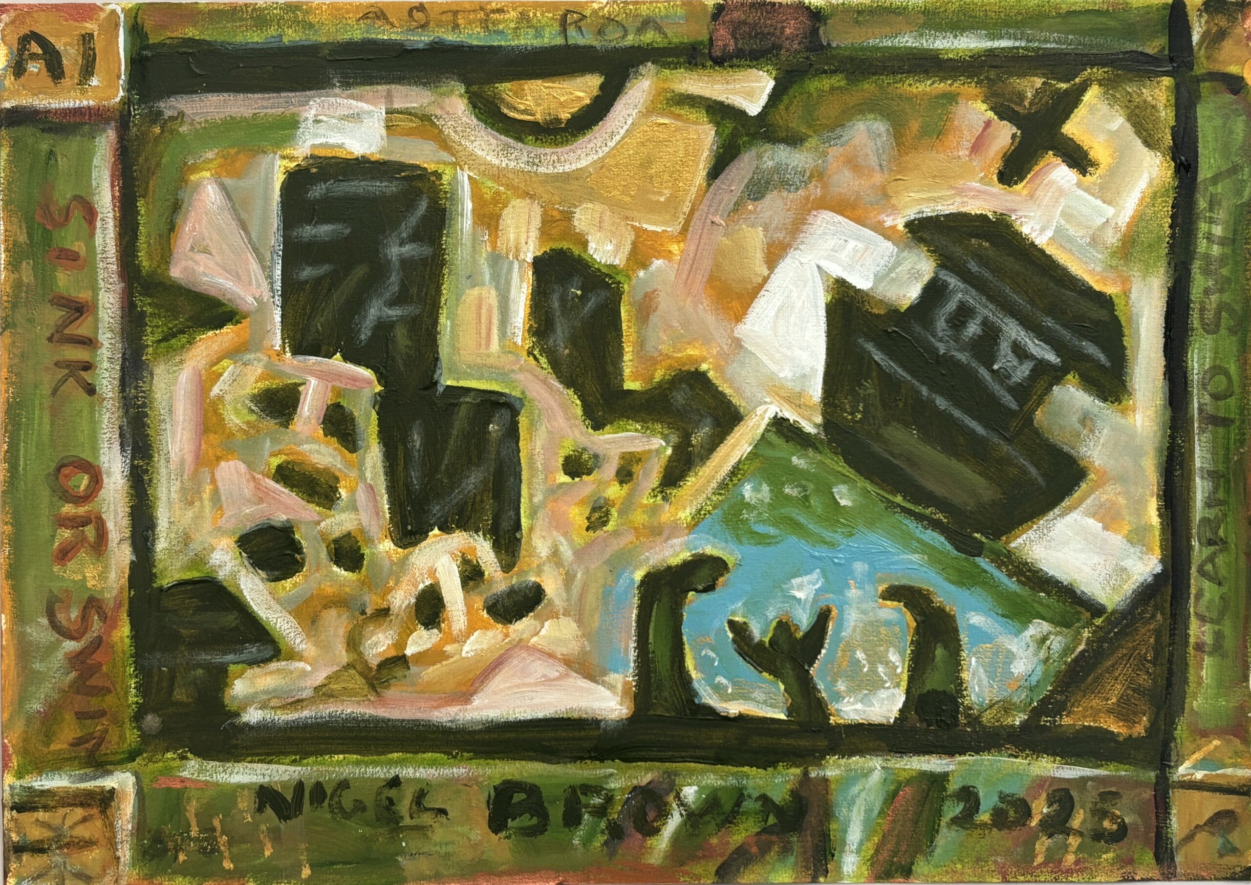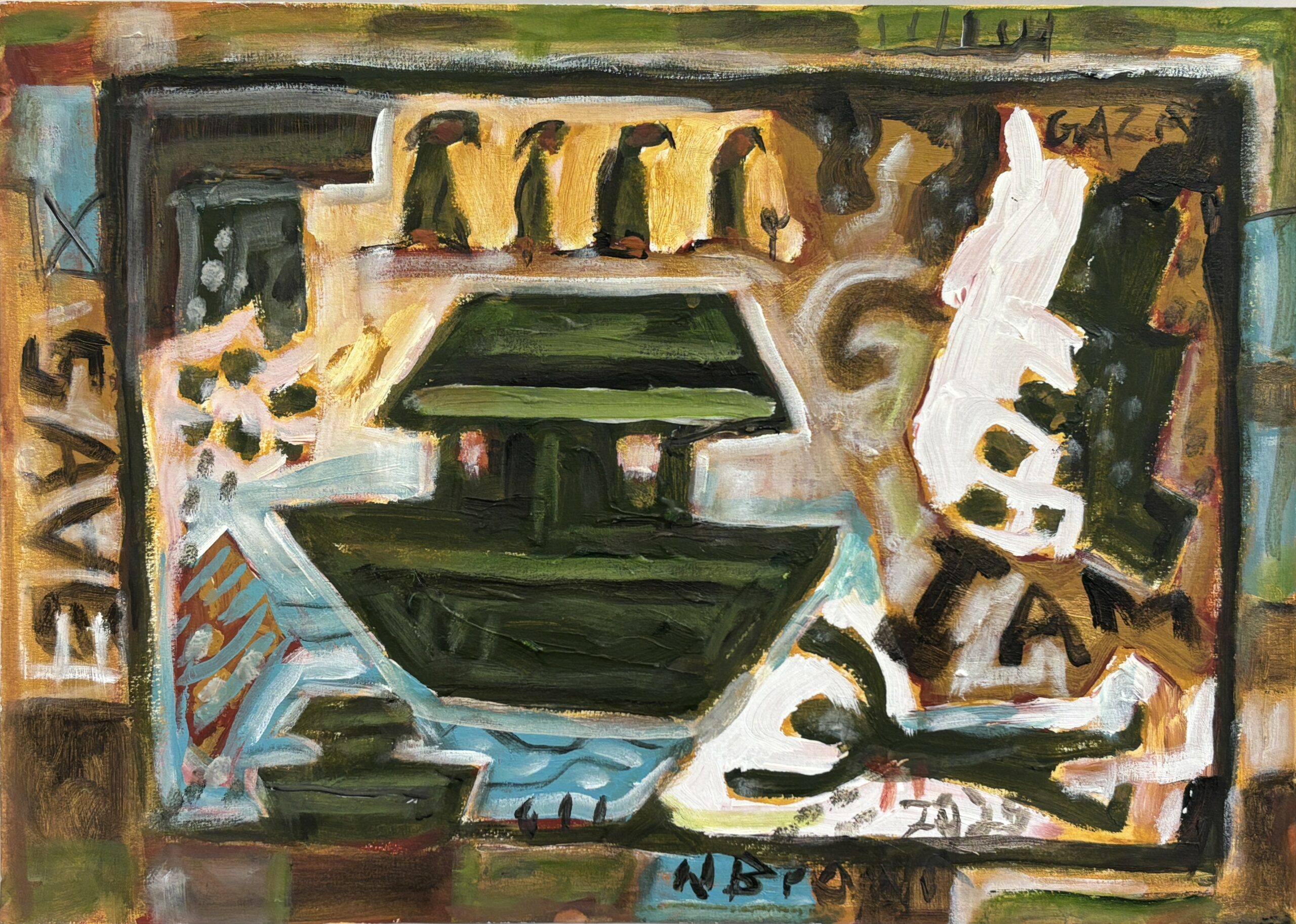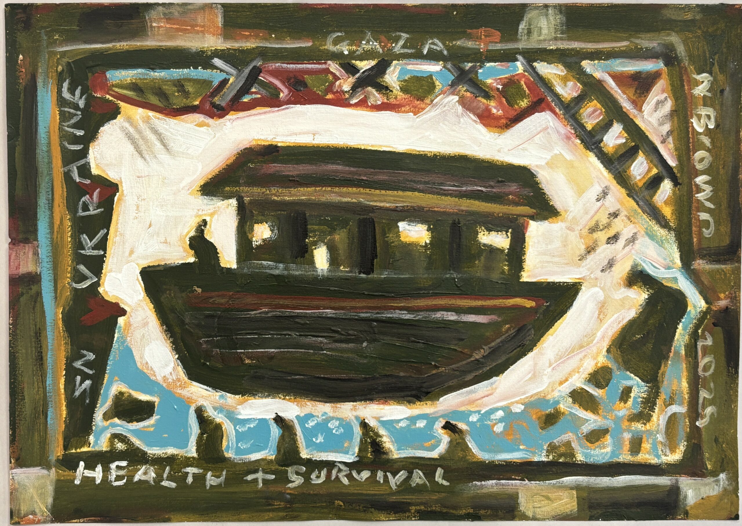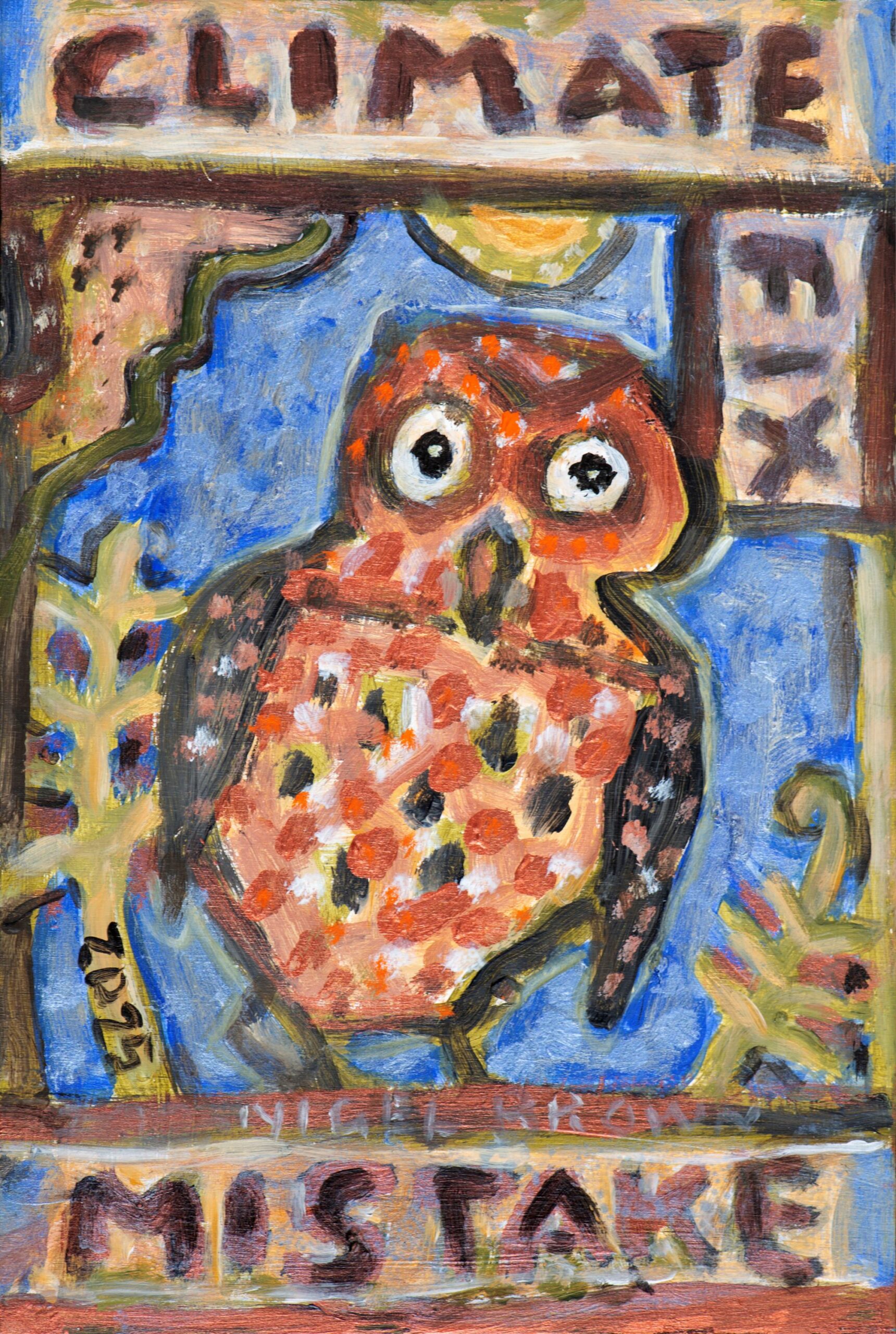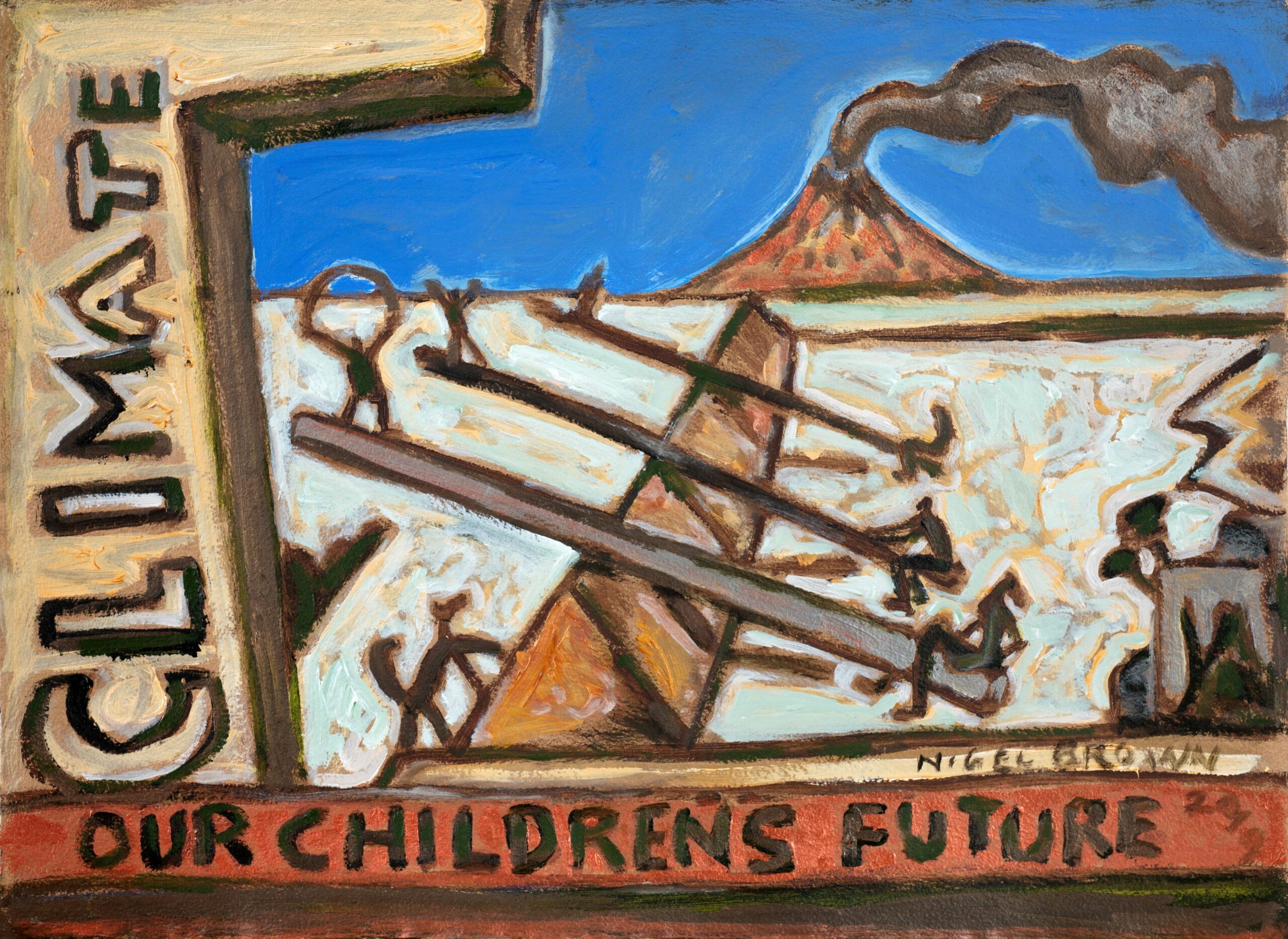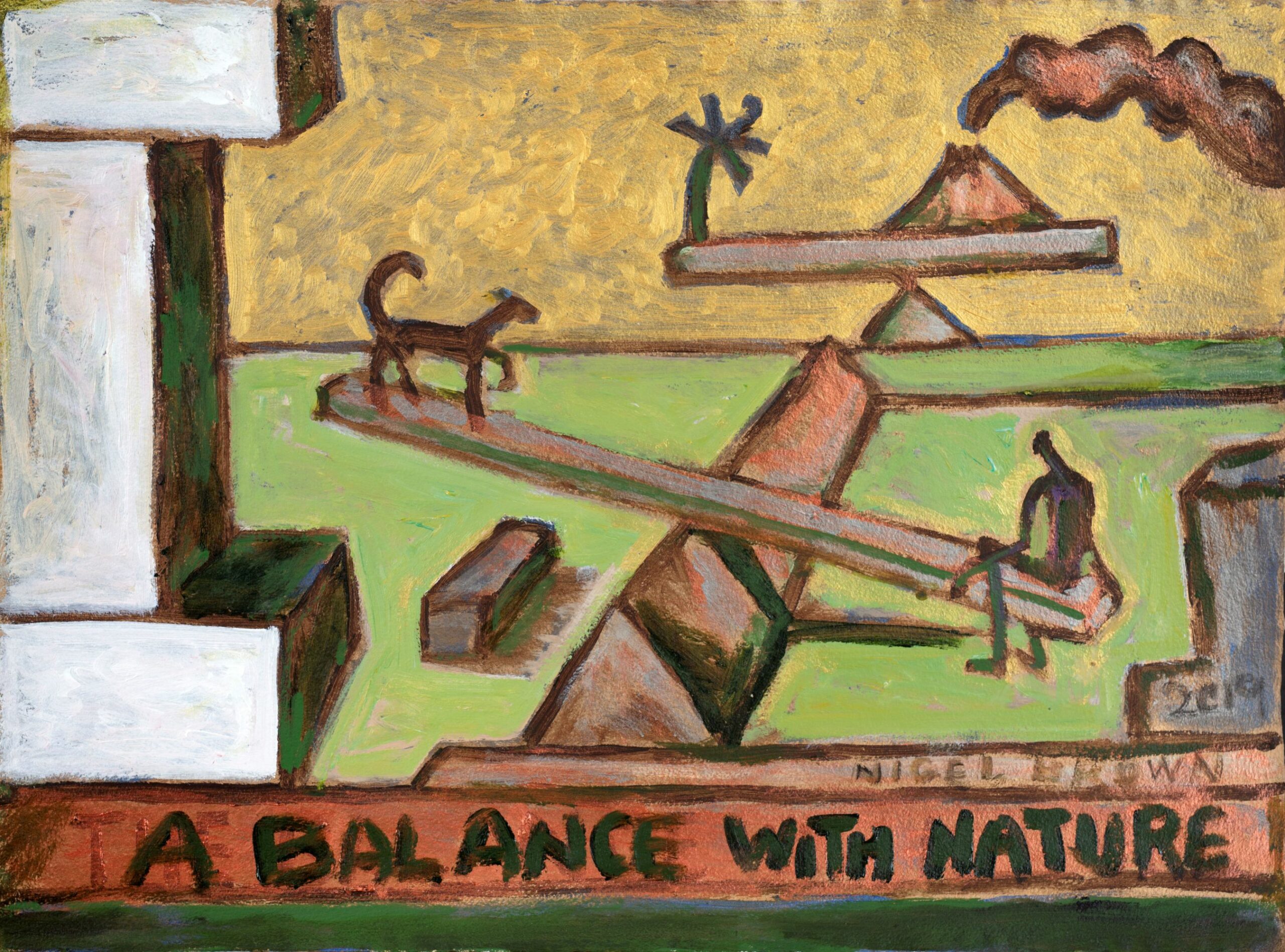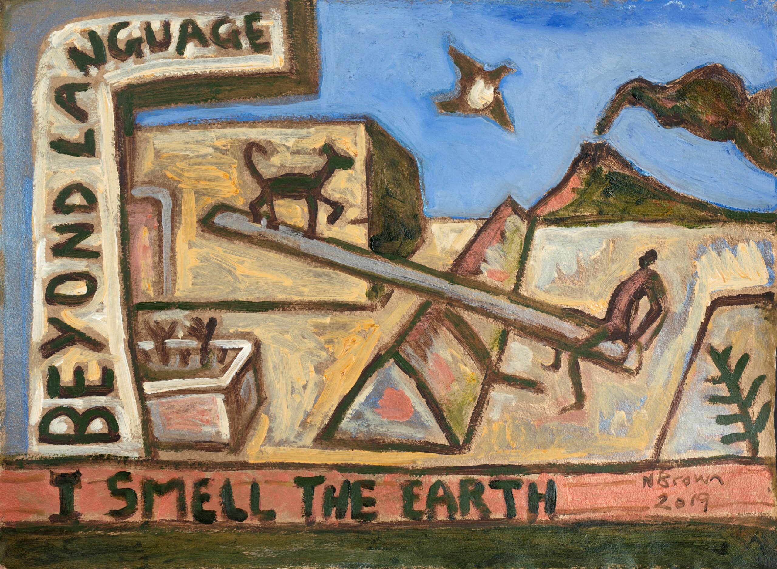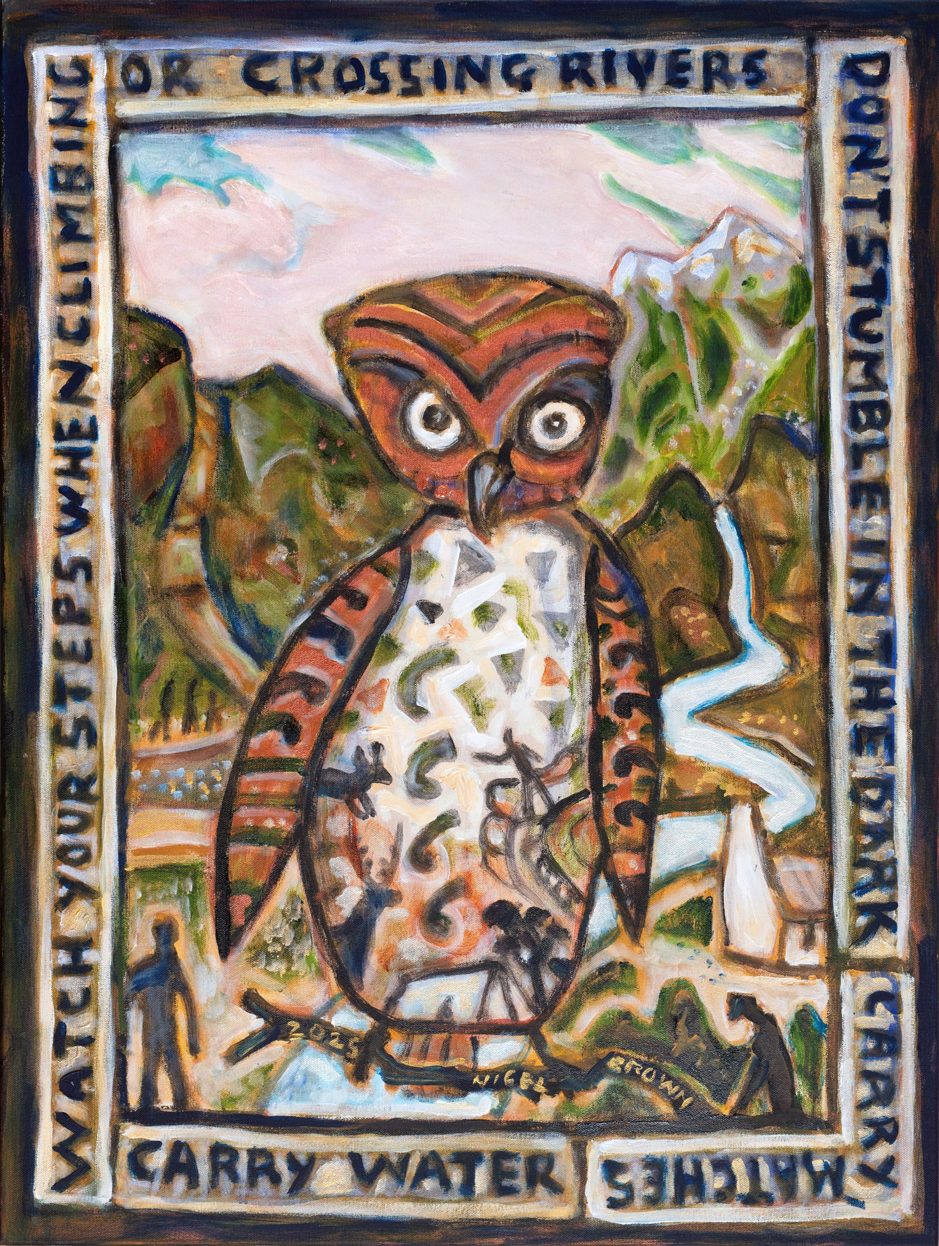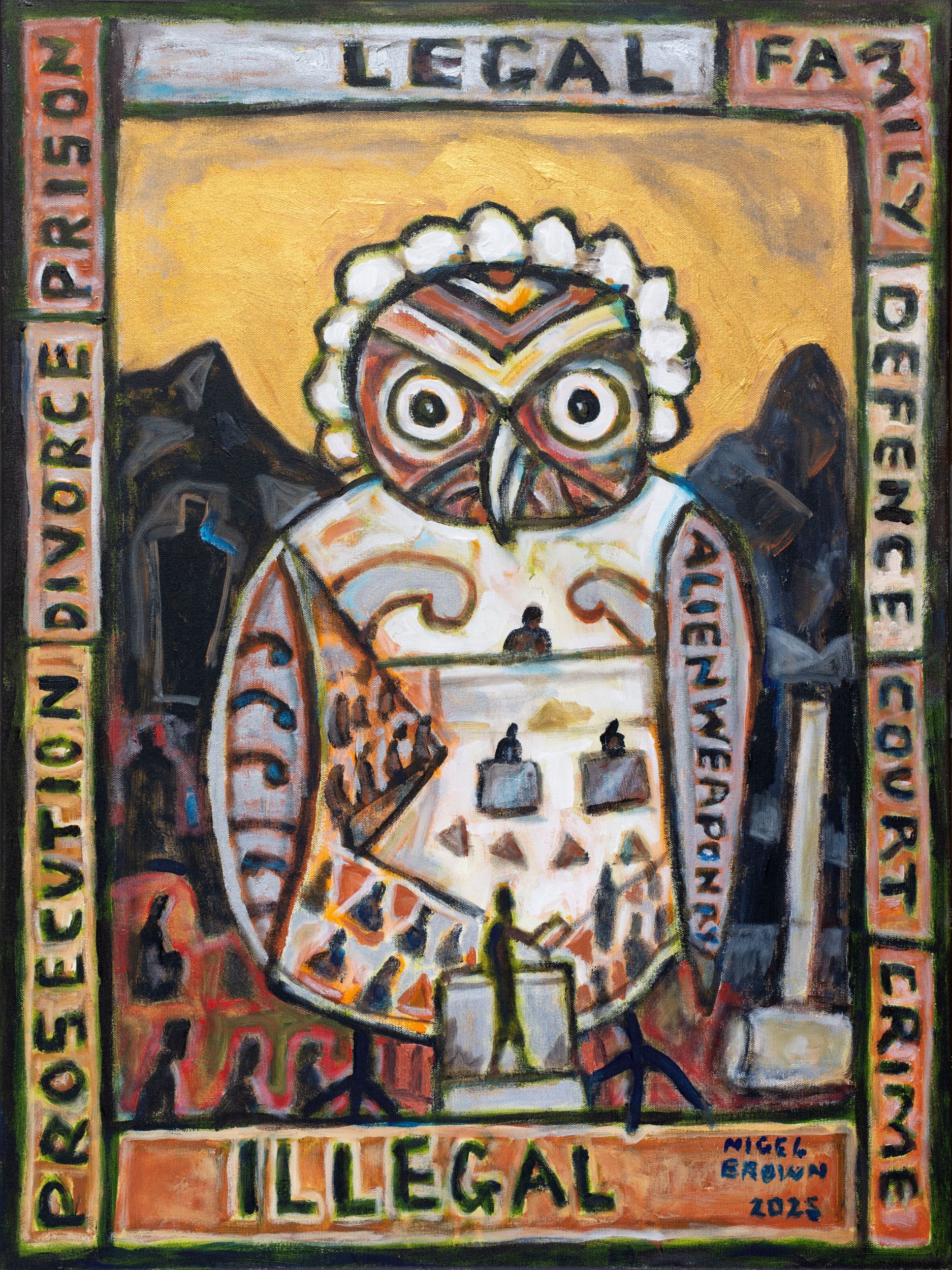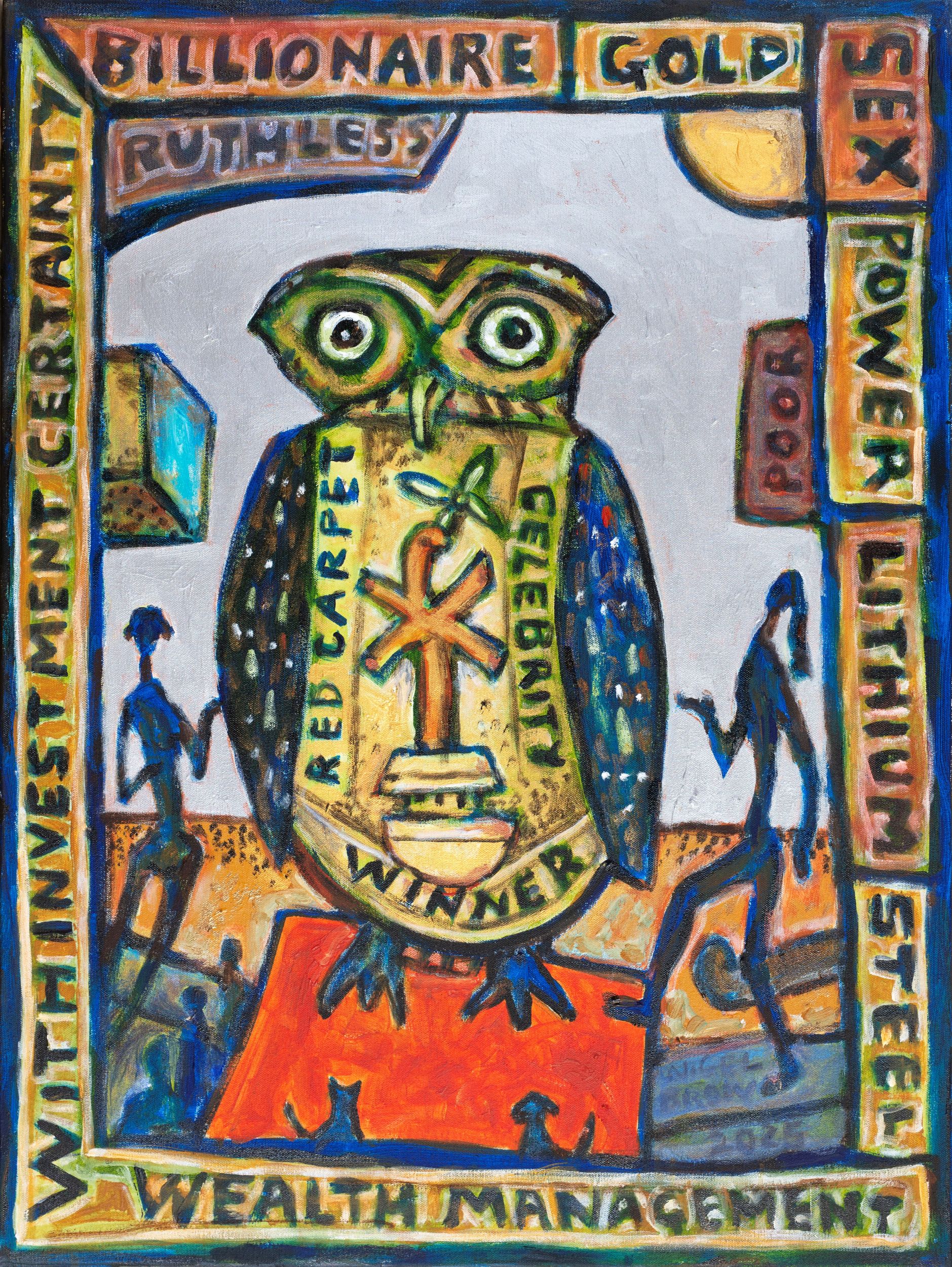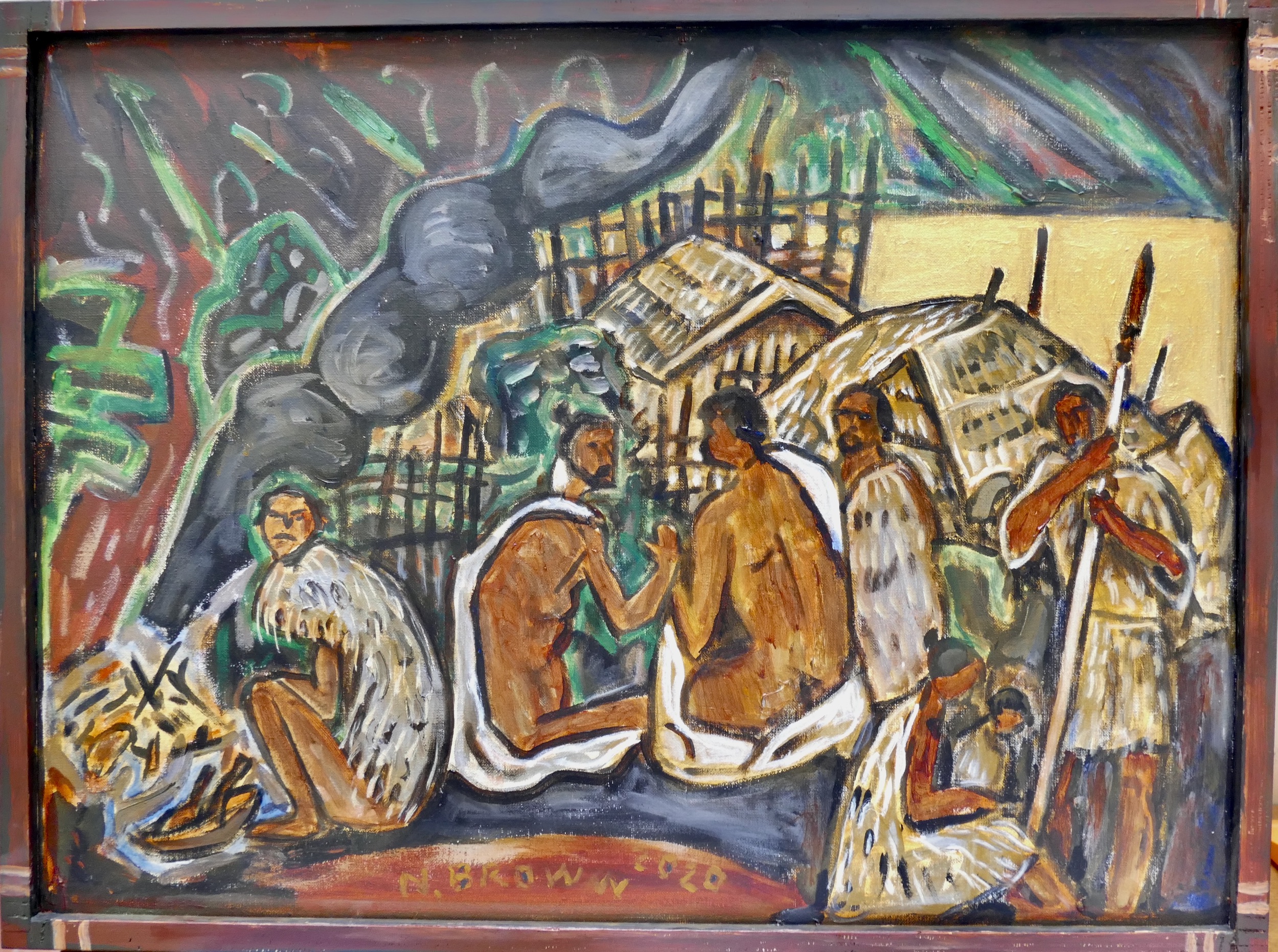
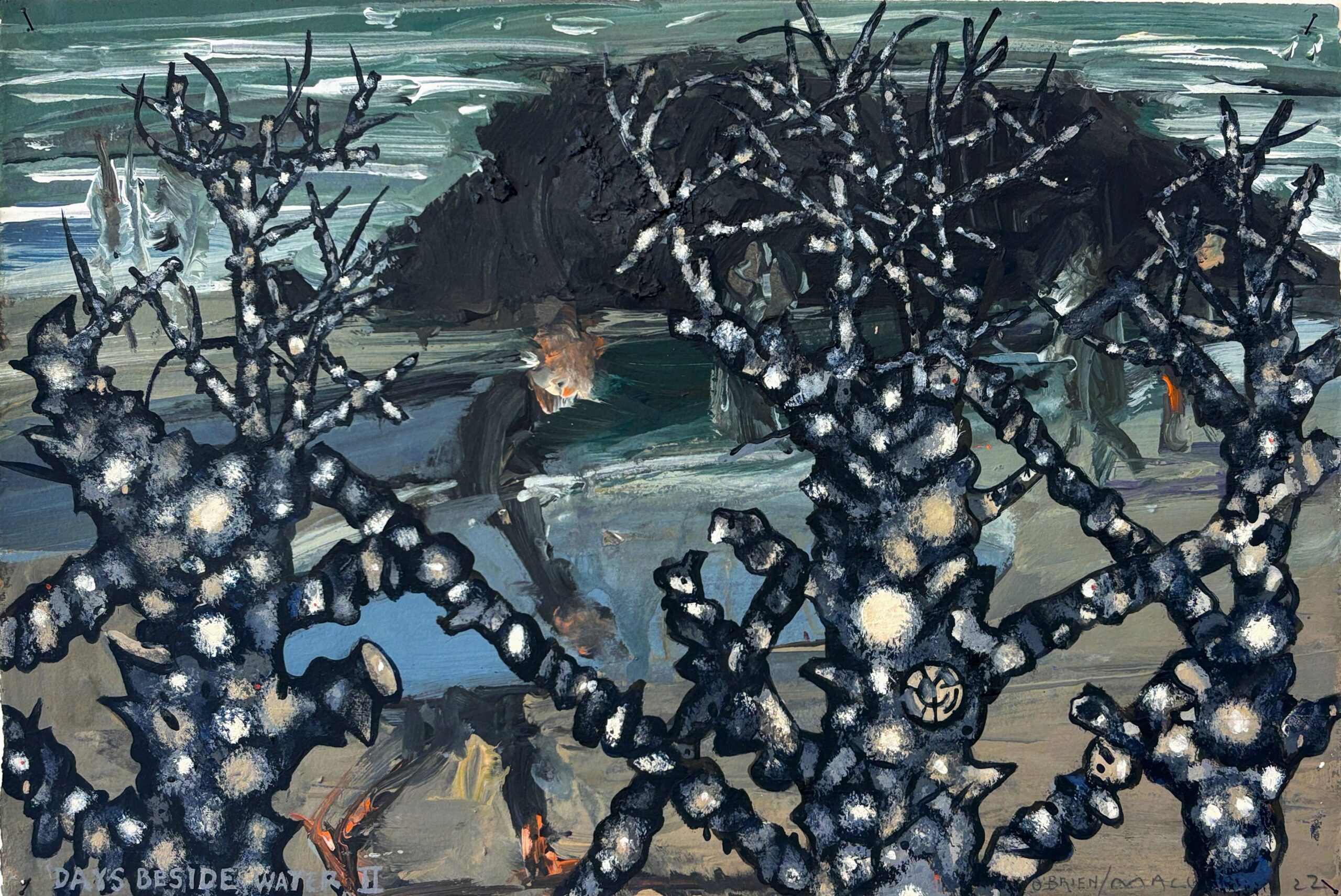
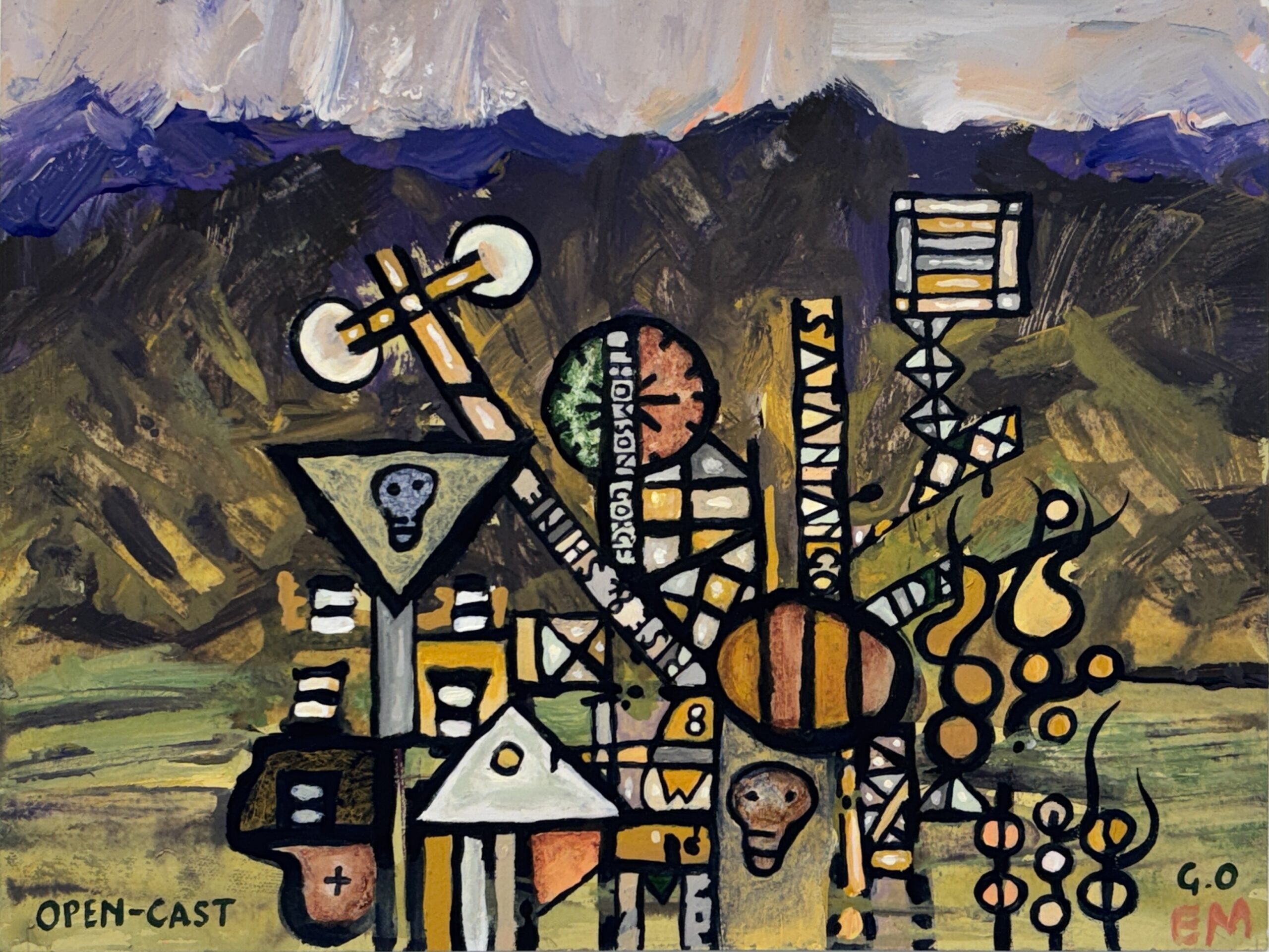
Protest at the impact of mining in Central Otago
Media Type: Painting
-
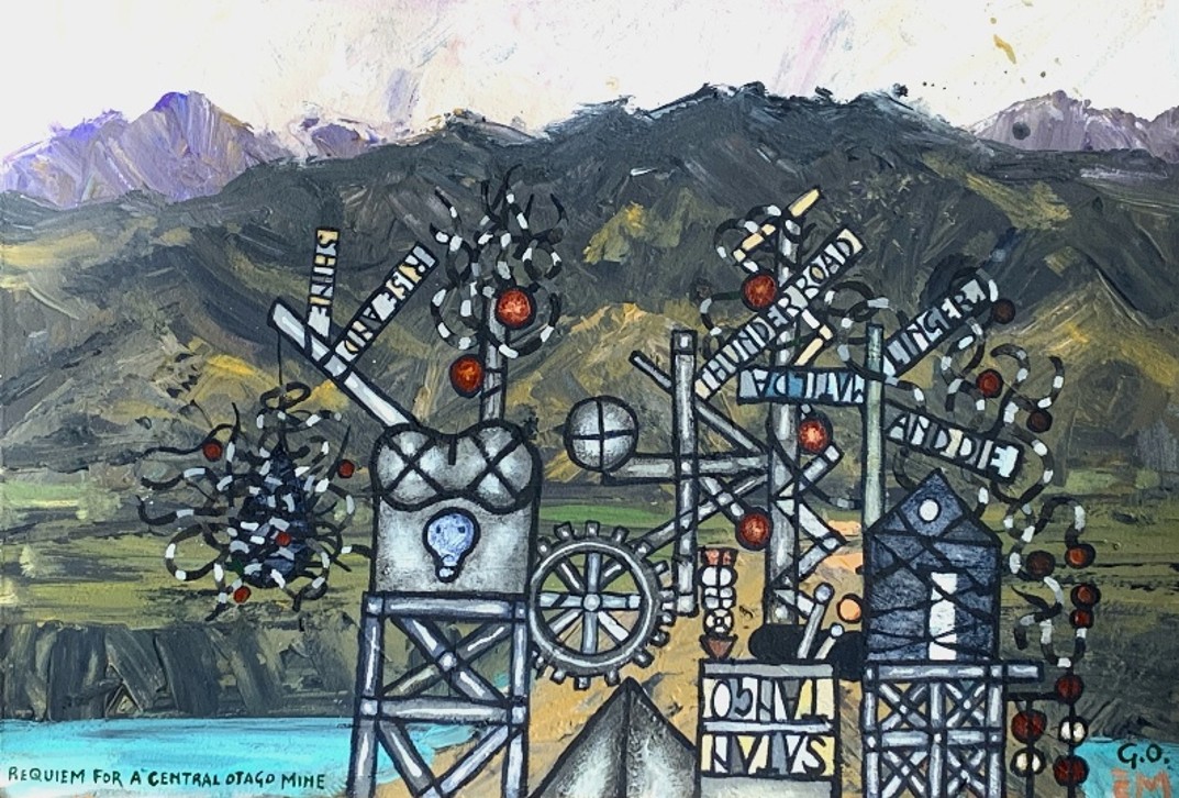
Requiem for a Central Otago Mine
From a series protesting mining in Central Otago, past and proposed
-
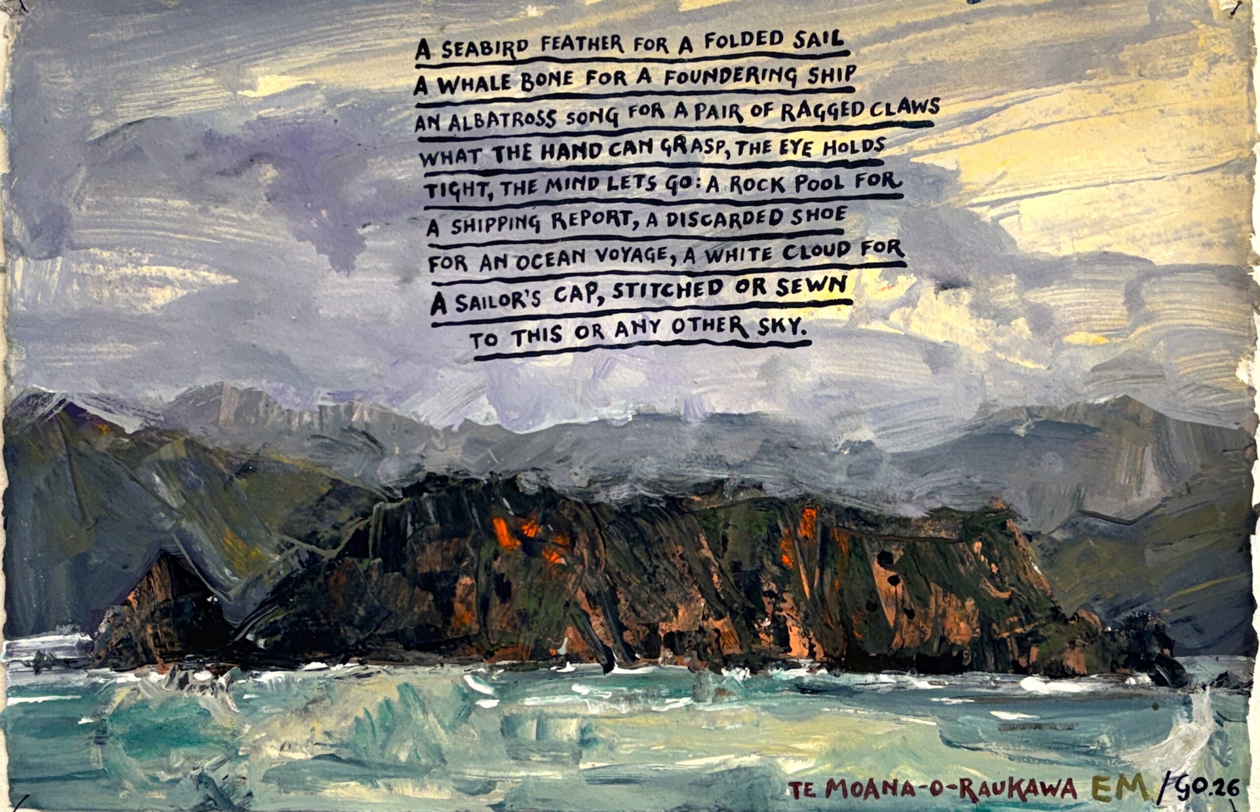
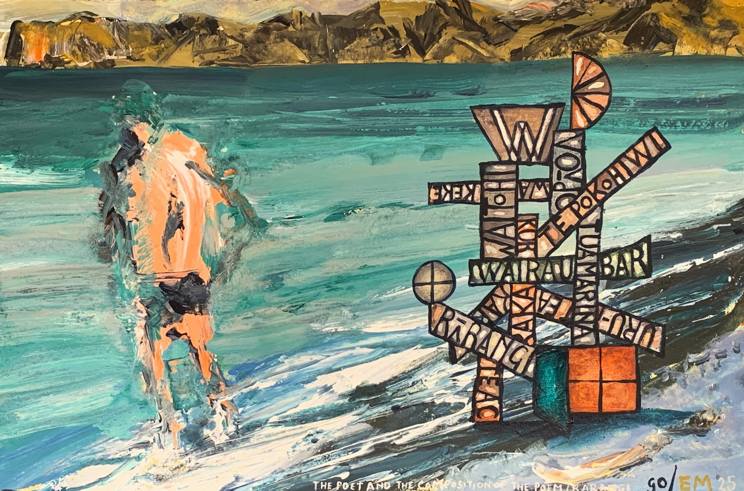
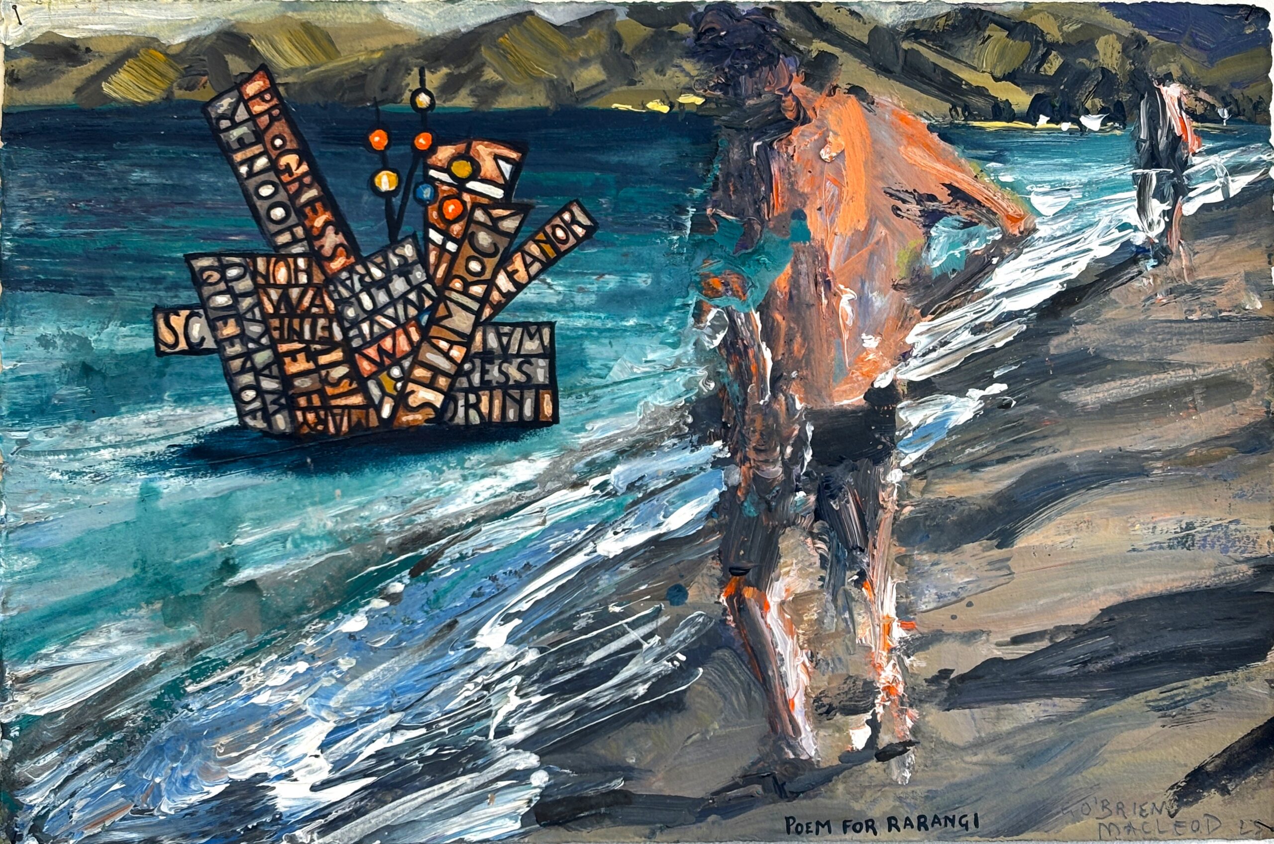
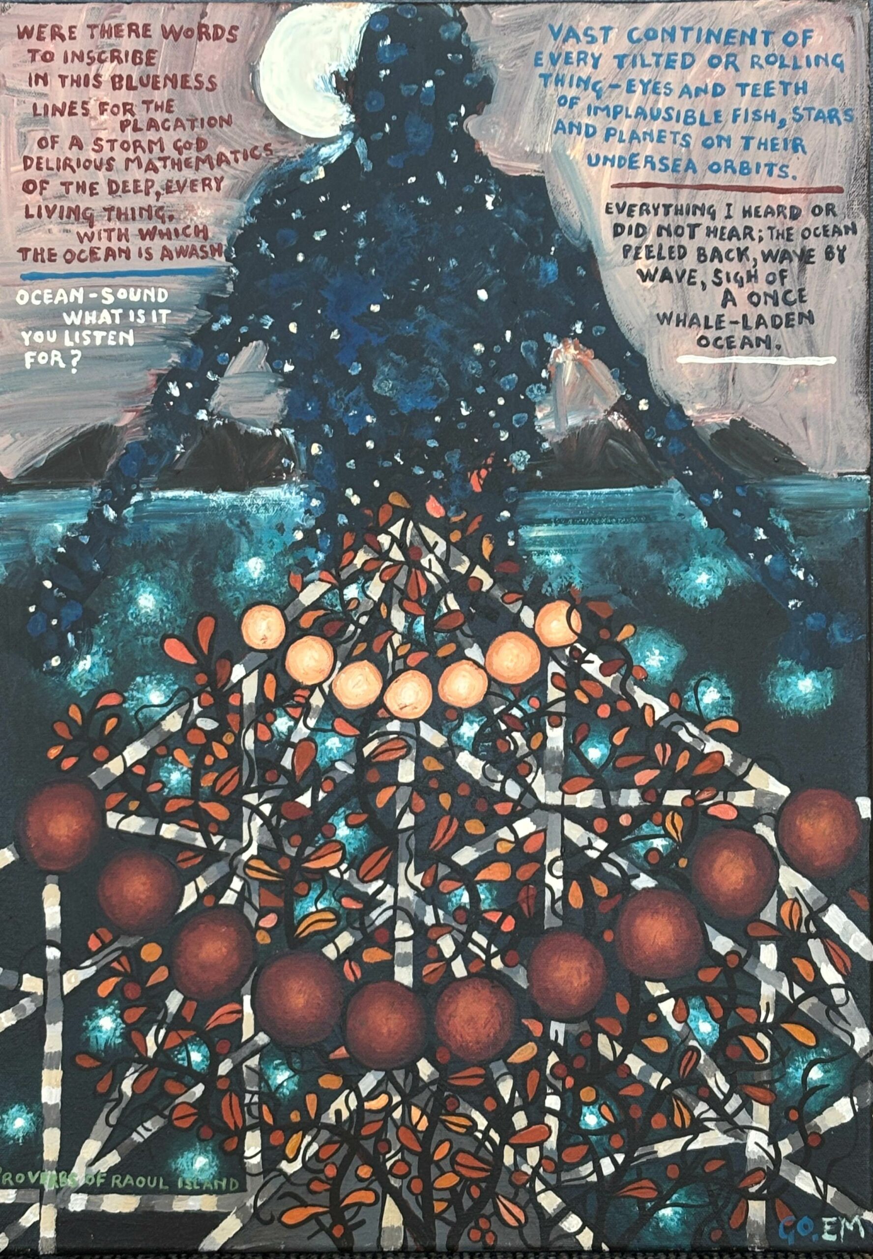
A poem for Te Moana-o-Raukawa
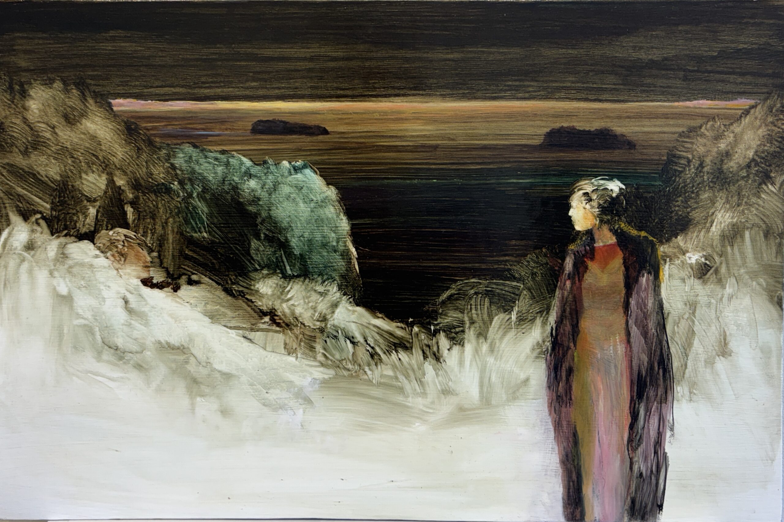
Gregory O’Brien’s poem responds to Euan Macleod’s evocation of seaward history, referencing Mākaro/Ward Island and sailors past.
-
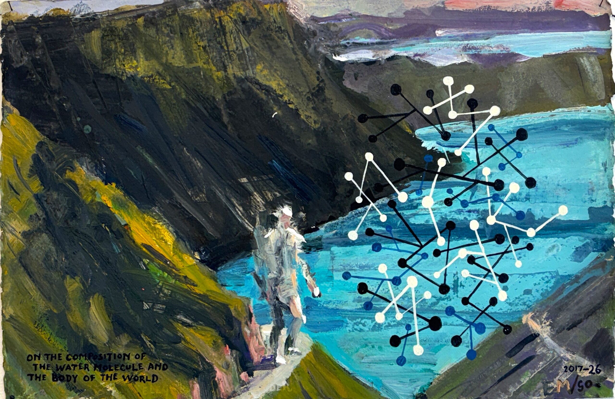
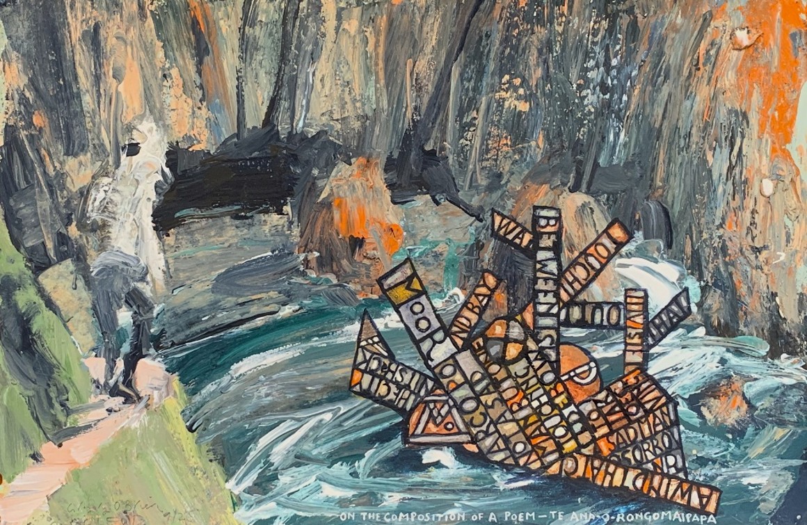
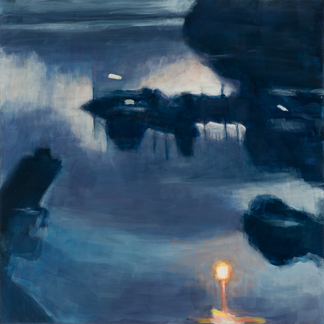
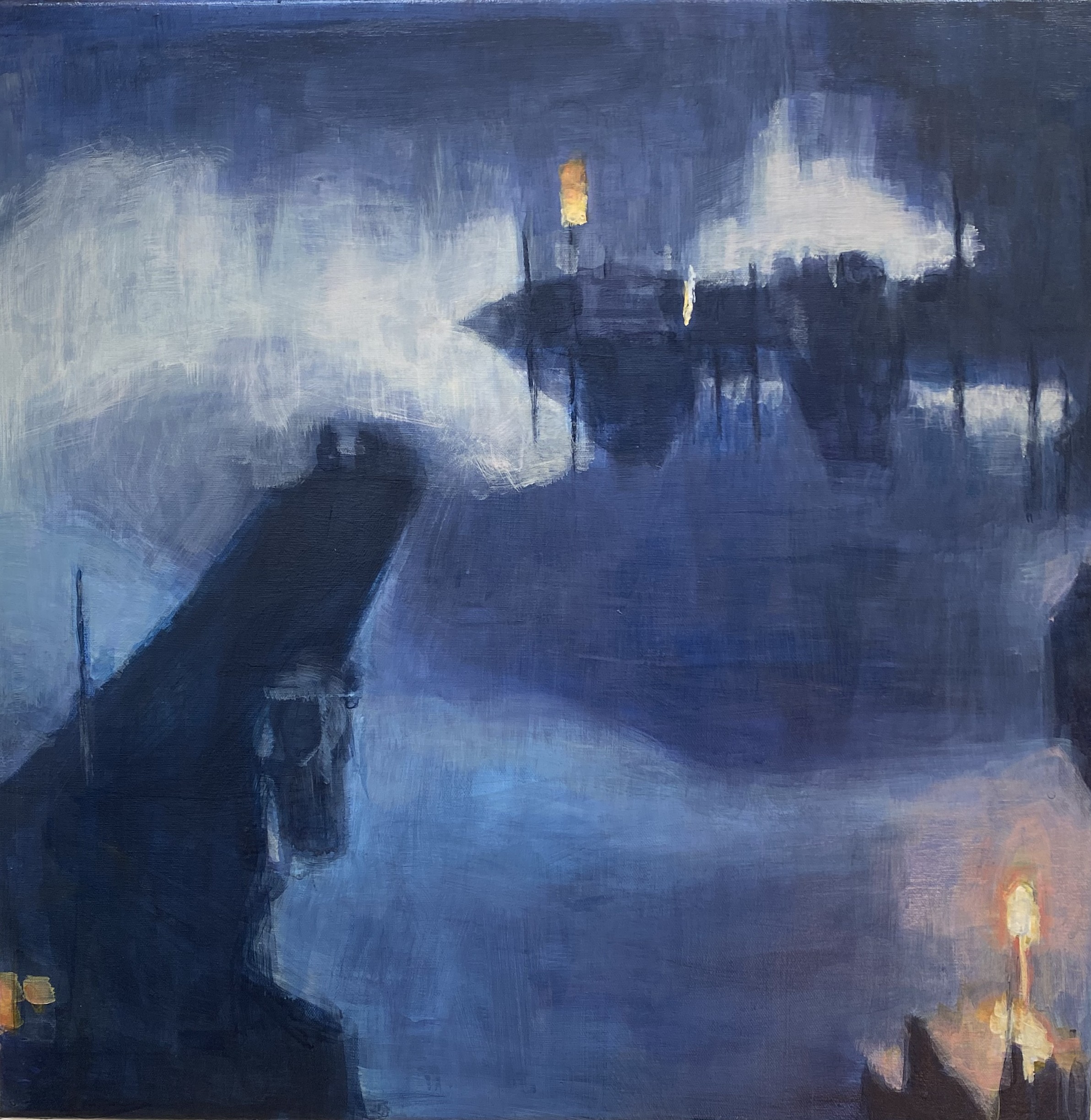
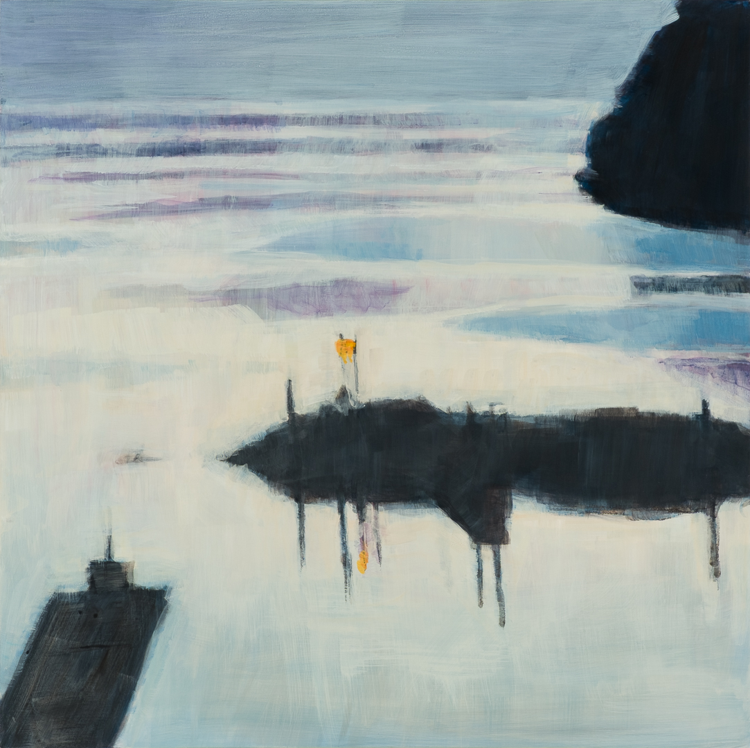
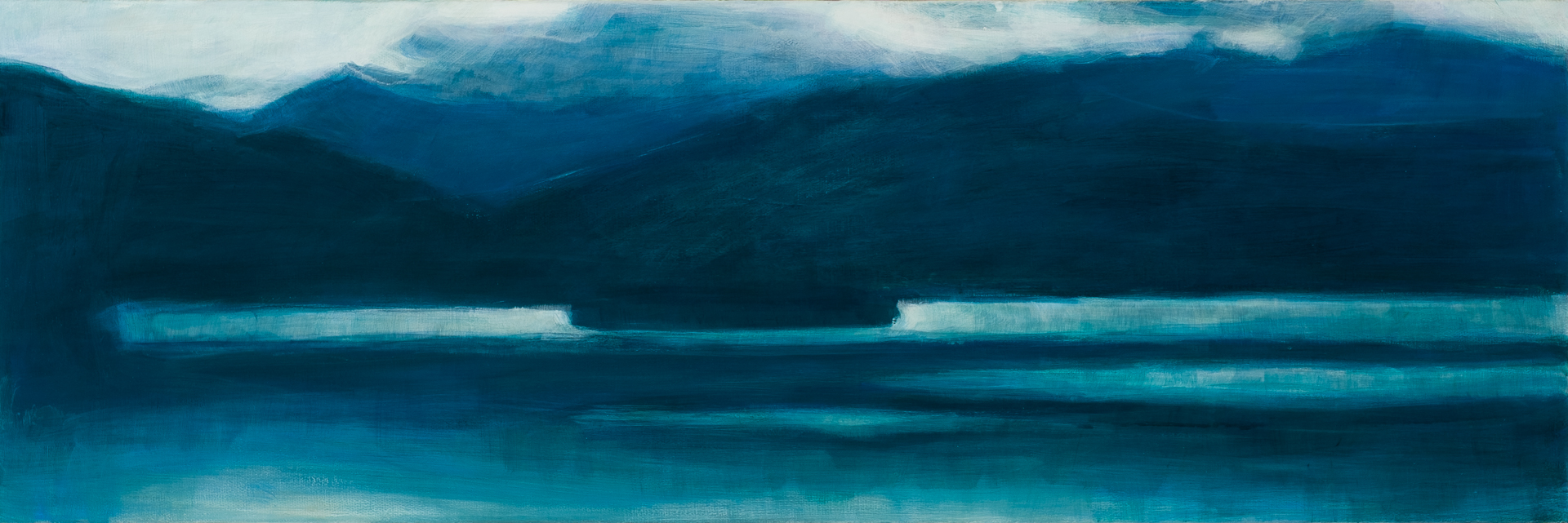
On the composition of the water molecule and the body of the world
A painterly evolution frm 2017 to 2026, inspired by concerns about water quality and particular bodies of water
-
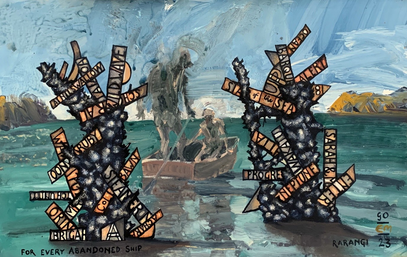
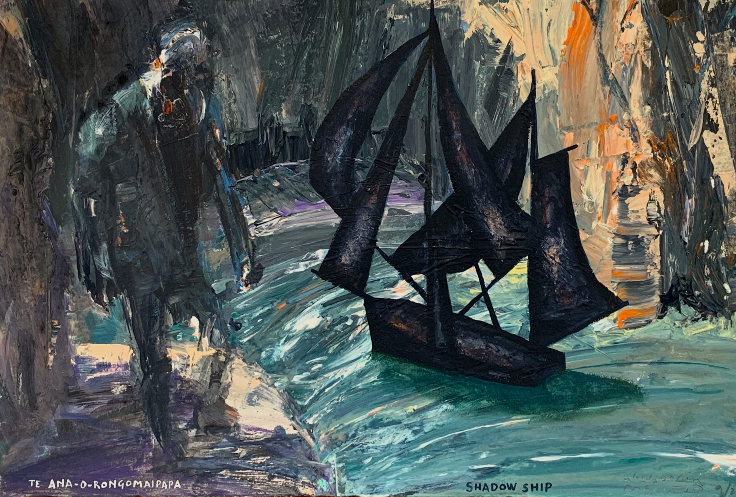
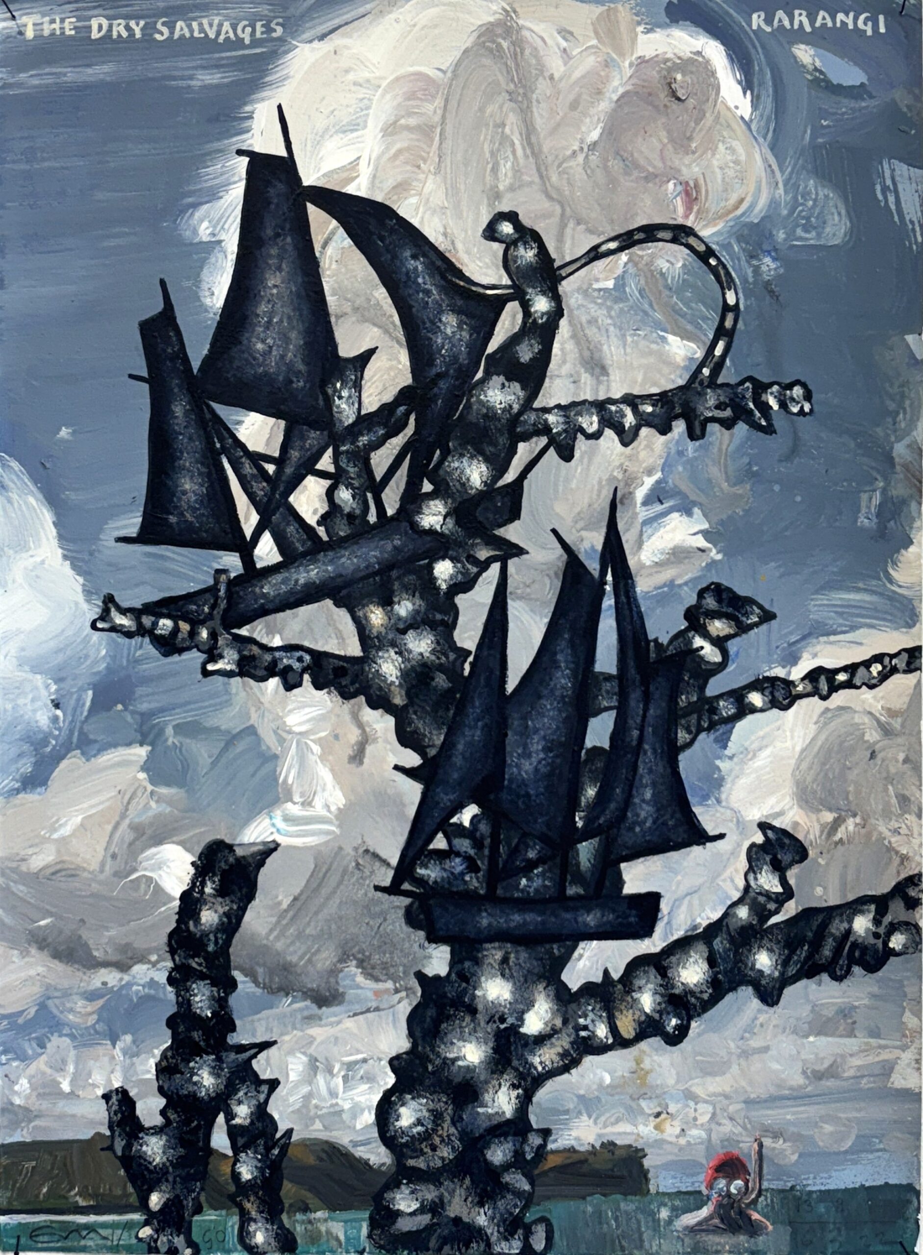
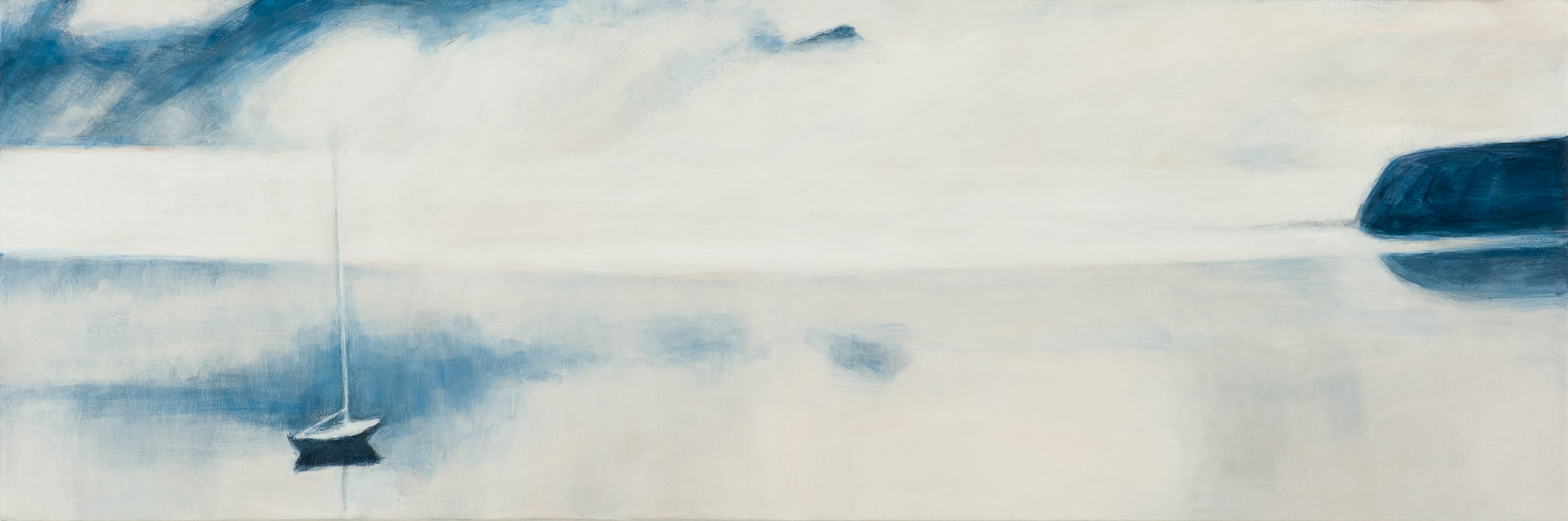
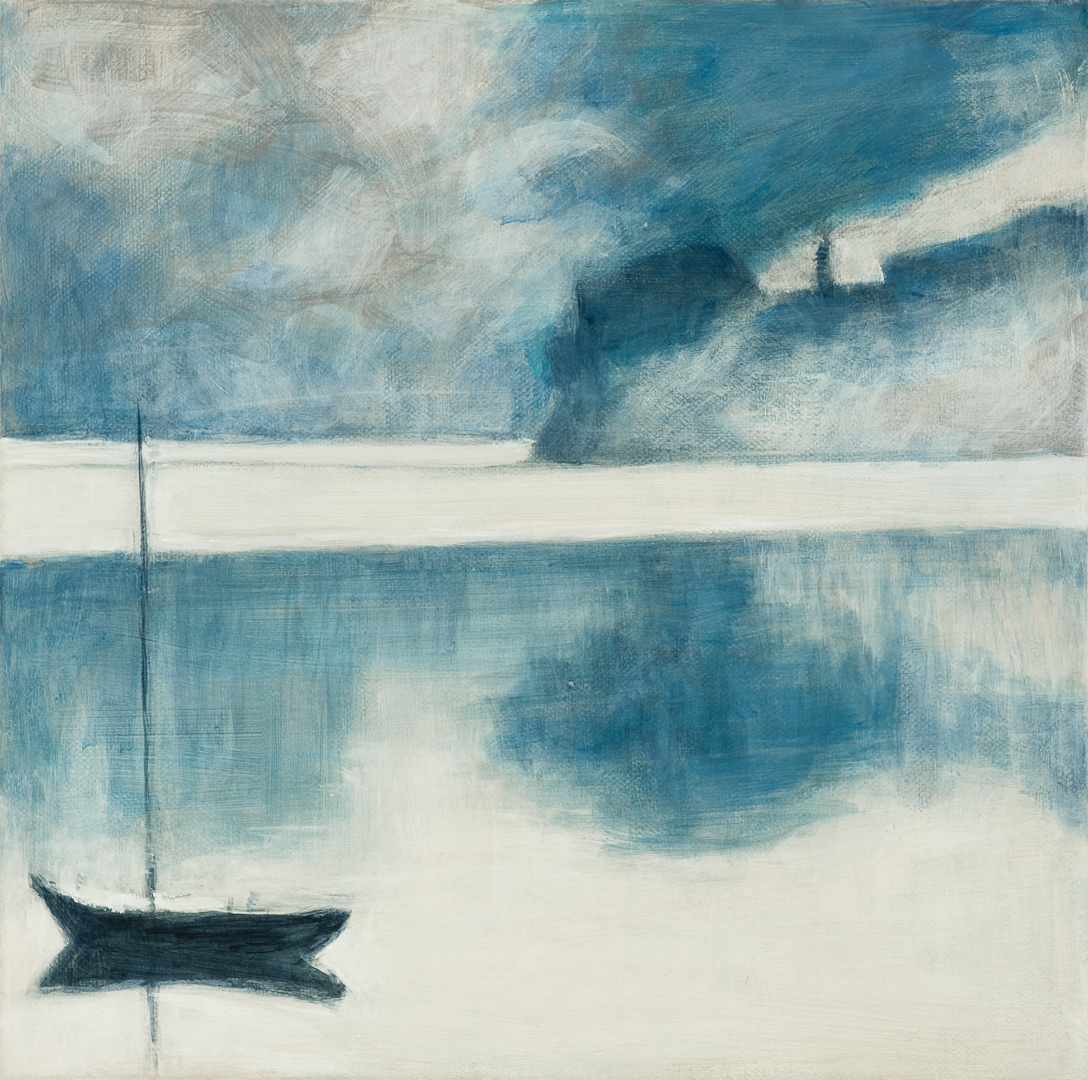
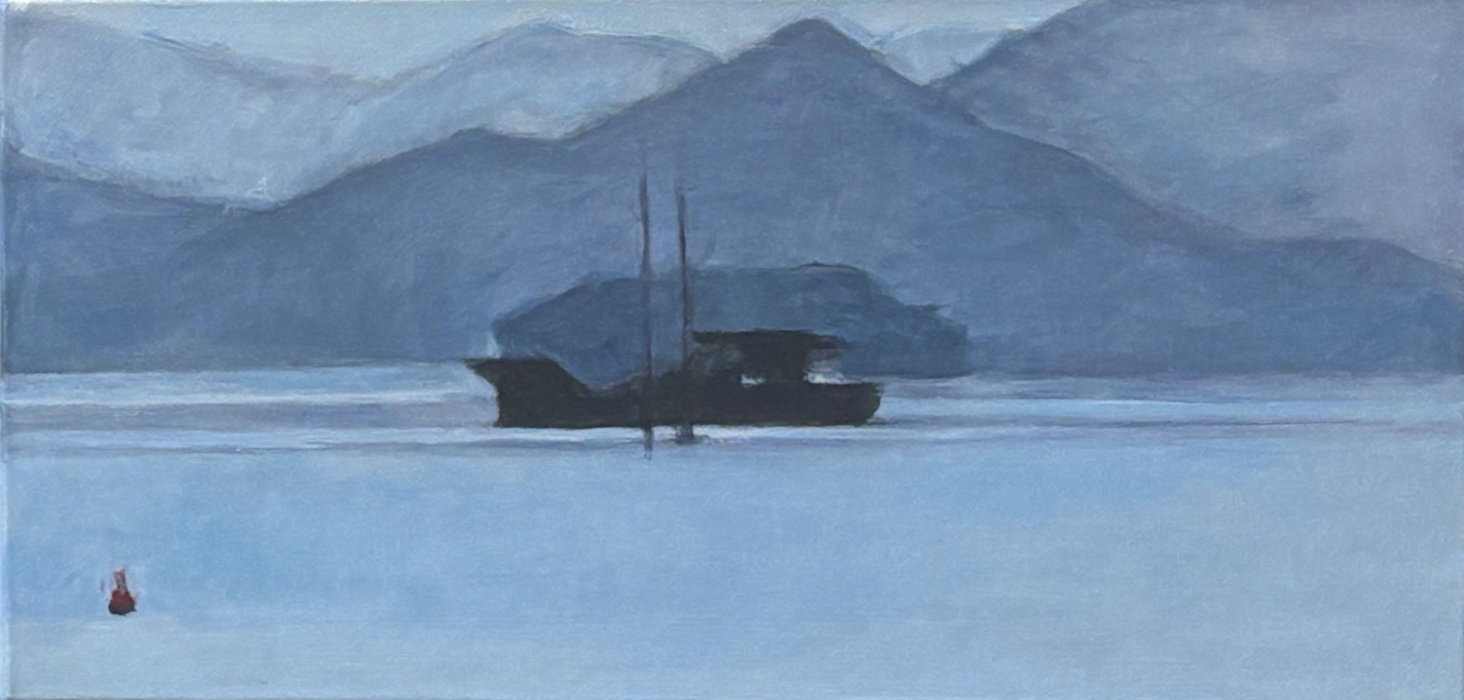
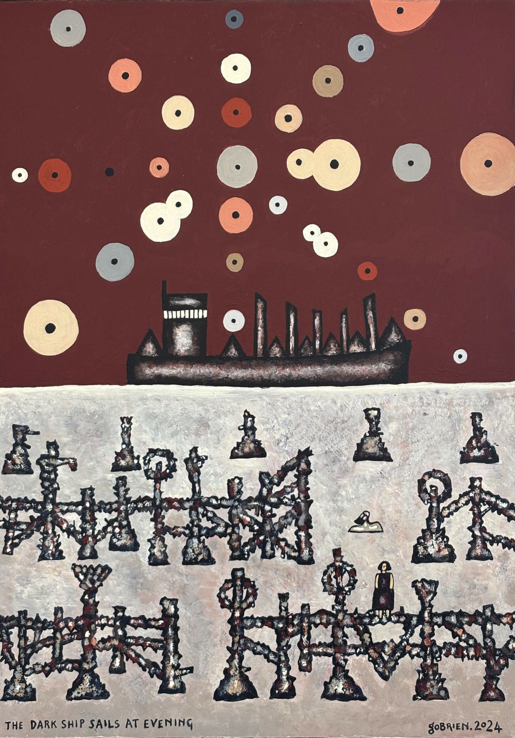
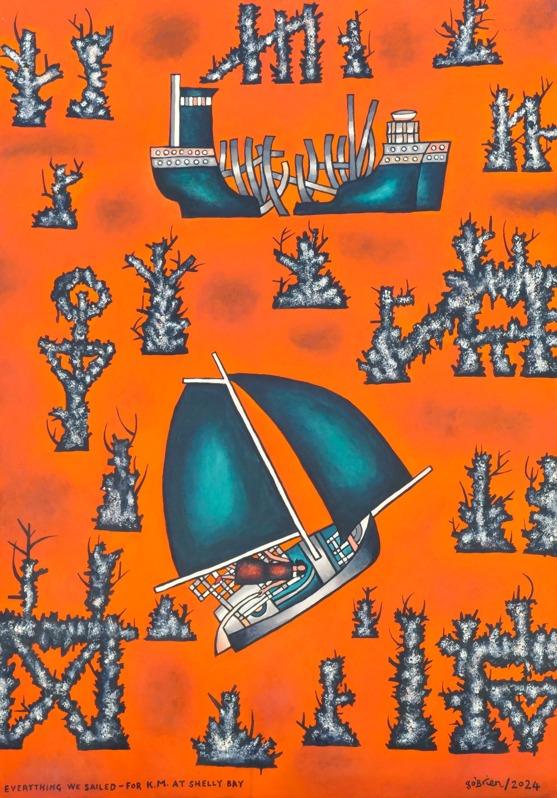
For Every Abandoned Ship
Evoking ships which historically foundered or were abandoned in Cook Strait and on the Marlborough coastline
-
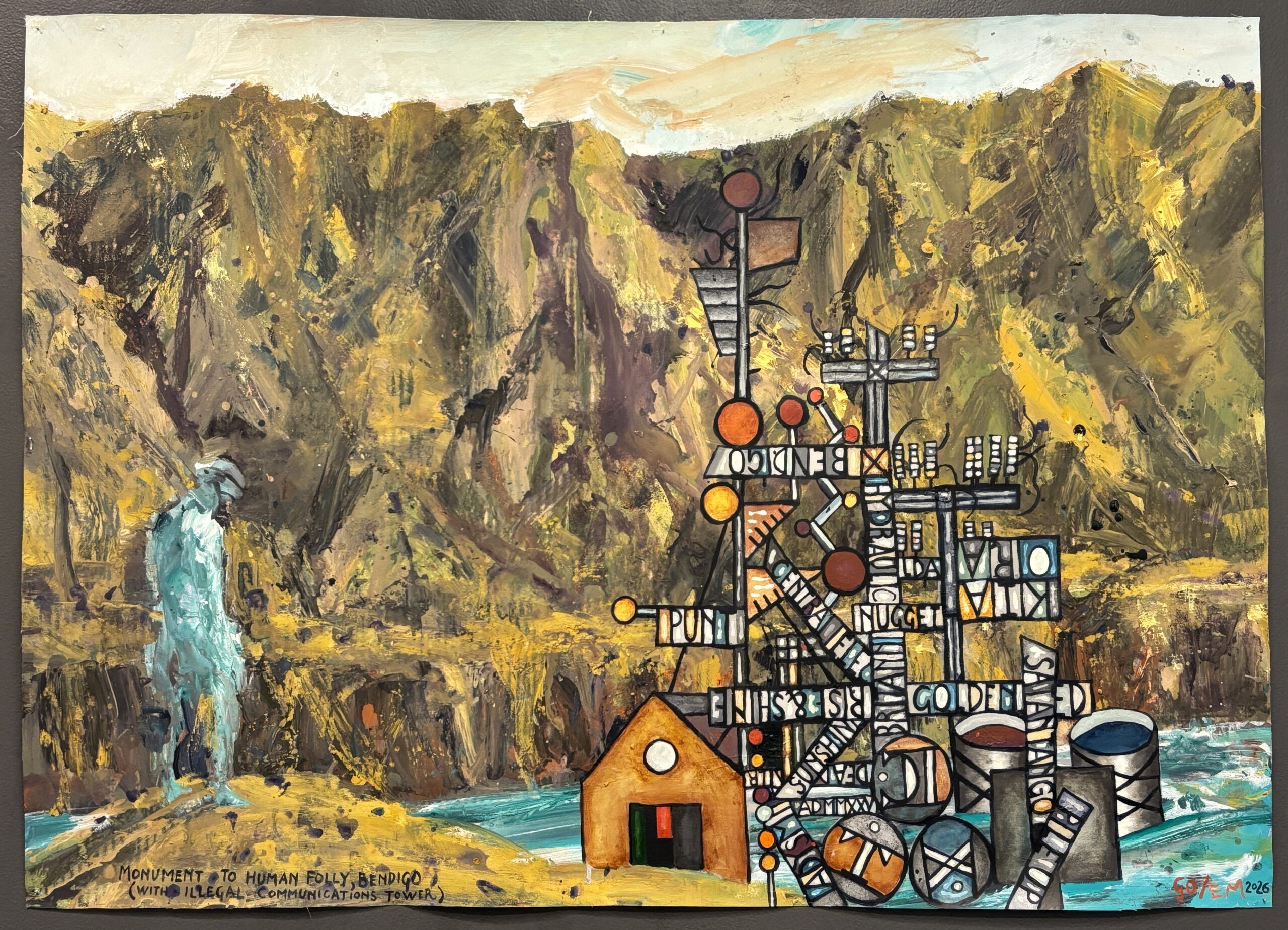
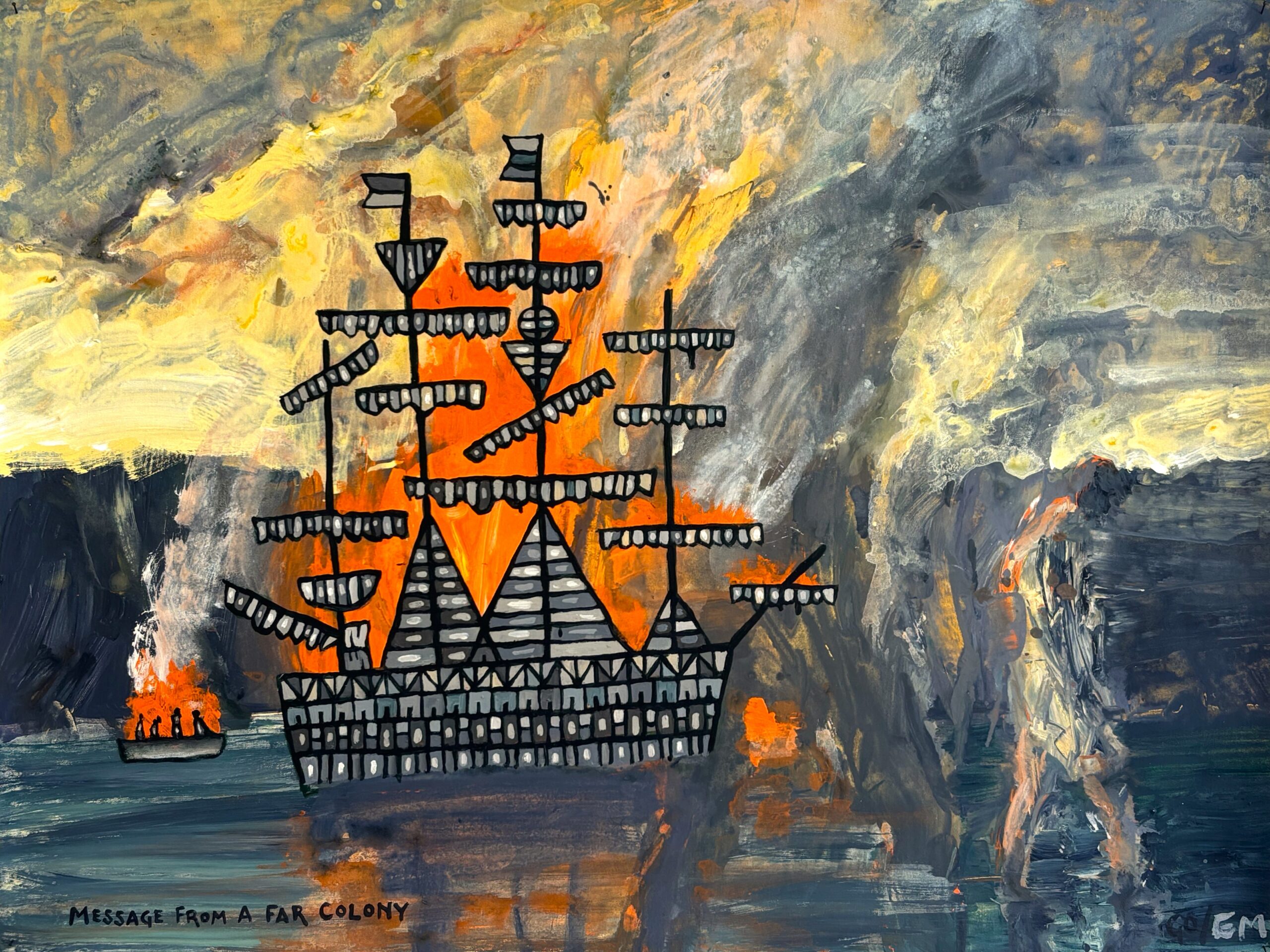
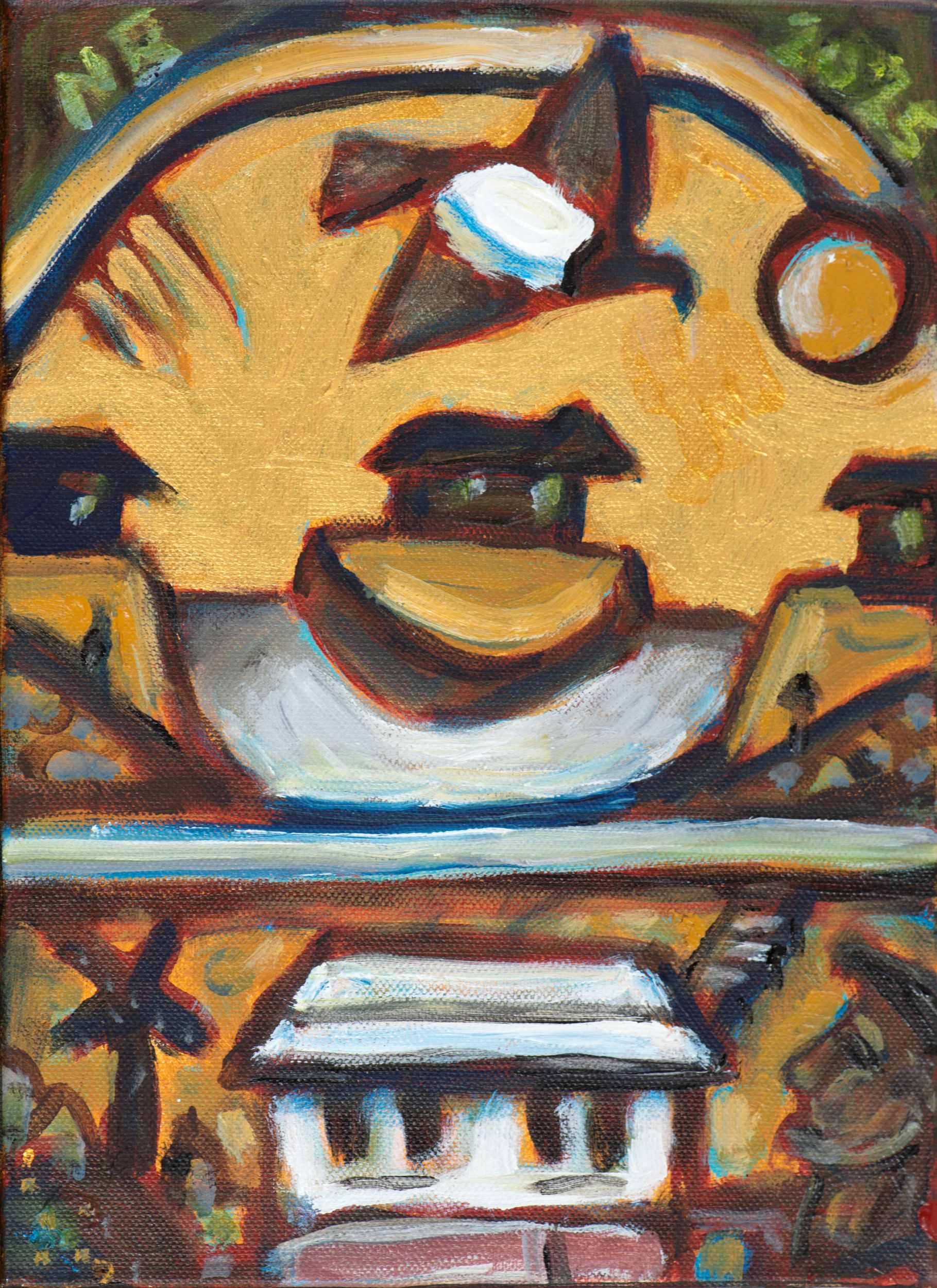
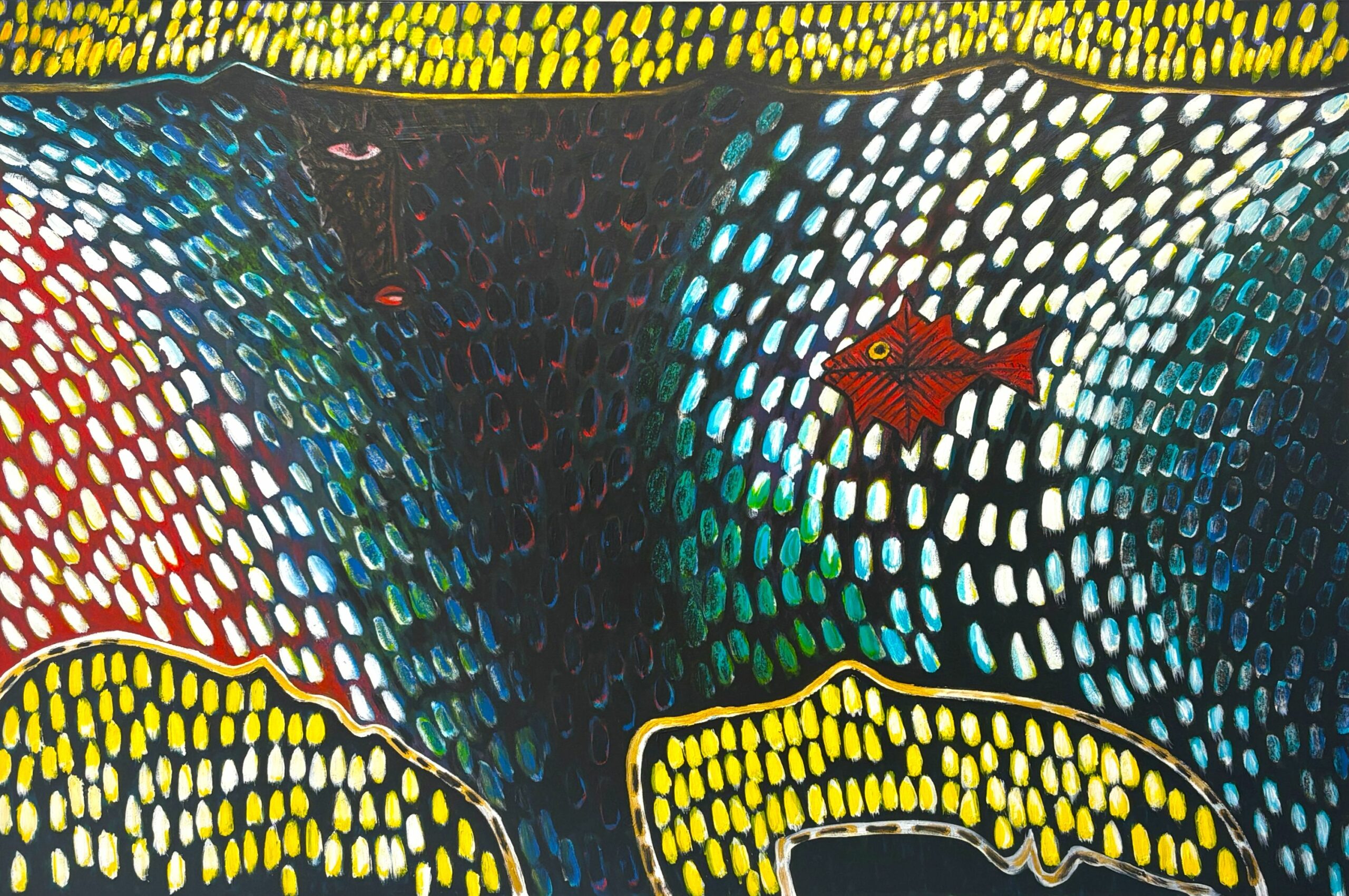
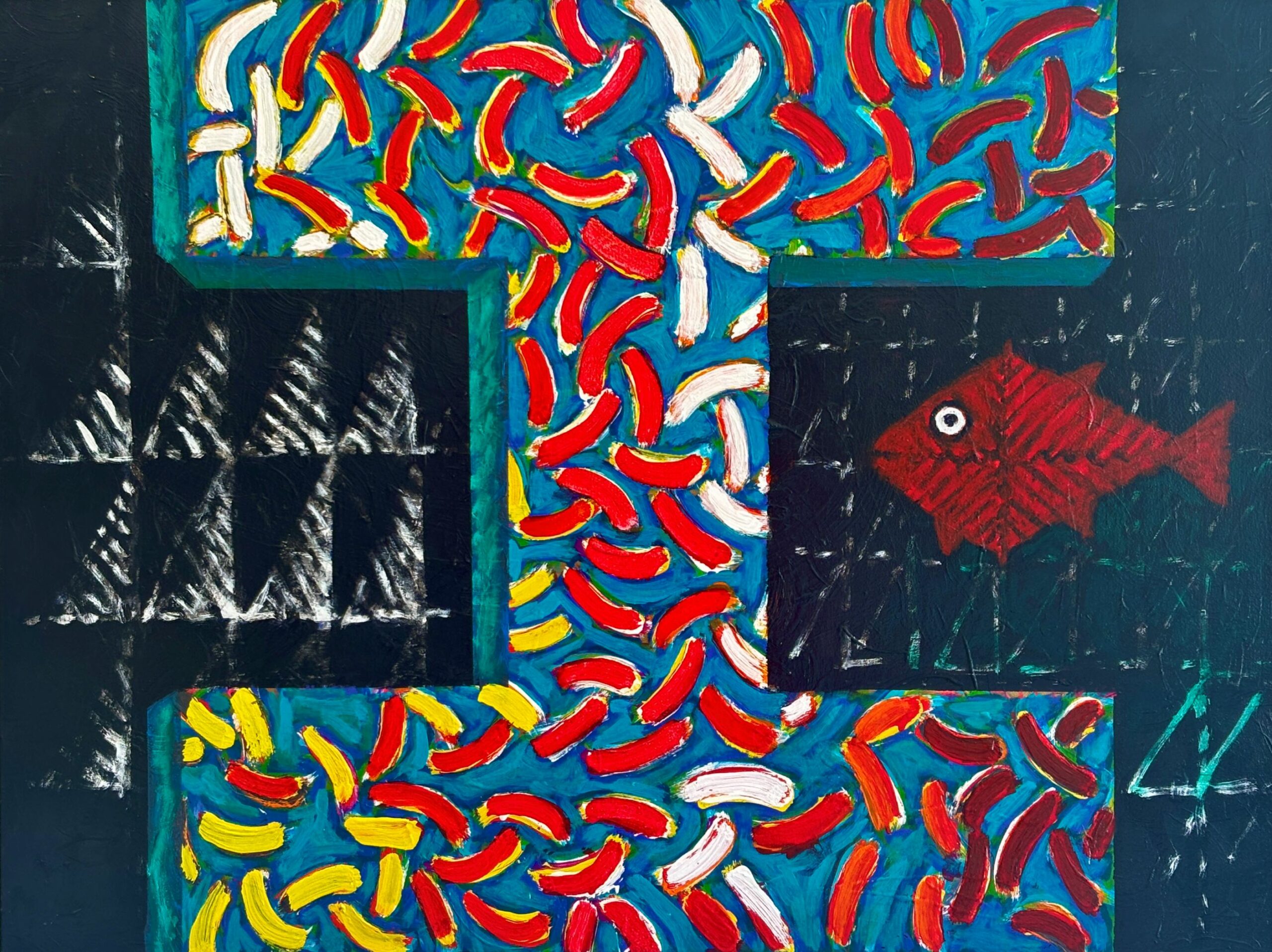
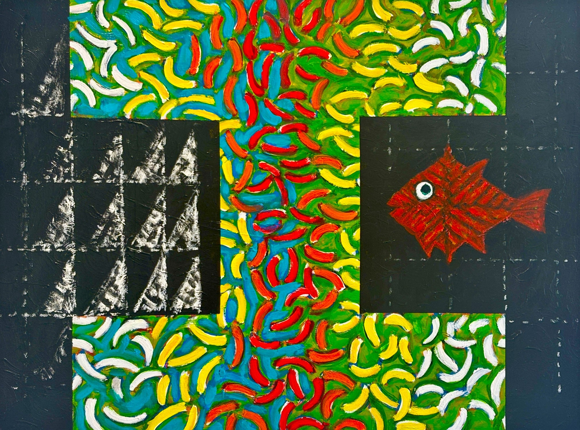
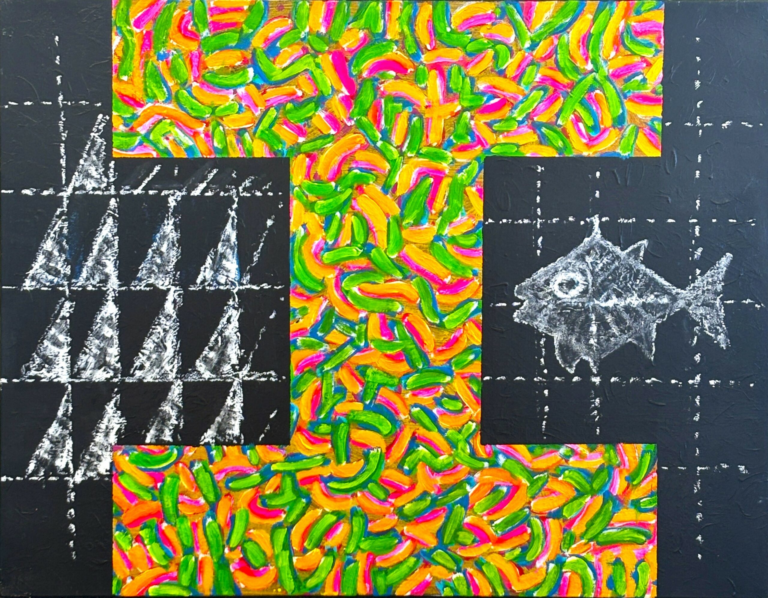
Monument to Human Folly, Bendigo, (with illegal communications tower)
Inspired by concern at the proposed Santana mine in Central Otago, and the company’s multi-million dollar illegal communications tower which the regional council insisted be pulled down. A collaborative work begun in Central Otago, later worked on in Sydney then Wellington by both artists.
-
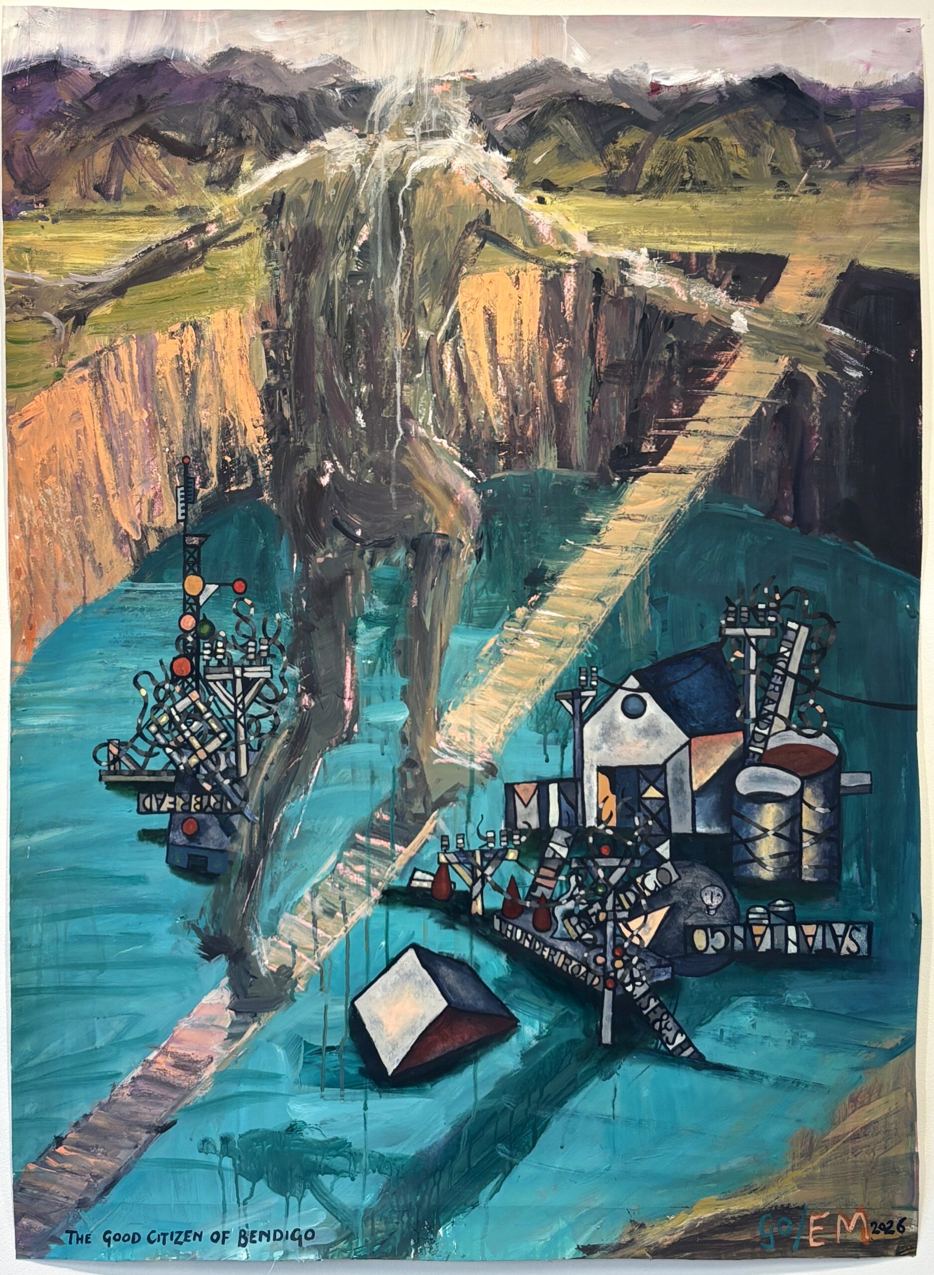
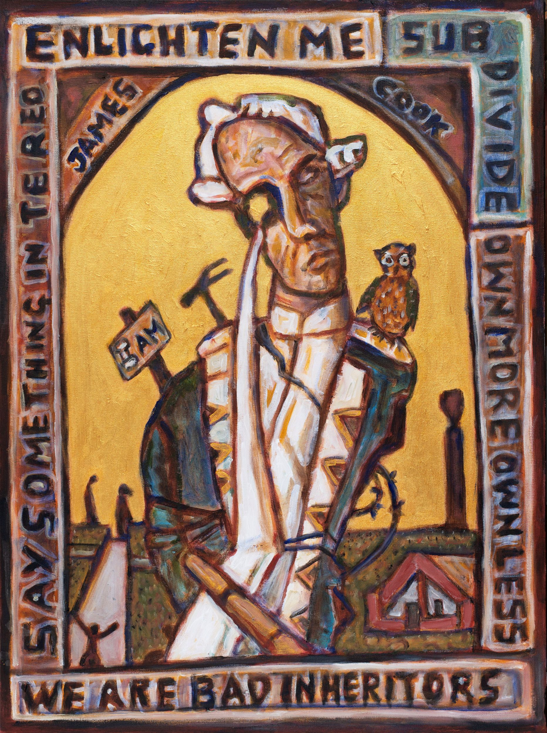
The Good Citizen of Bendigo
Inspired by protest and alarm at the impacts of the proposed Santana gold mine in Central Otago
-
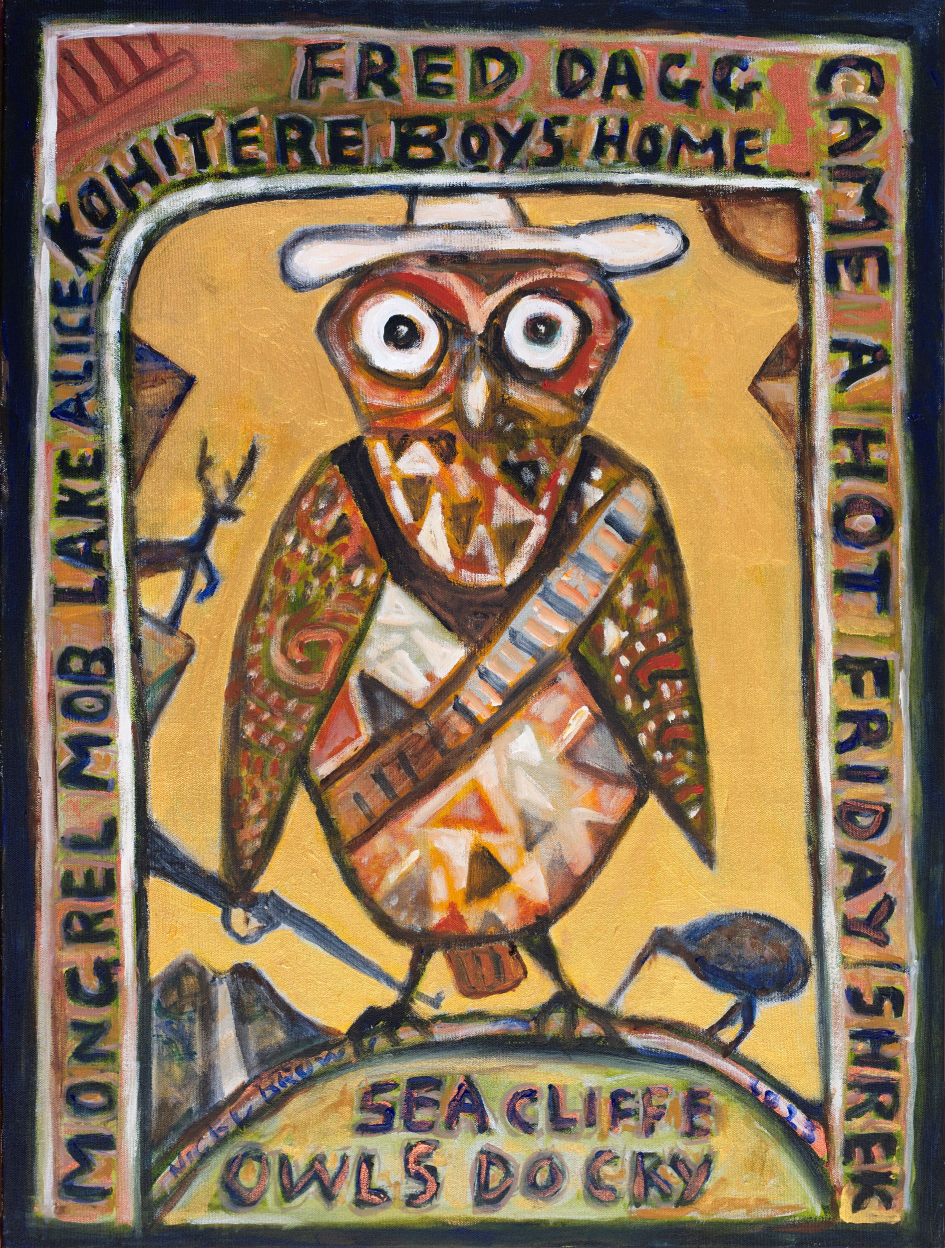
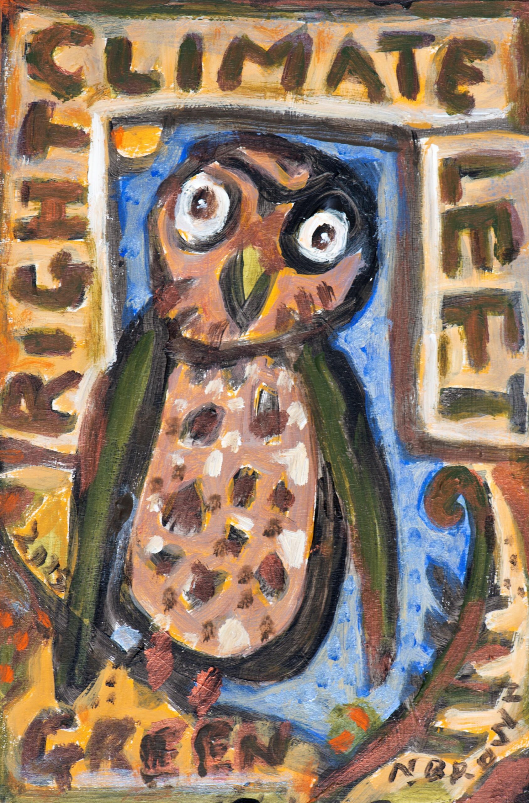
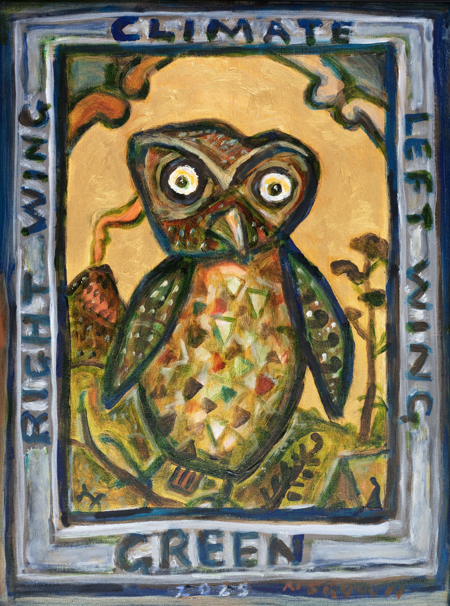
Owl for a Hot Friday
The ruru emerges into the light, luring with classic Kiwi humour but challenging us without compromise to deal with societal, abuse and sustainability issues.
-
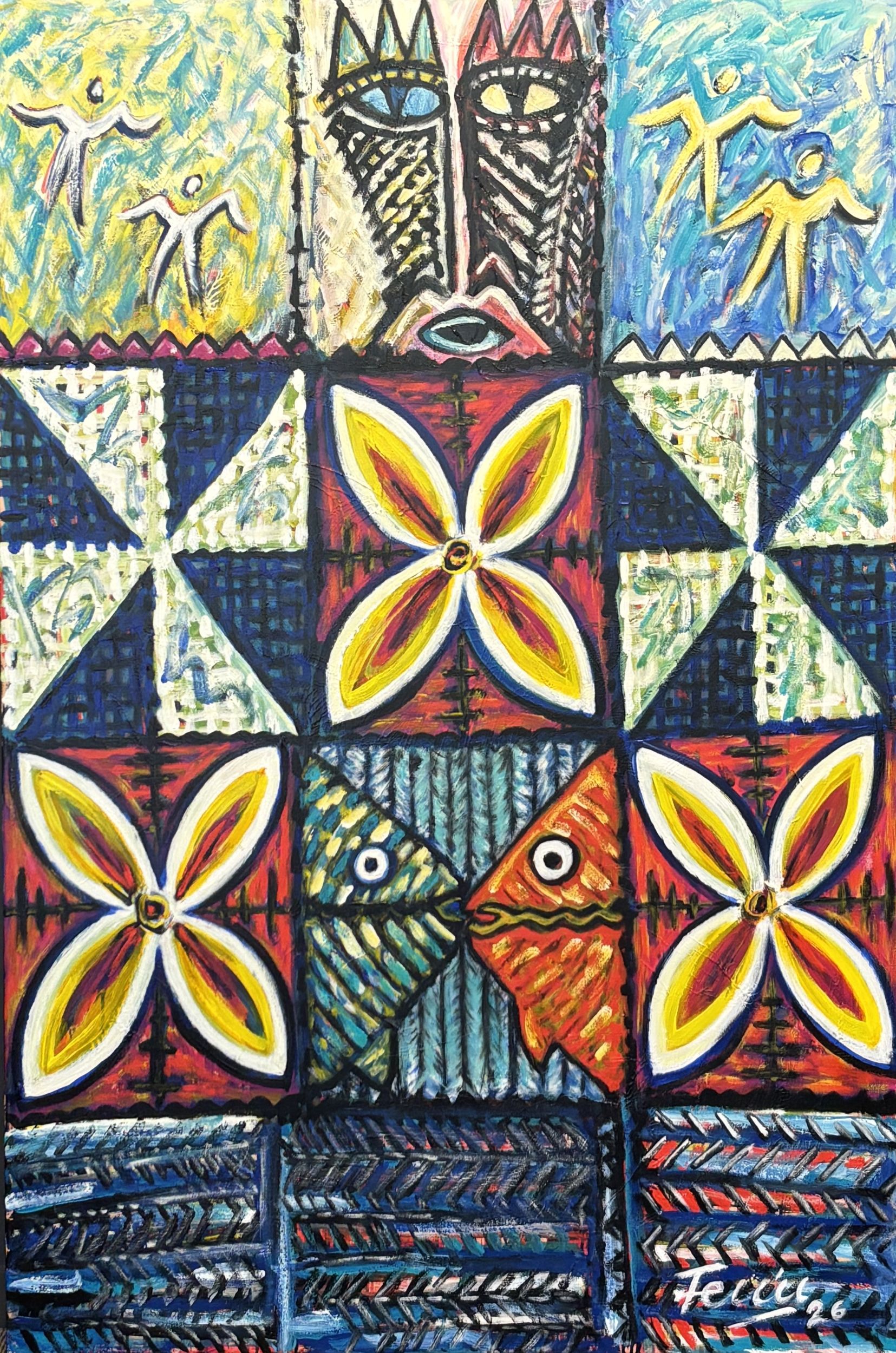
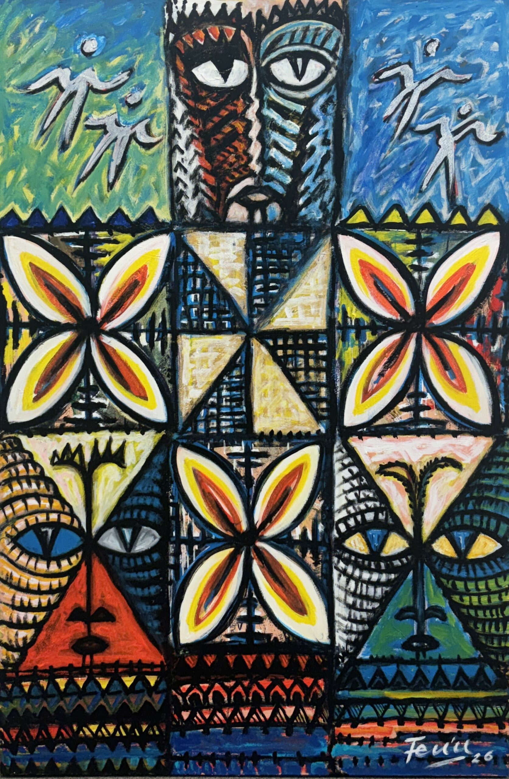
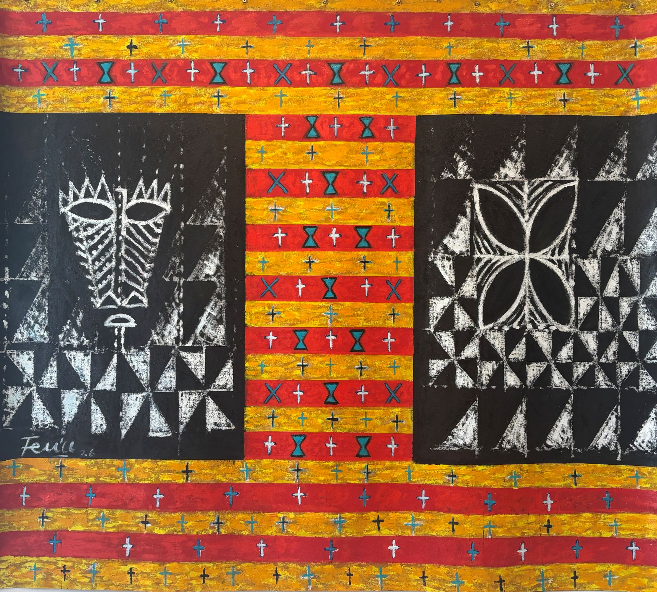
Fa’alasi
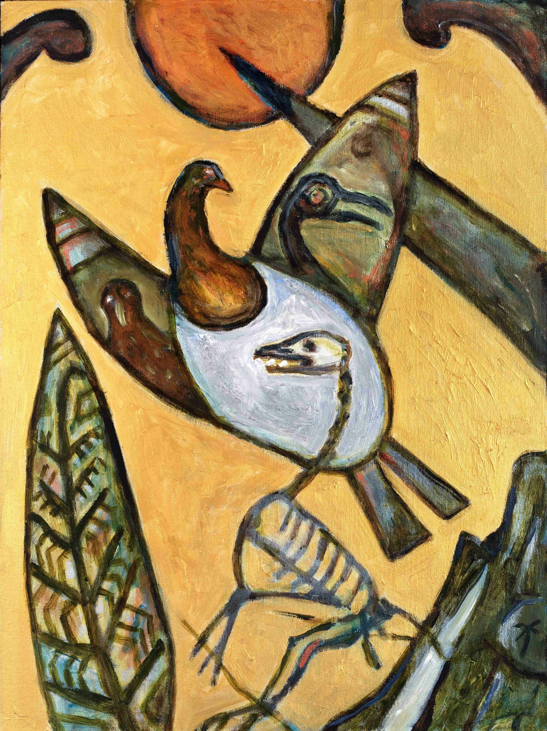
Fa’alasi can be translated as to bring into harmony; the motifs representing new life, ocean journeys, the overseeing god Tagaloa, the gogo – ancestor spirits, guardians watching over.
-
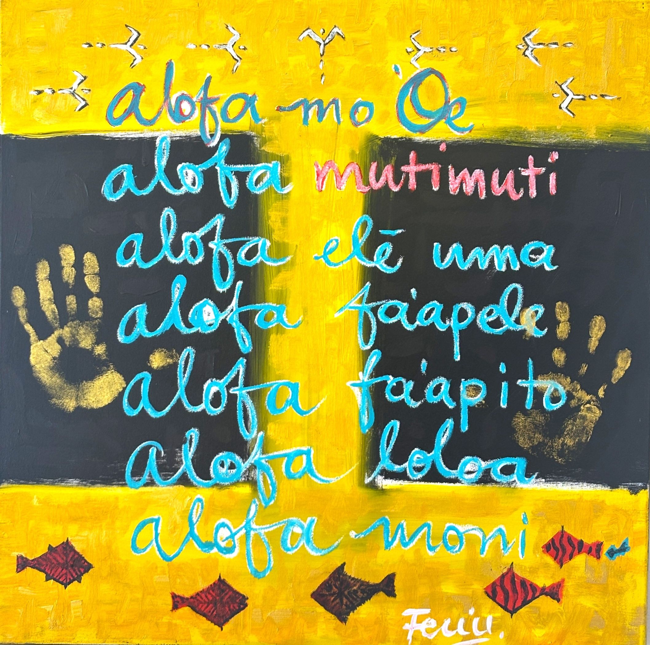
Muti Muti
Alofa Muti Muti = love as compassion
The various forms of alofa embrace all kinds of love, for family, oneself, each other, the world -
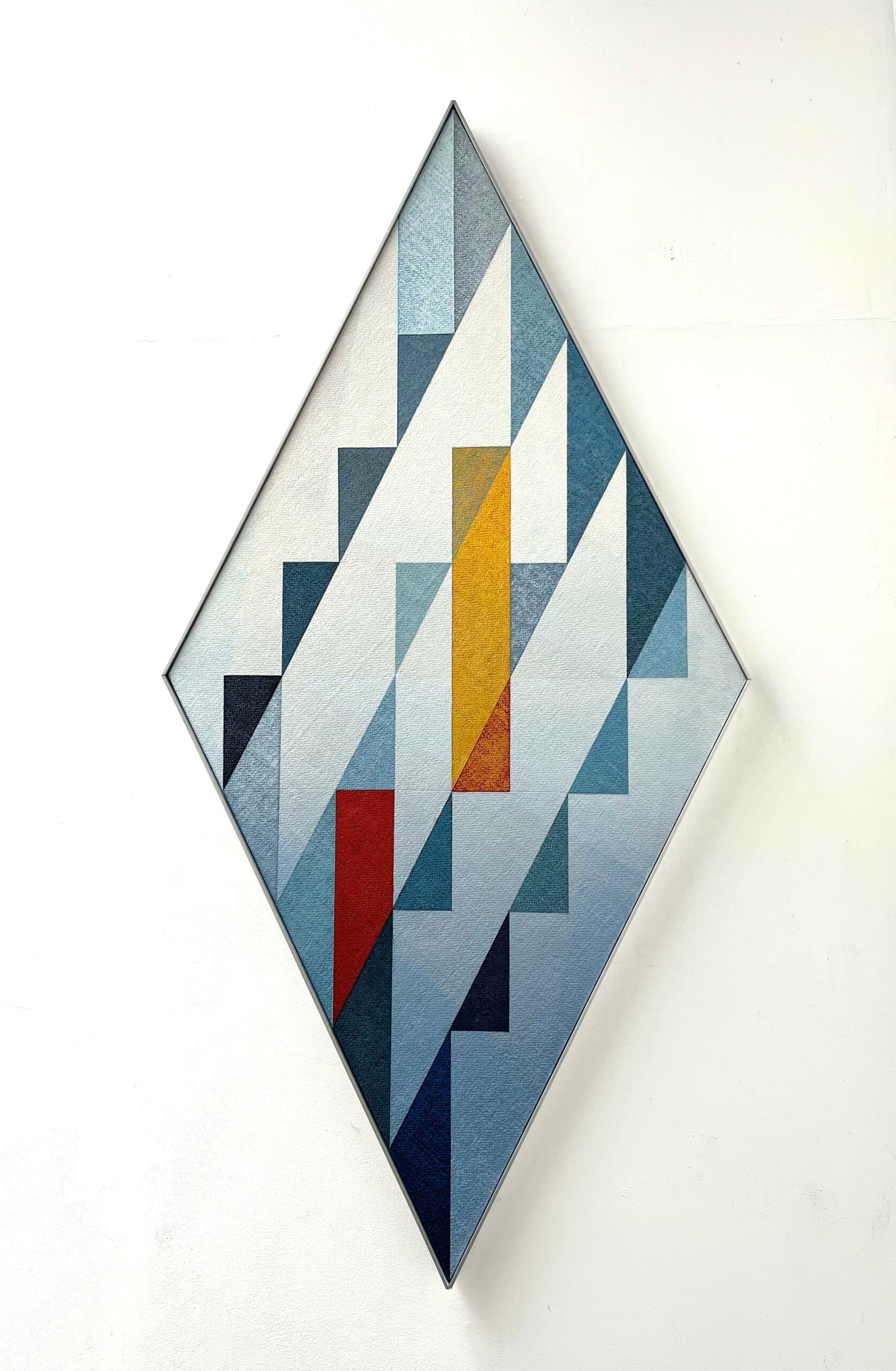
Gothic Portal II
Aluminium frame
From a series referencing the gothic shapes of the Cathedral and other structures in Christchurch.
-
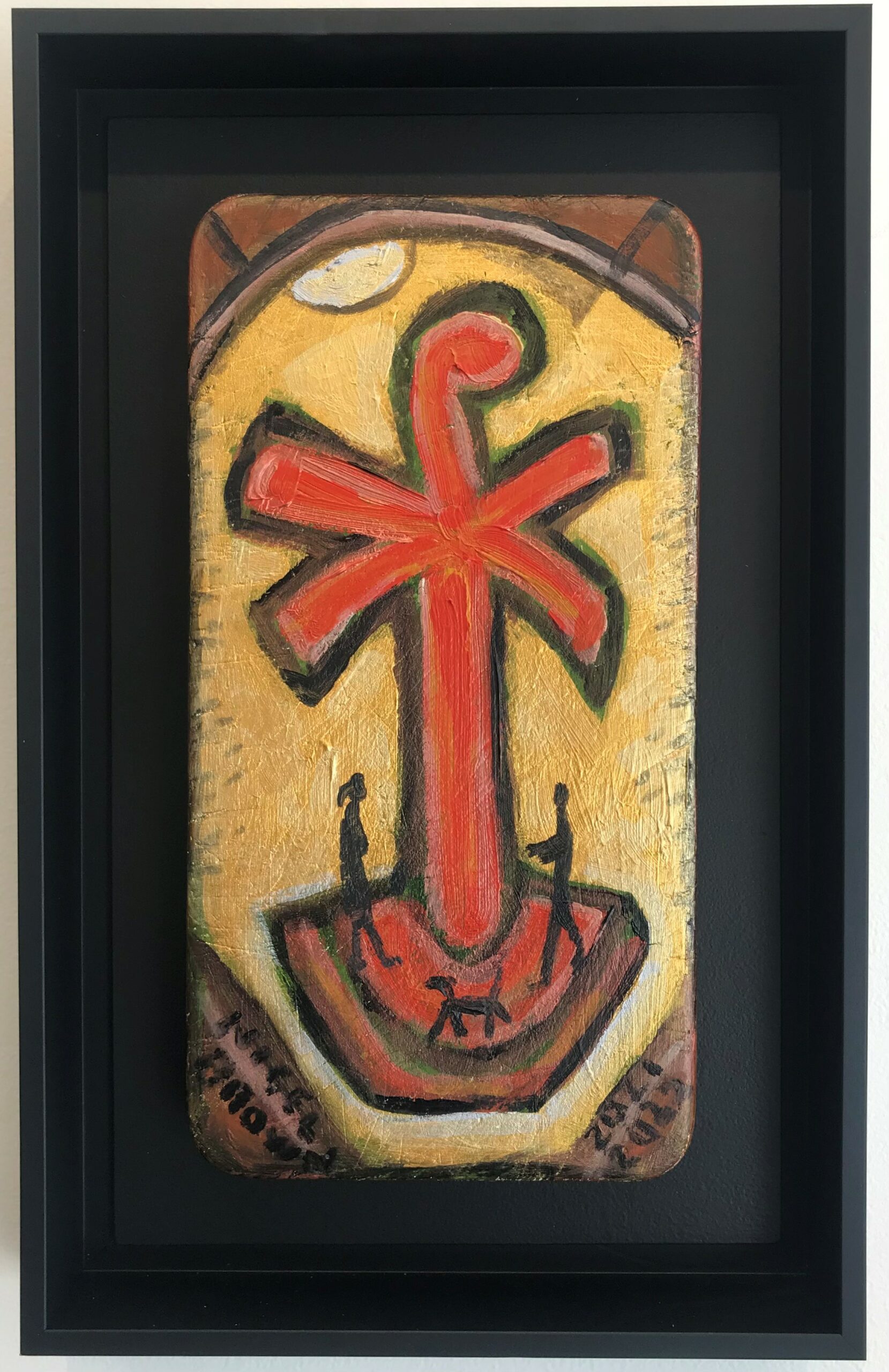
![Black Ark [for Gaza]](https://thediversiongallery.co.nz/wp-content/uploads/2026/01/Black-Ark-for-Gaza-Nigel-Brown-low-res.jpg)
Black Ark [for Gaza]
black shadowbox frame
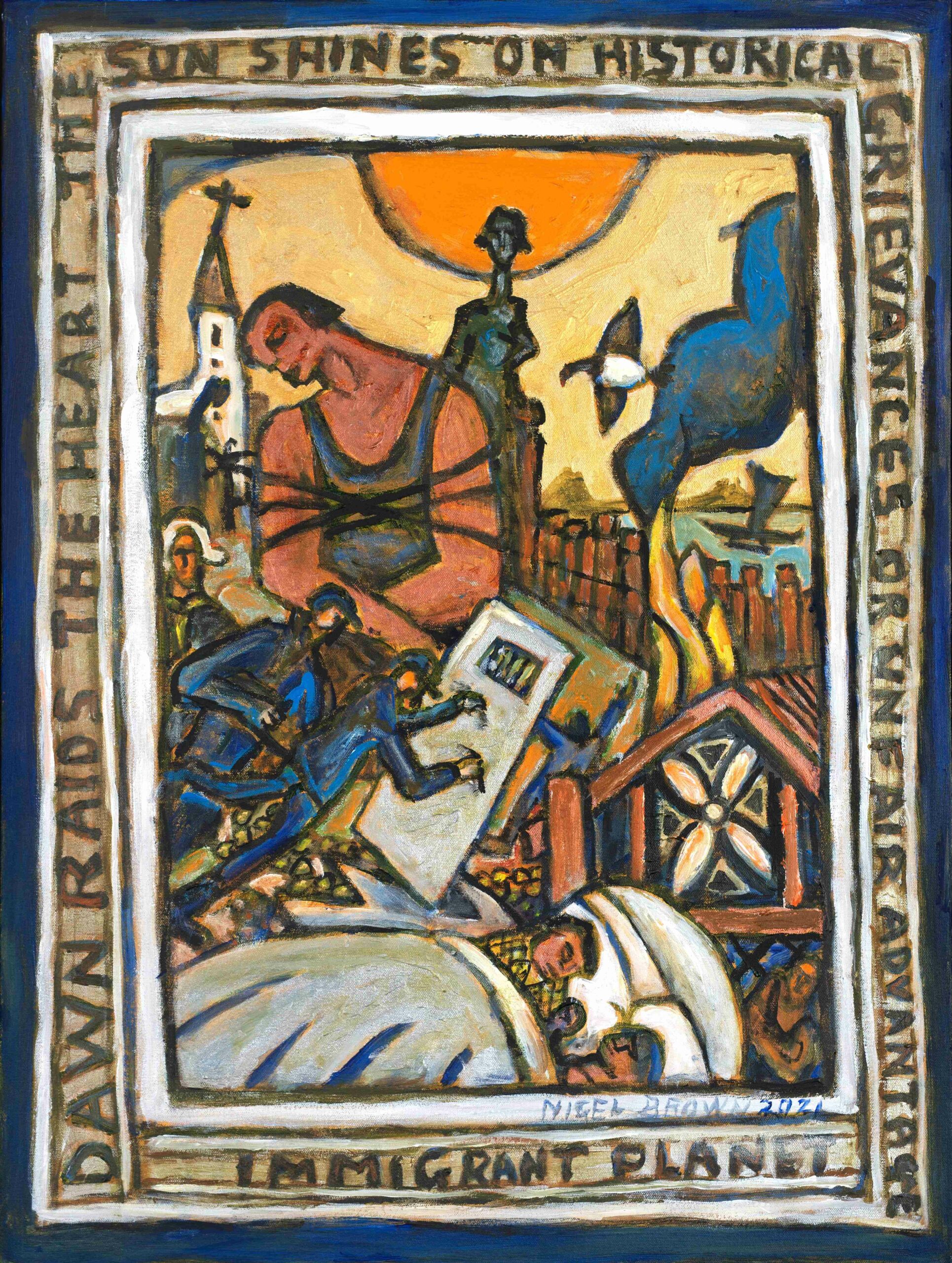
A powerful protest painting; whereas usually Brown’s Ark would be looking to save species of the animal kingdom; now it must be used to save a people.
-
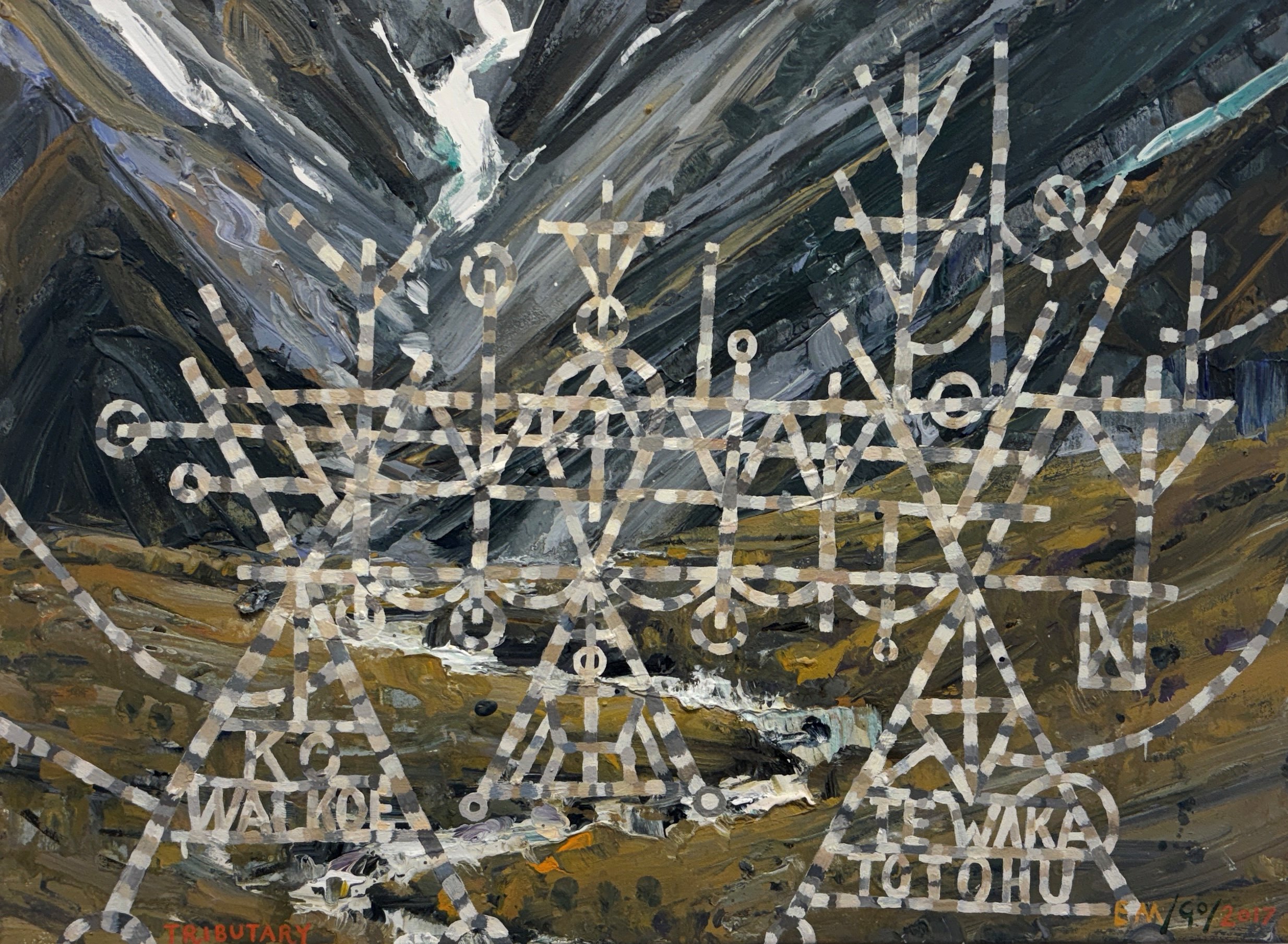
Tributary
framing on request
From a series of collaborations first shown in Sydney in 2018, this collaborative painting has been revisited by the artists, creating a stronger integration of the water-related imagery of O’Brien’s work, with Macleod’s rendering of the South Island landscape.
-
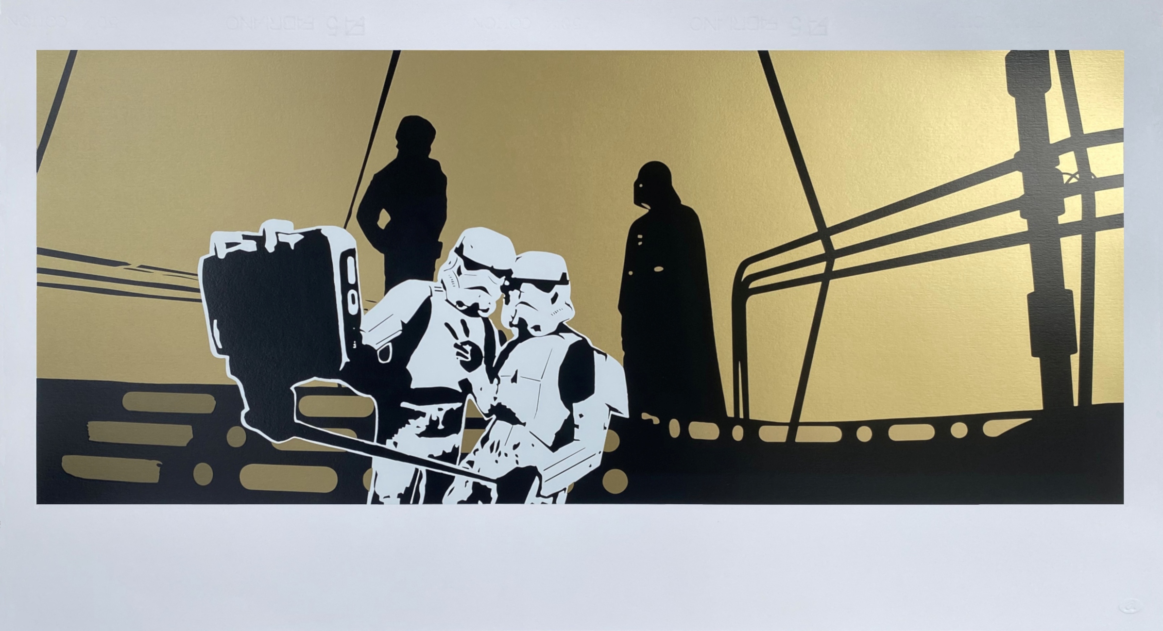
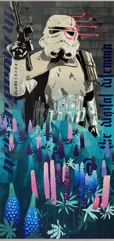
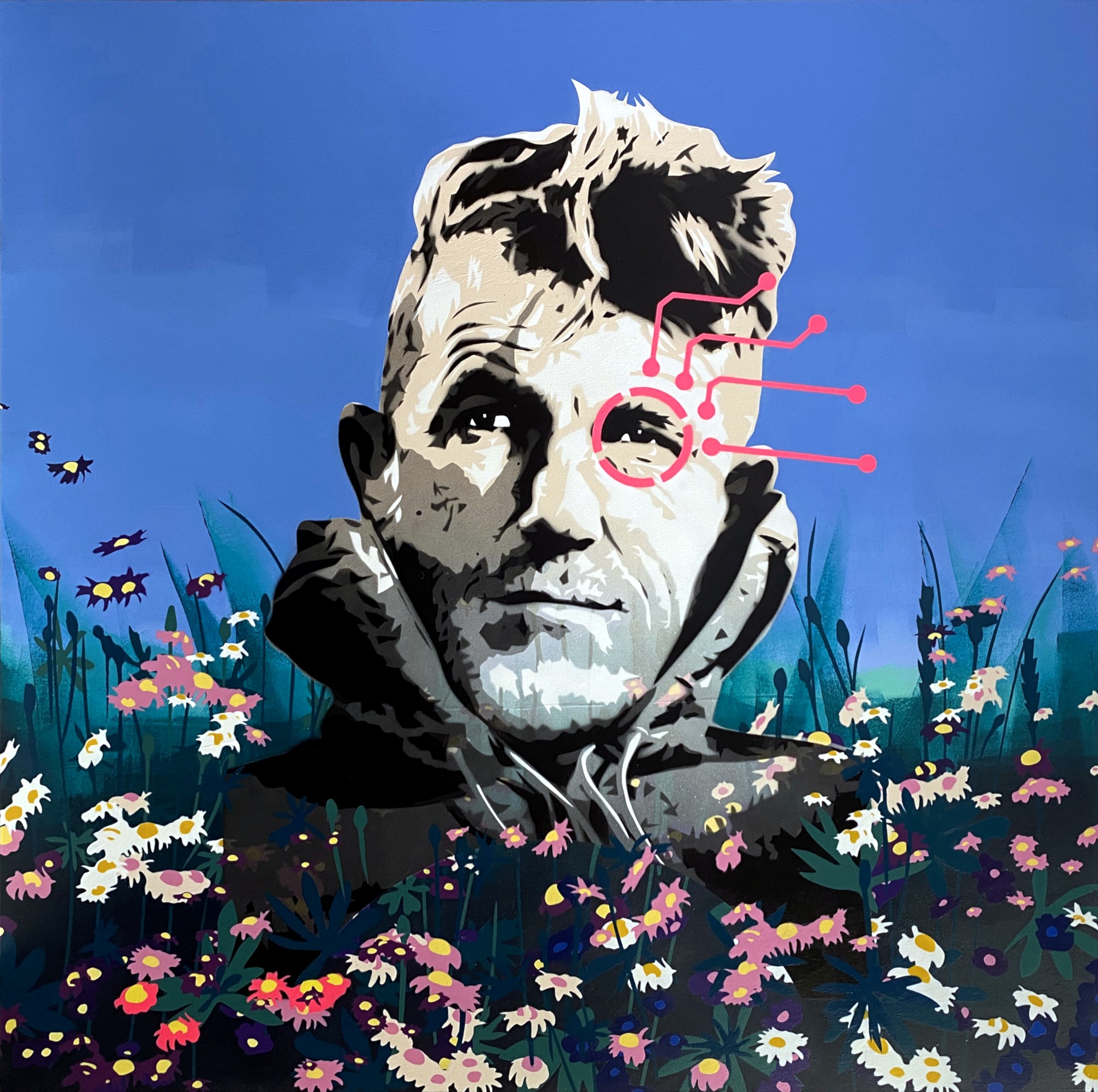
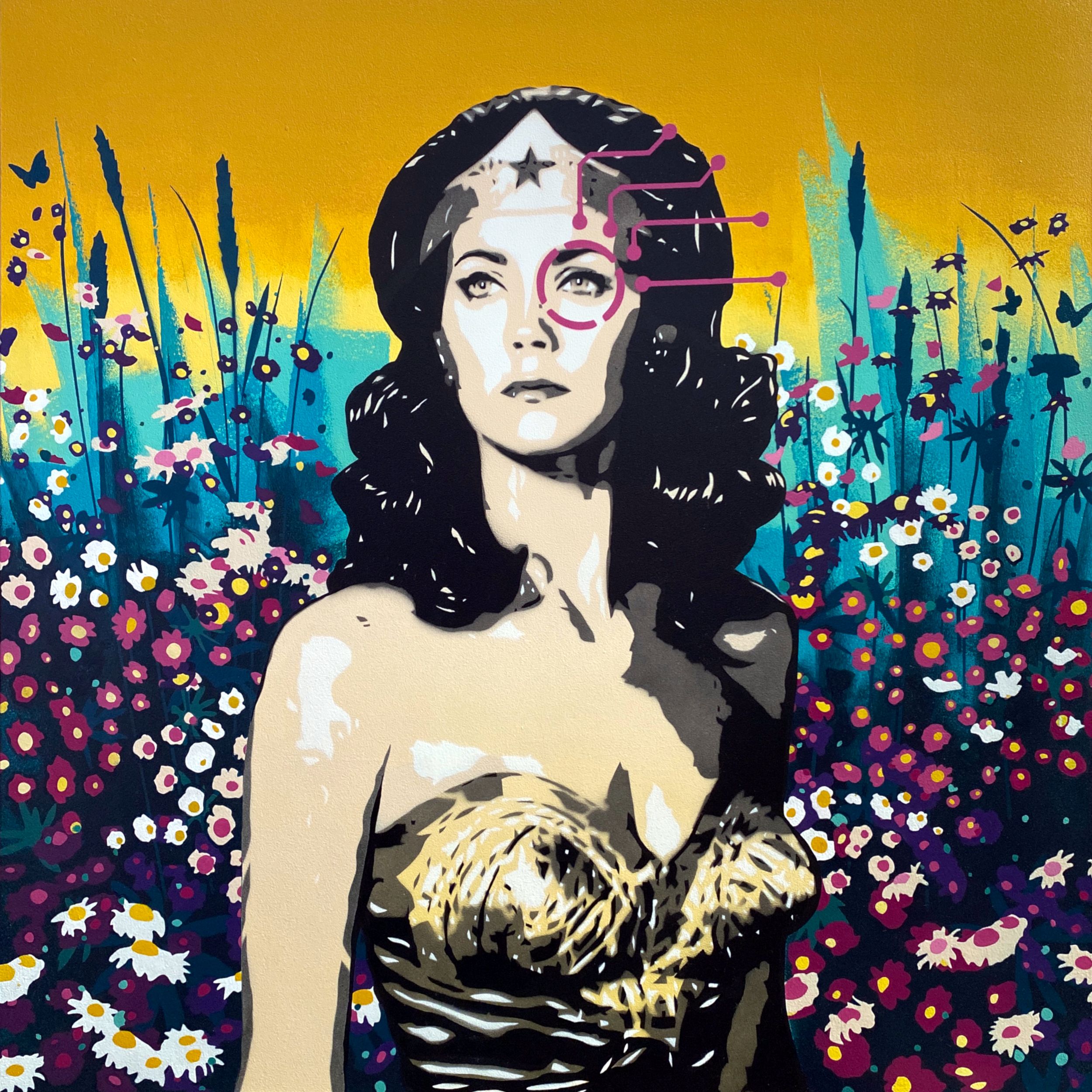
Say Cheese (1.6) G
A rare metallic gold edition of Novak’s depiction of the Stormtroopers focused on taking their selfie, oblivious to the most momentous event in the Star Wars series takes place behind them.
-
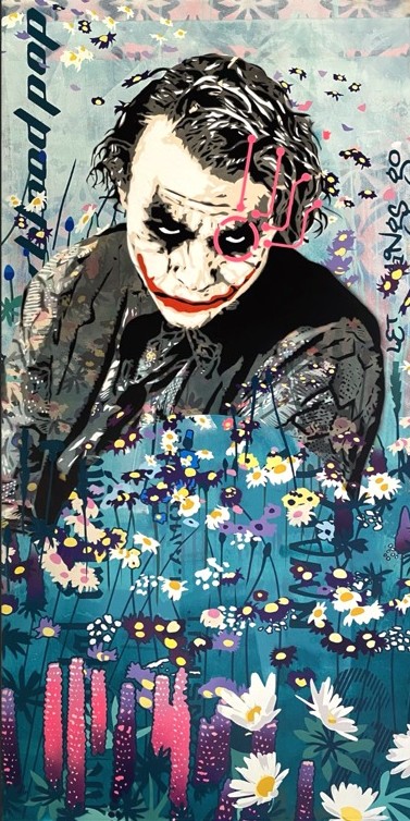
Nemesis 1.18
The Joker – Heath Ledger – expressing the idea of ‘let things go’, the balance between the digital world and connecting with nature.
-
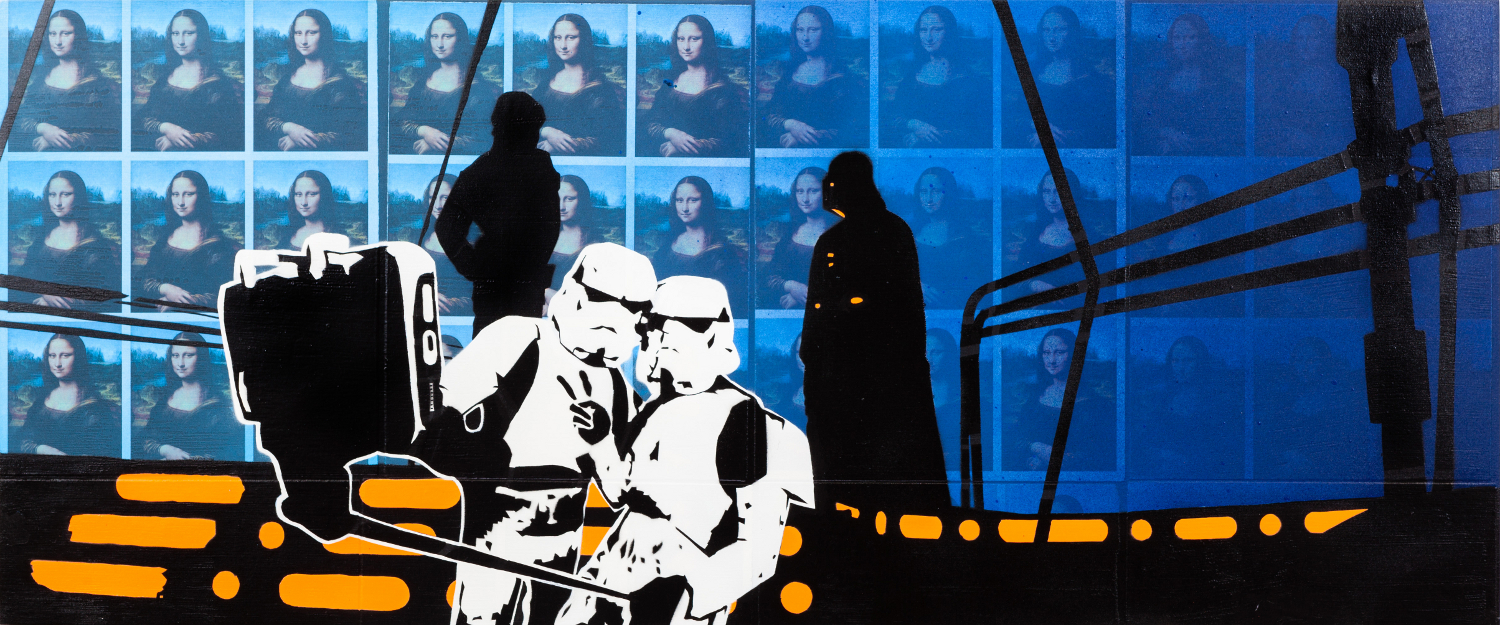
Say Cheese 1.3
From the early beginnings of the Say Cheese series, digital fixation vs major events in a world.
-
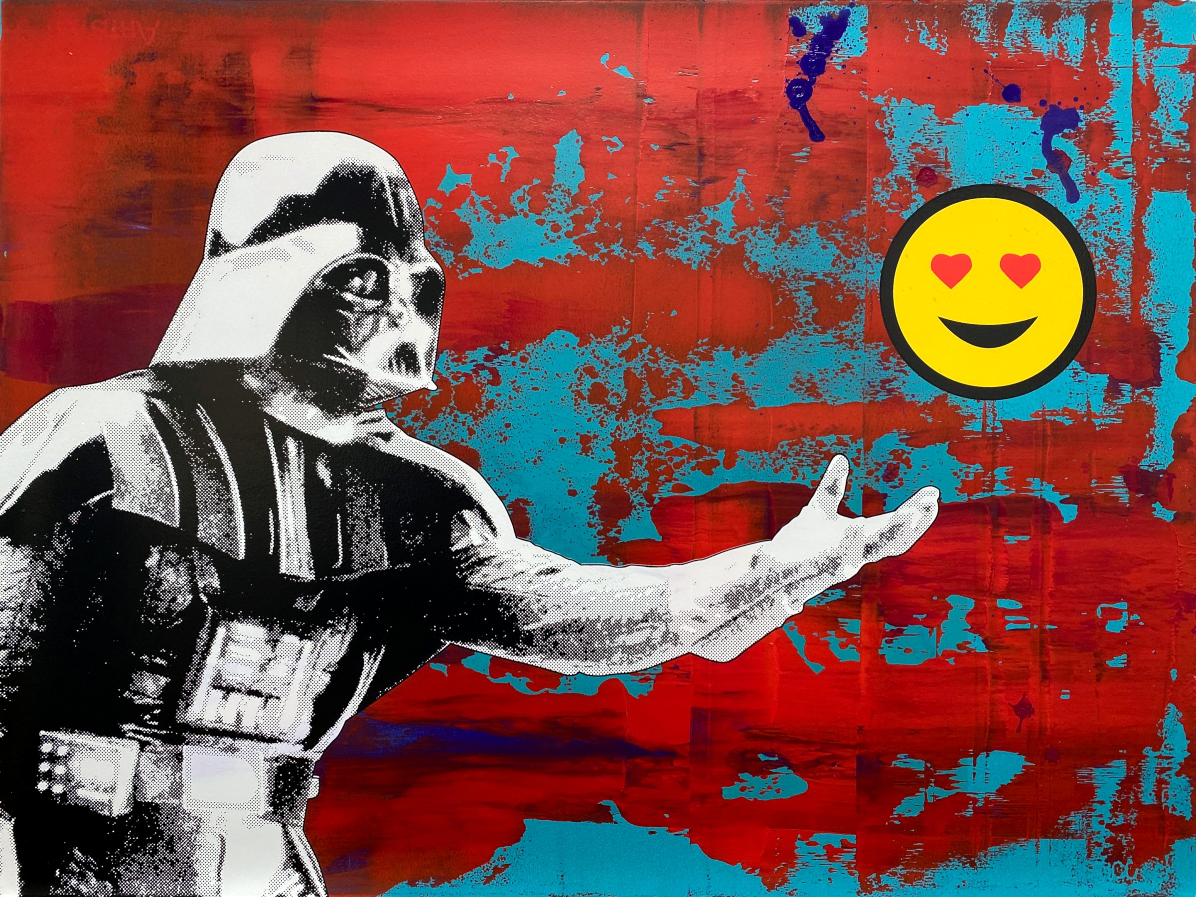
Father 4.1 (GRB)
A one-off work using paint technique inspired by Gerhard Richter. Darth Vader reaches out to his son Luke Skywalker – but only with an emoji; reality remains distant. A commentary on the digital world vs real connection. A screenprint variation of the composition is available.
-
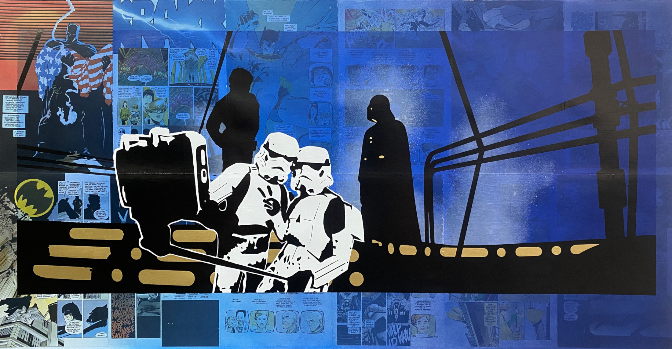
Say Cheese 1.6 DKRB
A unique evolution of the artist’s Say Cheese series, incorporating pages of a rare Batman comic.
-
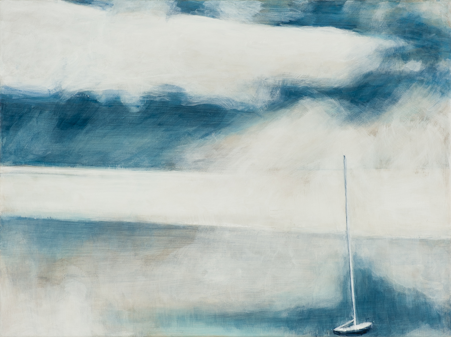
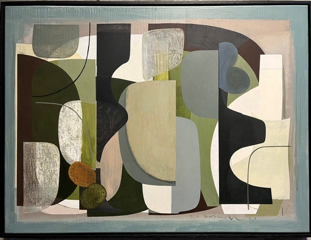
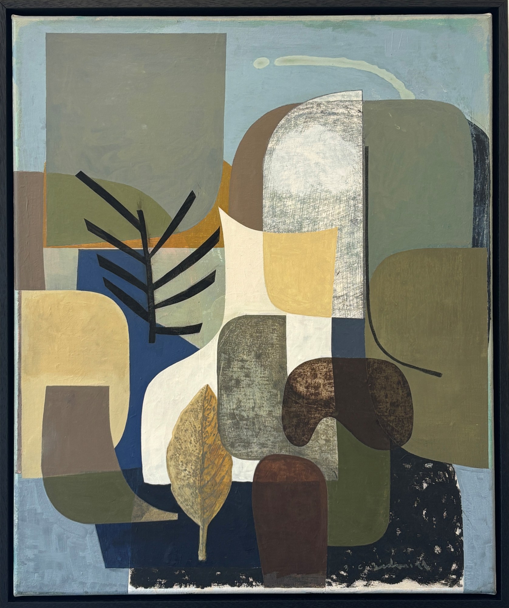
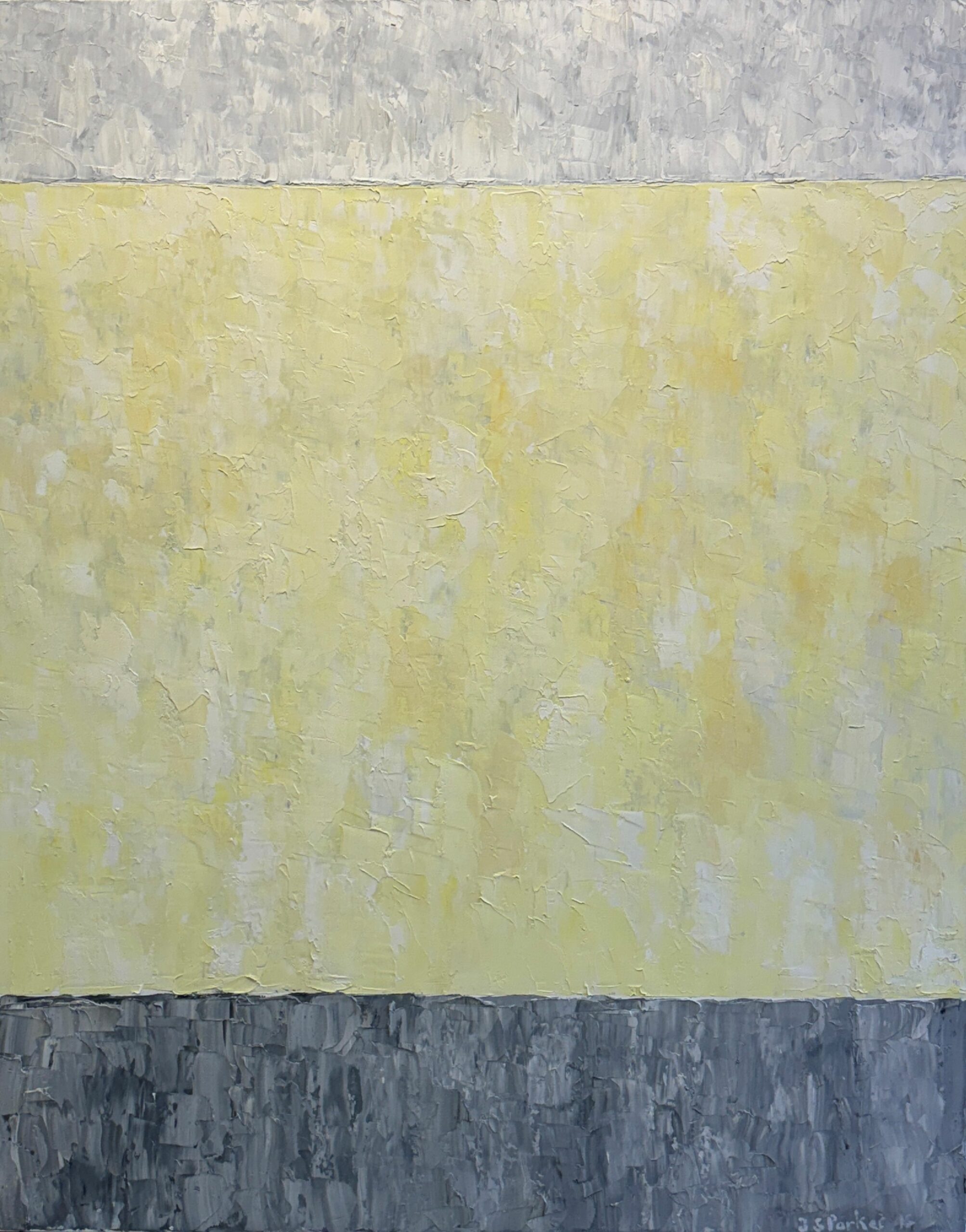
Light can be both Wave and Particle
This meditative painting has been selected for the cover of a book Light that is both wave and particle by prominent UK poet Maura Dooley, to be published in 2027. Both the artist and poet were inspired in their titles by the ongoing debate about the nature of light, and their creative works capture the shapeshifting, ephemeral quality of light and of our perception.
-
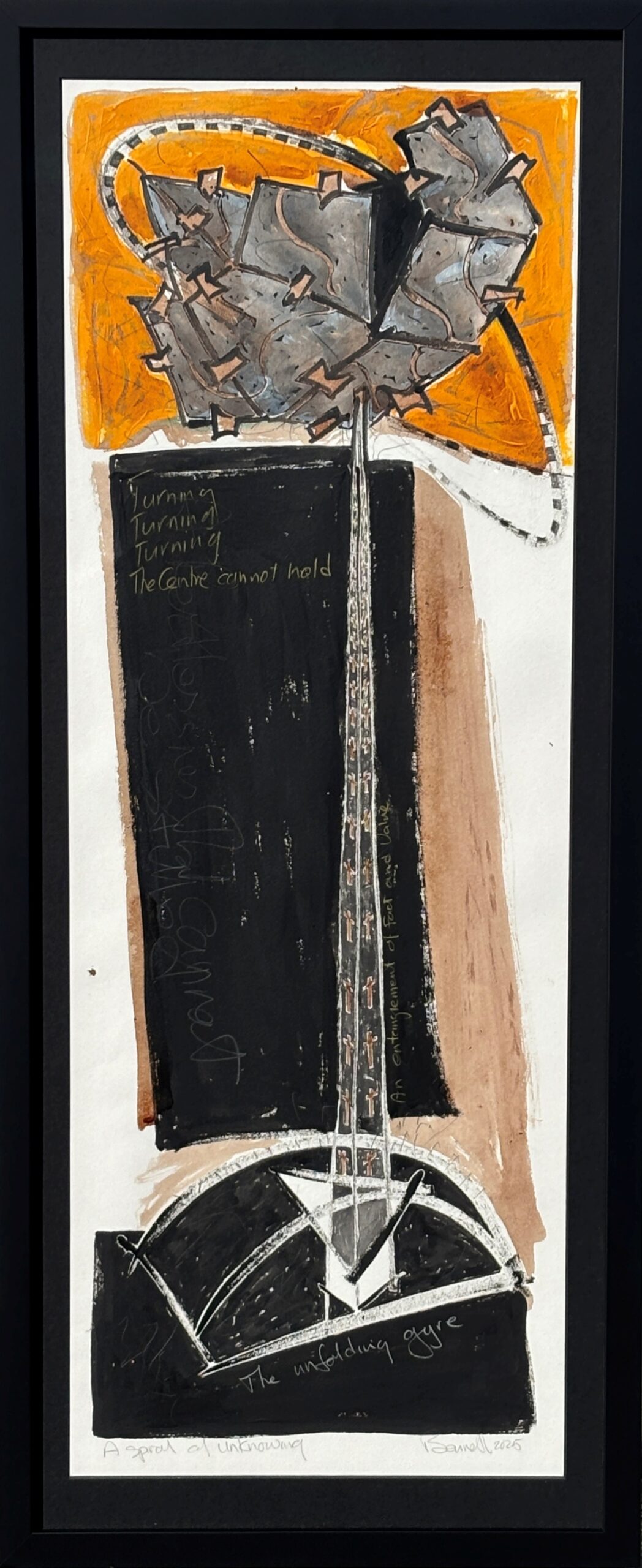
A Spiral of Unknowing
Float mount, Black frame and matt, anti reflect glass
A continuation of the series from the artist’s residency in Japan in 2024, documented in a feature article in Art New Zealand Autumn 2025 (copy of magazine included).
-
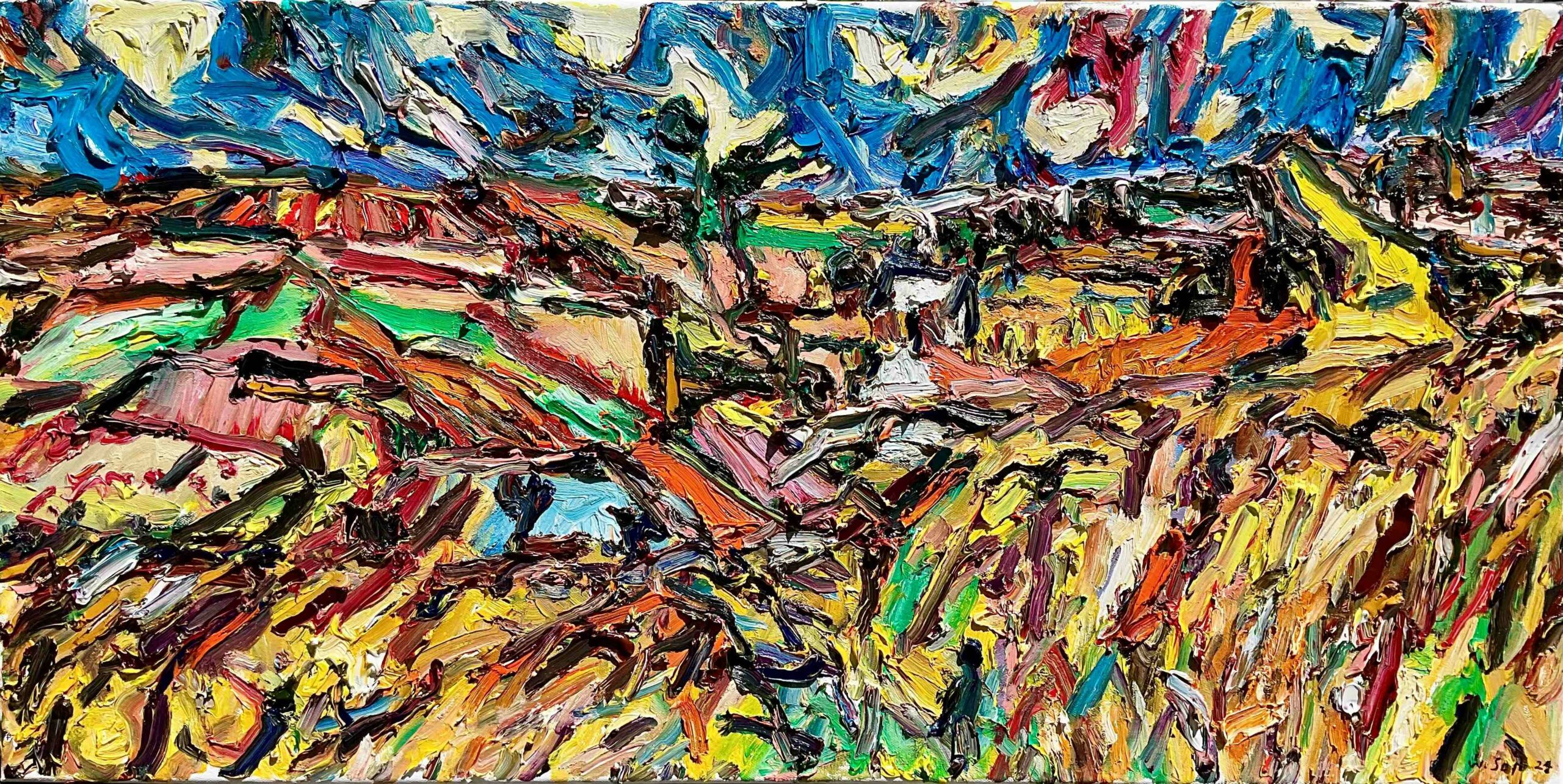
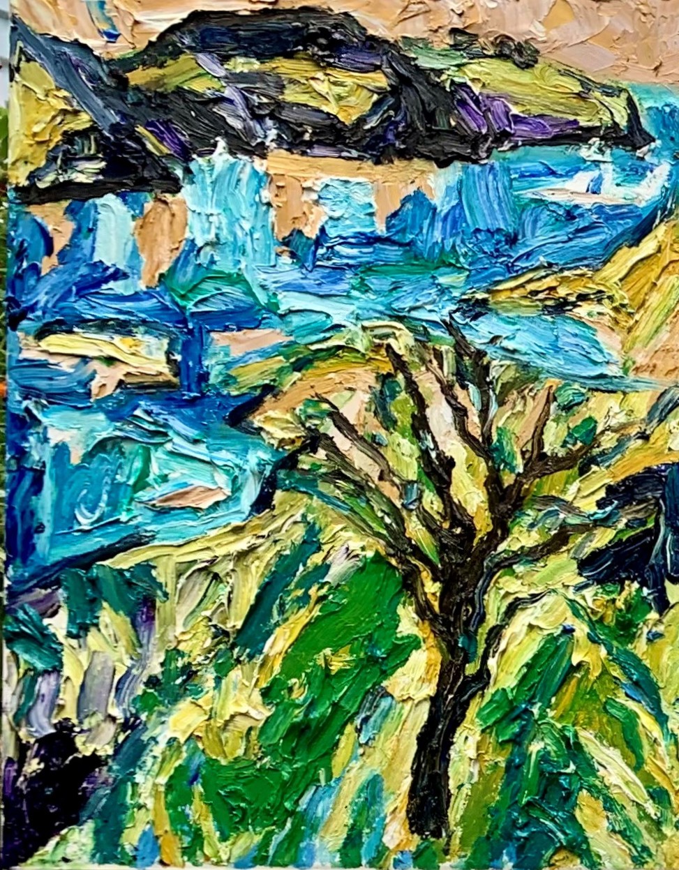
From drawings in Vincent’s pocket
white tray frame
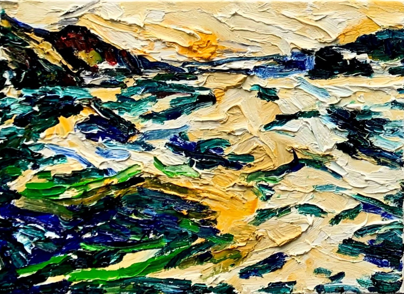
The painting is something of a homage to Van Gogh, one of Seyb’s artistic heroes. Drawings were reputedly found in Van Gogh’s pocket when he died, and Seyb decided to work from two of these images, rendering the drawings into paint, as a tribute to Vincent.
-
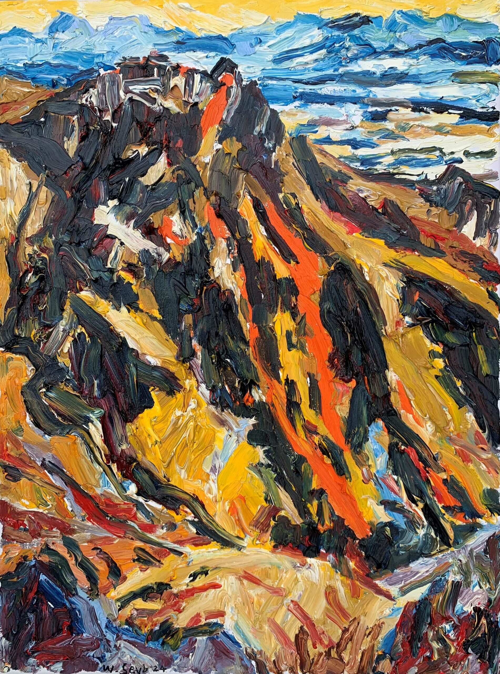
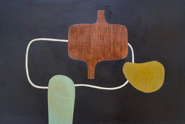
Too old to be John, Gondola 11
white tray frame
A homage to the artist’s friend, the late poet John Allison who lived near the foot of the Port Hills gondola. Travelling up the gondola a month after John Allison had died, Seyb noticed a kingfisher on the wire but decided the kingfisher was ‘too old to be John’, transformed.
-
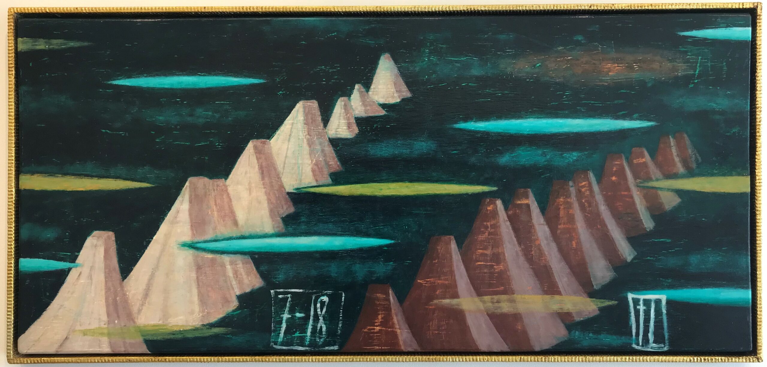
Tony Lane
About the Artist
New Zealand artist Tony Lane uses iconographic symbols such as necklaces, trees, chairs, veils, and more recently cloud forms carrying a sense of the spiritual and the indefinable, yet anchored to the earth. Or weeping? A chair might stand in for a human presence, while his mountain forms and water suggest the physical world, but Lane prefers not to fix interpretation in place by offering a narrative.
‘I’m very wary of titles, because by being too specific, you can limit a painting. I am trying to start an open-ended conversation.’ (speaking to Art News reviewer Virginia Were).
His visual language is rich, often drawing comparison to European frescoes and renaissance painting, but his delivery is all his own. There’s equally hints of pop art, and European modernism, alongside a sense of classical composition. His landscapes are like a form of still life, hypothetical and imaginary, yet they are anchored, a reference point we all connect with. ‘The imagery comes from everywhere and everything, looking at real things, remembering things. It’s built up the way you build up vocabulary in your speech.’
Tony Lane graduated from the University of Auckland’s Elam School of Fine Arts in 1970, and has exhibited extensively in New Zealand and internationally, living between Auckland and Spain. His work is held in significant public and private collections internationally.
Recent Works
Tony Lane’s recent works emerge from a series ‘Between Heaven and Earth’ which hover between surrealism and a sense of renaissance painting. These paintings link to the New Zealand landscape, the ever present mountains – with perhaps an influence from his early teacher, McCahon – and ideas about our environment, surroundings, in both a physical and metaphorical sense. We cannot connect with this ancient landscape without considering the contemporary issue of climate change, and the need to nurture the forests, the environment.
The mountains connect to the heavens and clouds – the physical to the spiritual – through familiar painterly devices such as strings which could be beads, tears, rain, or some other channel of connection; or haloes of cloud.
They present a kind of ‘still’ life, with space for meditation on our own connections, and consequences. And perhaps the clouds, more present in the new small paintings, are gathering, providing a space to contemplate the future?
-
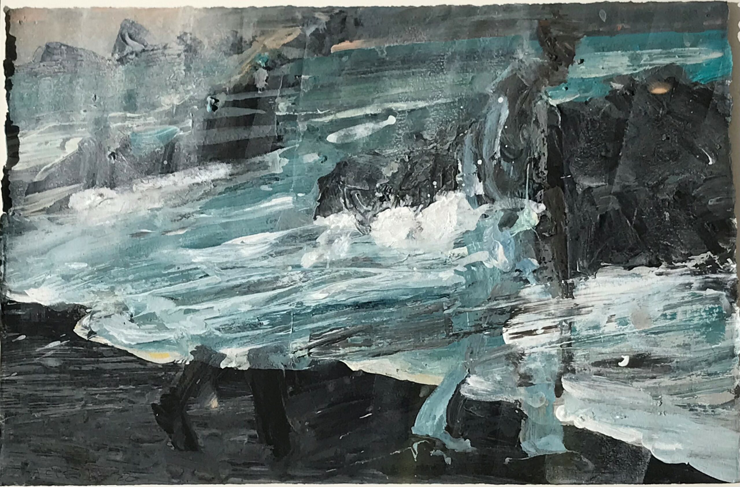
Euan Macleod
About the Artist
Born in New Zealand, Euan Macleod moved from Christchurch to Australia in the early 1980s, and has come to be regarded as one of the foremost painters working across both countries. His paintings often feature a dominant figure striding through or laying atop a powerful expressive evocation of landscape; moody, reflective, often with a sense of history or the past pushing through into the present. Often the figure appears to be walking through cultural history, mythological perhaps.
Euan’s work is represented in many private and public collections, including the National Gallery of Australia, Te Papa Tongarewa Museum of New Zealand, and the Metropolitan Museum, New York. Euan has won art prizes in Australia, including the Archibald in 1999, the Sulman Prize in 2001, the Blake Prize in 2006, the New South Wales Parliament’s inaugural Plein Air painting prize in 2008, the Tattersall’s Landscape Prize in 2000 and 2009, the Gallipoli Art Prize, 2009, and the King’s School Art Prize in 2011.
In 2010 Piper Press, Sydney, published a monograph, Euan Macleod: the Painter in the Painting, written by Gregory O’Brien.
Recent Works
Euan Macleod visited Meretoto/Ship Cove with Gregory O’Brien in October 2022 as part of The Diversion Gallery’s Meretoto project taking artists to respond to that place of sustained early contact between Māori and Captain James Cook. They produced several collaborative works, alongside Macleod’s striking studies in pastel on paper, expressive evocations of place, light, history, and a sense of connection through time.
They continue to work collaboratively, exploring everything from history to environmental issues, their style distinctively different, yet complementary.
-
Elizabeth Thomson
About the Artist
Elizabeth Thomson (born 1955, Auckland) graduated with an MFA from Elam School of Fine Arts, University of Auckland, in 1989. Since then her work has been exhibited widely throughout New Zealand and abroad. A major survey exhibition, ‘My hi-fi my sci-fi’ opened at City Gallery Wellington in 2006 then toured nationally. At Aratoi, Wairarapa, ‘Cellular Memory’: a survey exhibition 1989–2017 opened, and is at present touring nationally. Alongside the work of Len Lye, her art featured in the major two-person exhibition, ‘Waking up slowly’, at the Len Lye Centre, New Plymouth, in 2018. Based in Wellington since 1991, she works in a converted factory in the suburb of Newtown.
-
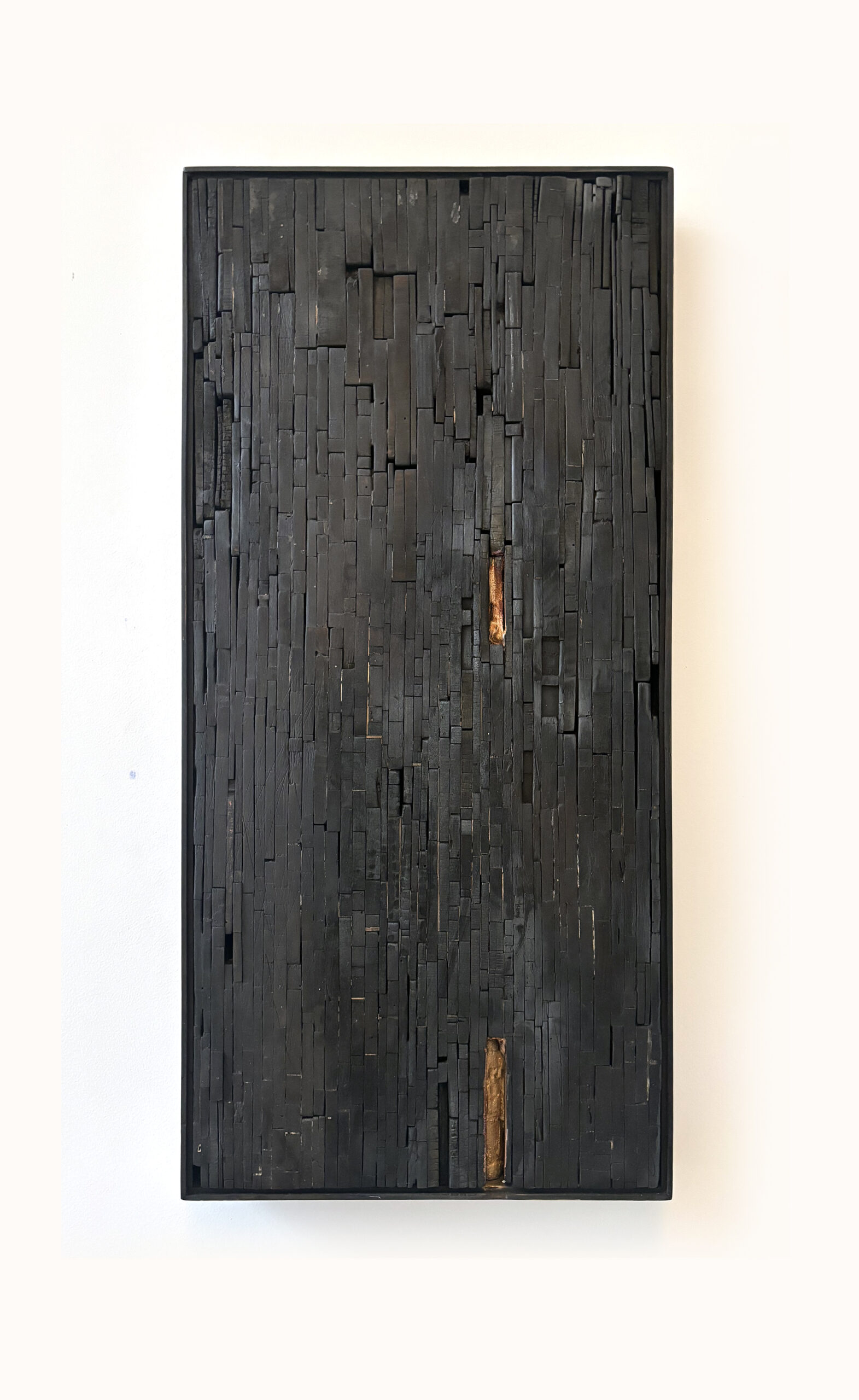
Kara Burrowes
About the Artist
‘Much of my work is intuitive, derived from unconscious thought and a willingness and impulse to experiment.’
The work In Casting Light on Shadows explored themes of hiraeth, a prominent thread through Kara Burrowes’ work during her Master of Fine Arts at Canterbury University, completed in March 2023 and awarded Distinction. Seated in nostalgia and an inexplicable longing for ‘home’, Burrowes works intuitively to express her inner dialogue. Drawn to shadow, reflection, muted, foggy and hazy memory, she works to get the feeling translated onto a surface through the use of a variety of media, often unorthodox. Beneath the layers of sublime acrylic paint, scraped back and reworked, are media such as resin or wax, sometimes burned, giving a texture and a sense of something unknown – or unknowable – concealed beneath.
More About the Artist
Kara Burrowes has featured in national and international art awards, notably as a finalist in the Parkin Prize, Molly Morpeth and Wallace Art Awards – flowing on from an early career 1995 award for Landscape Architecture. She lives and works in Christchurch.
She undertook a Masters of Fine Arts (University of Canterbury) in 2022-23, and achieved Distinction on graduating. The return to study took her more intensely back into painting, diverging from her previous mosaic assemblages of found heritage wood, charred and painted. Those processes have flowed through into the new paintings, but are hidden beneath intriguing, subtle and multiple layers of acrylic paint.
Kara Burrowes is establishing her place as a distinctive voice in contemporary abstraction, for her unique view, and often unexpected process, and for works that need first hand viewing to fully appreciate their power and subtlety.
-
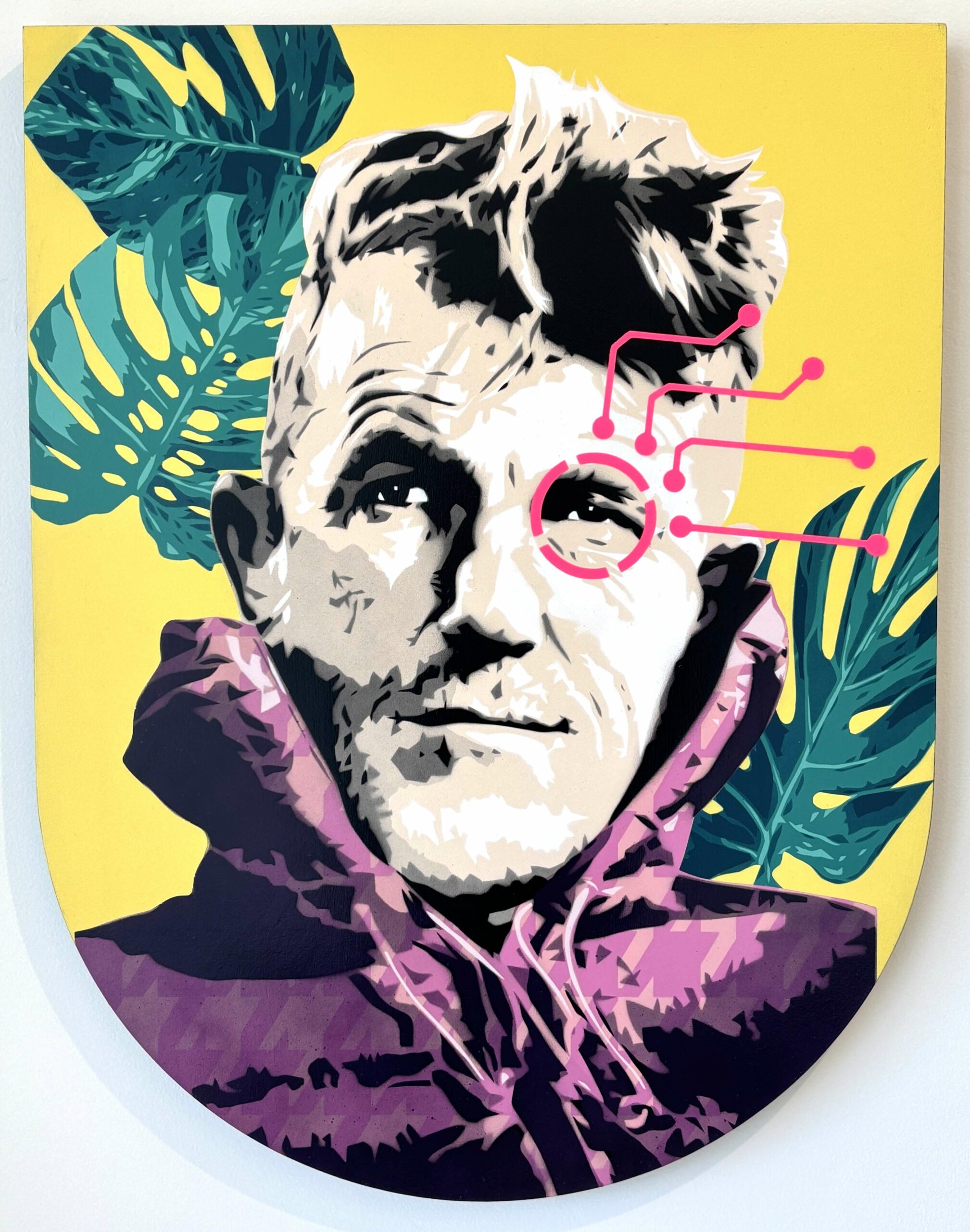
Brad Novak
About the Artist
“My art is about keeping our childhood dreams alive as we grow up” – Brad Novak (aka New Blood Pop)
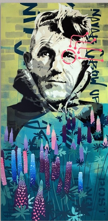
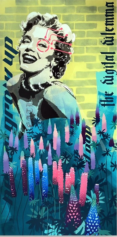
Brad Novak (Auckland) is a New Zealand-born urban artist exhibiting internationally, whose work sits sharply at the nexus between fine art and street art. Under the moniker ‘New Blood Pop’, his one-of-a-kind, hand-collaged and stencil-spray-painted works involve the layering of popular imagery, into unique works with an edgy commentary on the influence of technology in our lives and outlook.
Novak is shows work internationally through galleries in the US, Canada, the UK and New Zealand. In October 2015 Novak became the first New Zealand-born artist in the country’s history to show simultaneously alongside both the legendary pop art megastars including Andy Warhol, Keith Haring, Roy Lichtenstein, and the street art global elite such as Mr. Brainwash, Shepard Fairey (OBEY) and BANKSY (Struck Contemporary, Toronto).
Novak uses popular culture, specifically the depiction of celebrities from the hyper-inflated world of American stardom. Icons such as Harrison Ford and Marilyn Monroe inhabit his creations, as do the Stormtroopers and Darth Vader from Star Wars. Their iconography is underpinned by the use of repetitive images of fellow superstars, such as Carrie Fisher and Christopher Reeve, interpreted in different ways in each composition. More recently, he has incorporated some New Zealand icons/superstars like Sir Edmund Hillary, first to conquer Mt Everest.
These artworks, while at first glance visually striking, call for a paradigm shift in the way we experience life itself. Our over-reliance on science and technology has taught humanity to see the world through a dreamlike state that can cause suffering. Many of Novak’s works depict people shedding tears formed from computer circuitry, or looking at the world through a technological ‘lens’.
The artist calls this ‘subconscious escapism’ – the loss of our collective minds. Our ever increasing love affair with technology has definite tradeoffs. However, Novak challenges us to reconnect with reality by practicing mindfulness – getting out of our heads so to speak. Western medicine and psychology is finally catching up to the teachings of ancient Eastern philosophy.
The artist’s dual career as a practising medical doctor also comes to the fore in this series. Medical iconography is drawn upon, with the Caduceus symbol frequently featured. His Hybrid series refers to how everyone has more than one history, one narrative. We all have other strands – just as he is a medical doctor and a successful urban artist.
The artist describes his own experience of the works:
New Blood Pop is concerned with how we experience life itself, the 21st century issues we face such as inequalities in wealth and health, sustainability and globalization. I’m also interested in the idea of escapism especially through science fiction and the superhero franchise. Of the things we choose to believe, what’s real, and what’s not? These works are global, flagrant, iconic and ironic.
I endeavor to create powerful multi-layered works, with an emblazoned foreground overlaying a ‘veiled’ background, to show that many of us are living life through a distorting veil, clouding our perception. Our awareness tainted by biases and judgments – a fantasy that we’ve created for ourselves – the practice of mindfulness promises salvation.
More About the Artist
Whilst living in London in the early 2000s, the urban and street art scenes greatly influenced Novak’s work. Additionally Richard Hamilton’s manifesto on Pop Art provided inspiration. In the letter written to Peter and Alison Smithson in January 1957, Hamilton, a British artist, defined the different characteristics of pop art – describing it as “transient, glamorous, expendable, sexy, and popular”. The frivolity of these terms forms the basis for Novak’s artistic exploration. Novak, however, combined his love for street and pop art to create his urban series – the self-titled ‘New Blood Pop’.
New Blood Pop is…
– Concerned with how we experience life (‘veiled’ or with clarity);
– Concerned with 21st century issues (e.g. inequalities in wealth and health, sustainability and globalization);
– Concerned with escapism (science fiction/fantasy and comics/superheroes-villains);
– Global (non-specific to a particular country);
– Repetitive;
– Scientific or medical;
– Ironic (contains contradictory or contrasting messages).New Blood Pop (Copyright Brad Novak)
-
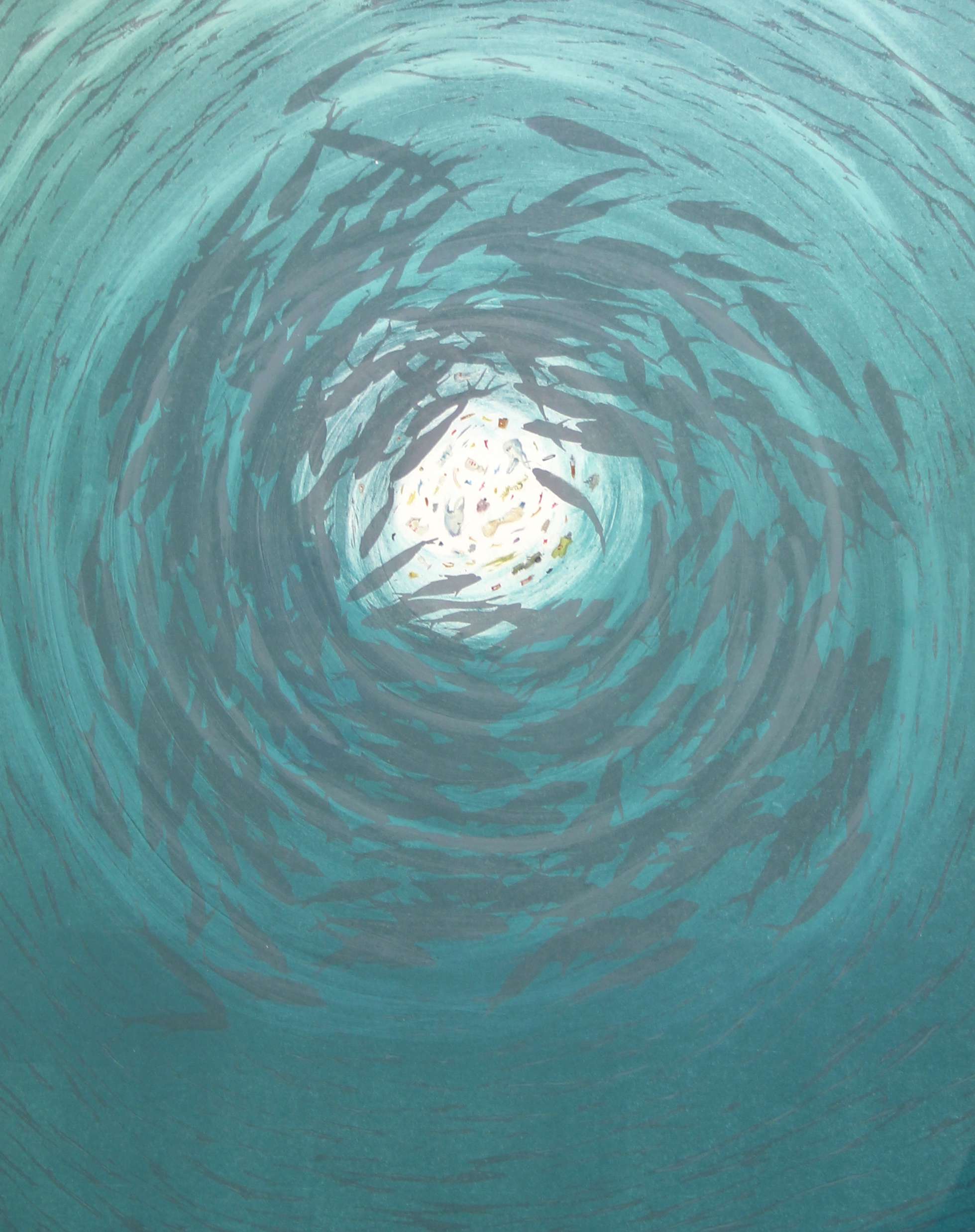
Denise Copland
About the Artist
I have long had an interest in the actions and thought processes that occur when humankind and/or other life forms and ecosystems are teetering on the threshold between life and death be that as a consequence of Nature’s fury or by misfortune, or through wide spread industrialization. How living things respond to such forces and turbulence is largely governed by the choice to survive or not. In the case of humankind survival it is often at the cost of others.
My point of view is not a Utopian or dystopic one but rather one that is based on allegory and adaptability to a changing planet. These concerns and memories of such things combined with historical and contemporary notions of survival have underscored my work for several years.
More About the Artist
Denise (Dee) Copland graduated Diploma of Fine Arts with Honours in Printmaking, School of Fine Arts, University of Canterbury, Christchurch, 1977 and Certificate of Graphic Design, Christchurch Polytechnic Institute of Technology, 1971.
She has been awarded several national awards to include a prestigious Antarctic Arts Fellowship in 2001-2002 and has taken up several Artists-in-Residences since 1985. She lectured at the School of Fine Arts (1982-4), University of Canterbury, was a Senior Lecturer at the School of Art & Design, Christchurch Polytechnic Institute of Technology until the end of 2006 and has lectured at several other Polytechnics and Summer schools throughout New Zealand. She is now a full time artist living in Portobello, Dunedin.
Denise has exhibited extensively in over 25 solo and 170 group exhibitions since 1977. She has, by invitation, exhibited work in the Eight International Artists, Orleans, France (2007); 7th Triennale Mondial de L’estampe, Auvergne, France (2006) and numerous other International Print Biennales in Europe and Asia. Her work has also been shown in group exhibitions in NZ, Japan including Shared Lines; Sendai x Christchurch Art Exchange, Sendai (2012); Asia Print Adventure, Hokkaido, Museum of Modern Art, Sapporo ( 2003); USA; France; Australia including Melt, Sydney University Art Gallery, Sydney (2009) and Project space, RMIT University of Melbourne, Melbourne (2008).
Copland collaborated with, and printed for a number of NZ artists to produce, in 1989, a limited edition boxed collection of prints titled 6 Artists – 6 Prints. In 1985 she created The Intaglio Print – Chemically assisted processes, a limited edition hand printed educational book.
Her work is held public and private collections in NZ and internationally.
-
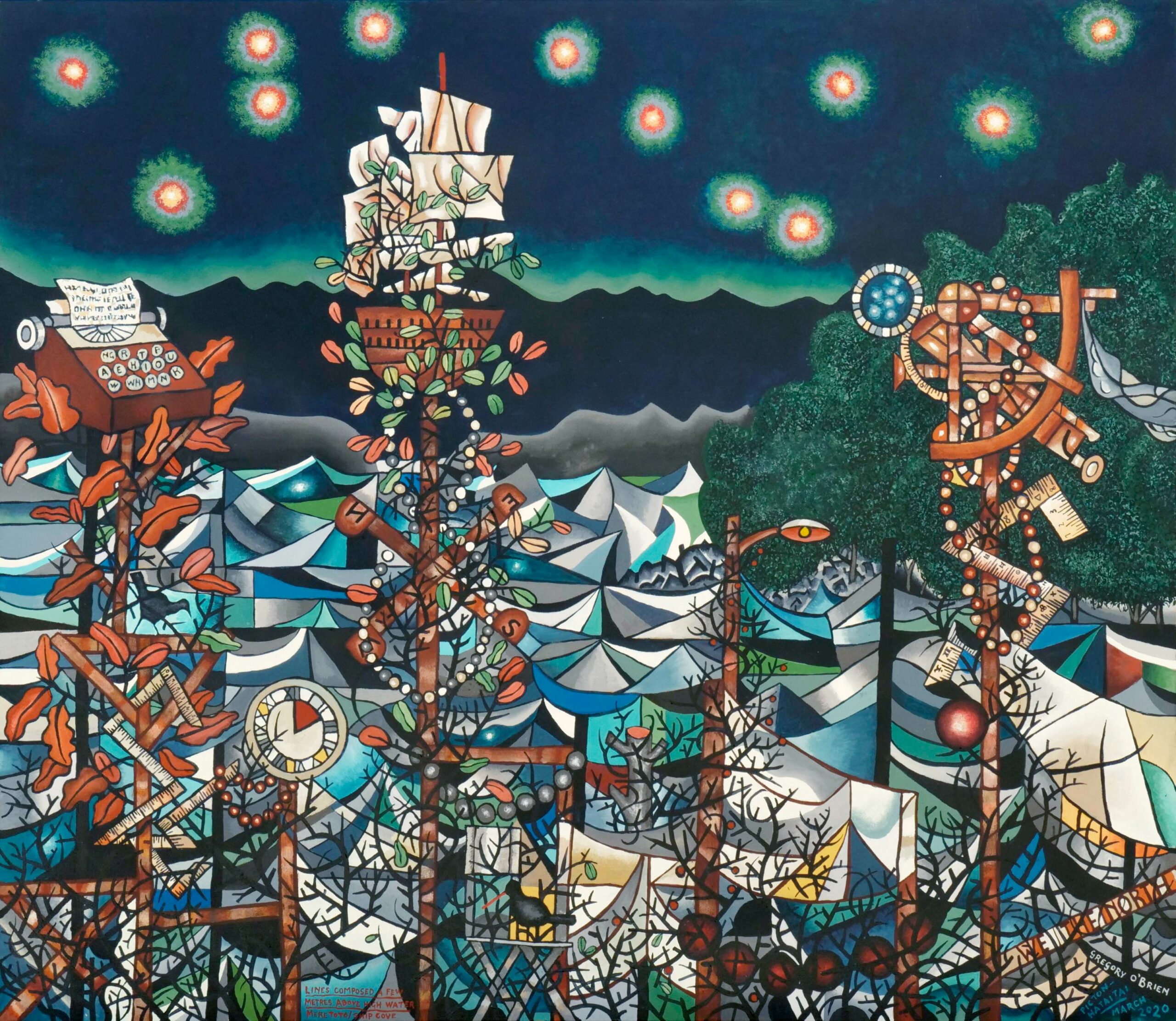
Gregory O’Brien
About the Artist
Since 2011, painter and poet Gregory O’Brien has followed the migratory routes of whales and sea birds across vast tracts of the South Pacific Ocean.
Many of his paintings and prints are the result of time spent on a number of islands – Raoul Island (in the Kermadecs), Whakaari/White Island and Tuhua/Mayor Island (in the Bay of Plenty) as well as Rapanui/ Easter Island, Tongatapu and the Chathams.
His works are a poetic exploration of these outlying places, the ocean between them, and the whale species and sea birds which are found there, and of our own cultural and personal linkages with places in the Pacific.
Born in Matamata (1961) and now based in Wellington, Gregory O’Brien is a poet, painter, curator, essayist, and printmaker. He frequently works in collaboration with John Pule, prominent Niue-NZ artist (see separate artwork listings under represented artists); and with painter Euan Macleod.
His book Always Song in the Water, part field notebook, part whale survey, part memoir, offers further insight into his paintings and printmaking; copies are available from good bookstores or Auckland University Press.
-
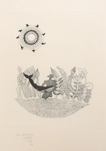
John Pule
About the Artist
Born in Niue, and recognised as a leading Pacific NZ artist, John Pule has worked in colloboration with Gregory O’Brien frequently in recent years, particularly in etching and aquatint, resulting from their travels to the Kermadecs and Raoul Island.
However, Pule has also carved his own individual reputation for paintings and lithographs which are exhibited nationally and internationally.
More information about this artist is available on request.
-
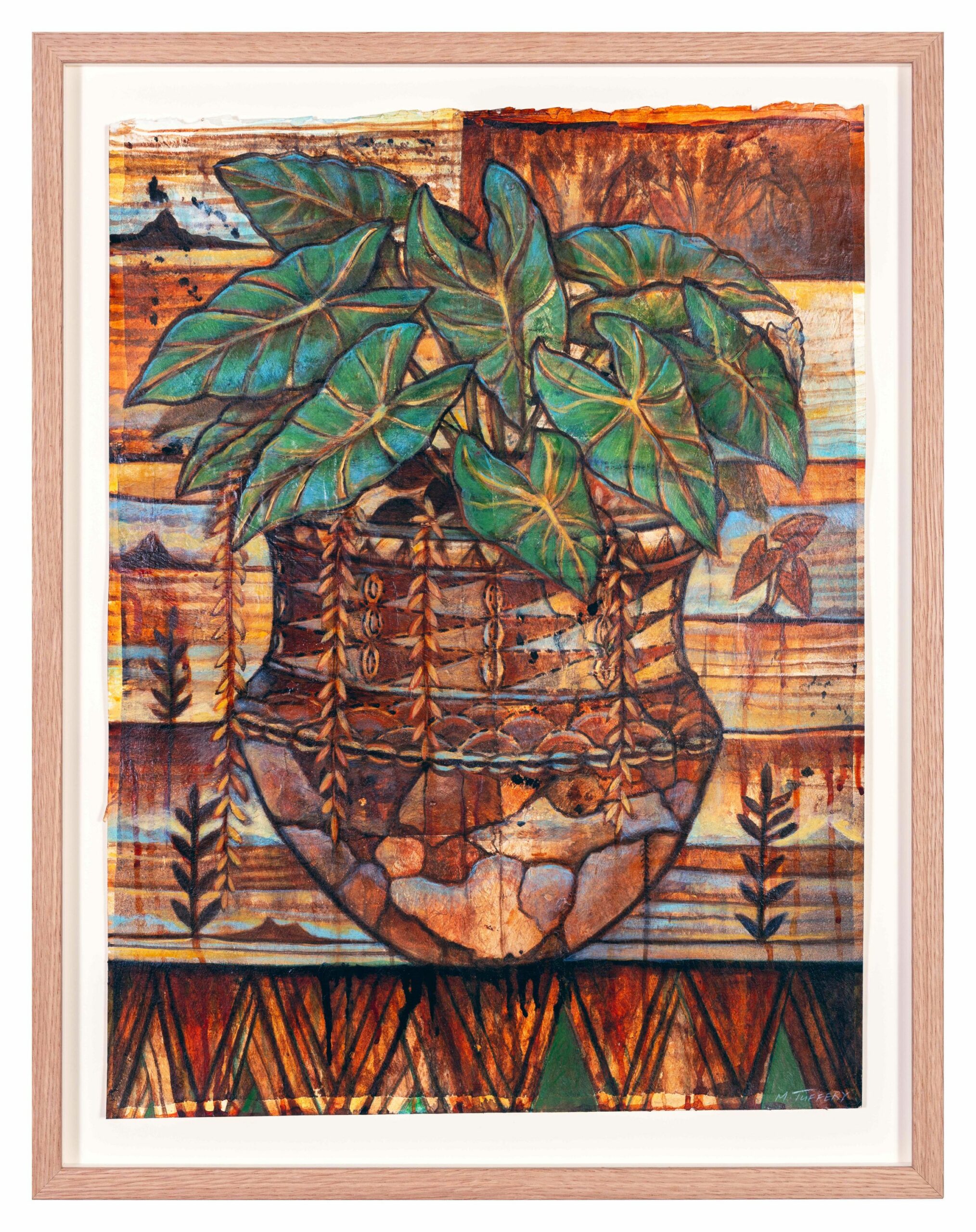
Michel Tuffery
About the Artist
“Manuia le aso. Kia orana. Ia ora na. Greetings. I’m Michel Tuffery, a New Zealand-based artist of Samoan, Rarotongan and Ma’ohi Tahitian heritage. My kaupapa within my art practice is the role of working ‘in between’ as a connector by placing a fresh lens on environmental, community, cultural and art historical divides. I had the benefit of being in the first wave of artists with Pacific ancestry to work within the contemporary art world and we all came to prominence in the early 1990’s. I’ve sustained an amazing art career, with incredible platforms to engage myself creatively all over the world. As an active participator in contemporary culture my artwork is curated into major international exhibitions and commissions. Having undertaken numerous research and community residencies throughout the USA, Germany, France, United Kingdom, Asia, India, Australia and much closer to home Aotearoa and proudly the Pacific.” – Michel aka Tuffs
Michel Tuffery was appointed as a Member of the New Zealand Order of Merit for services to art in 2008.
Recent Works
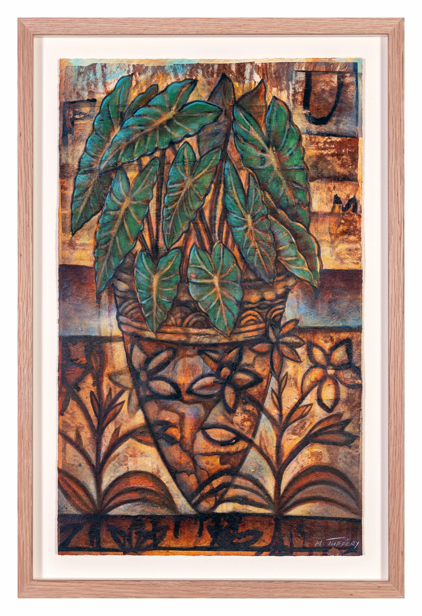
Conversations with the past, whanau, and the fragile environment underpin the latest journey through time by Michel Tuffery – a story of being human and connected in other ways, in a technological world.
History flows through into the present day, in this leading Pacific-NZ artist’s use of precious tapa fragments laid onto paper. He allows some of the original lines and drawings on the tapa cloth, as well as the texture, to come through in his overlay of painting, in what he describes as ‘a collaboration with the past’. ‘The lines are like middens, I don’t get rid of those, just work with it, in conversations with those stories.’ The fibre is the ‘hard drive’ – carrying memory, and when it meets the paper, the work is the response. Ancient Lapita pottery shards from Pacific history become a metaphor for the fragility of our environment, pieced together again as a foundation for other motifs of the natural world. Missing fragments reveal a glimpse of the past, through Tuffery’s painterly lens.
Finding taonga goes back to his childhood visits to museums, initiating a fascination with archaeology and anthropology; now, Tuffery has personal connections with major museums internationally, and rare invitations to view and handle precious taonga first hand.
It’s not just about sight, touch and sound. There’s the first smell, a flower over an ear, or coconut oil, as he steps off the plane onto Pacific homeland, greeted by family; or the aroma of taro or kumara signalling home. He uses the original palette of tapa woodblock, overlaid with the moana (ocean) blue, and vivid greens of nature, promising revival.
Human beings are what we touch, he says – like the digital world and the phone; or the plants and ancient stones. Tuffery holds out an ancient black volcanic rock, from Hawaii. This USB stick carries memory, of generations, places, identity and origin, an enduring place in the world.
Michel Tuffery is a prominent New Zealand-based artist of Samoan, Rarotongan and Ma’ohi Tahitian heritage. Within his art practice he plays the role of working “in between” people and places, and focusing a fresh lens on environmental, community, cultural and art historical divides.
His intense engagement with anthropology and archaeology through the Pacific, have brought close relationships with major international museums and institutions, and rare invitations to handle taonga or precious artefacts of history in their collections – connecting through to the stories and memories of past generations and interconnections of cultures. A recent project was a collaboration on the stunning design of the new Dunedin Public Library.
Tuffery is a passionate educator who openly shares his kaupapa and knowledge to empower our youth through residencies and workshops for school-aged children in New Zealand and abroad.
-
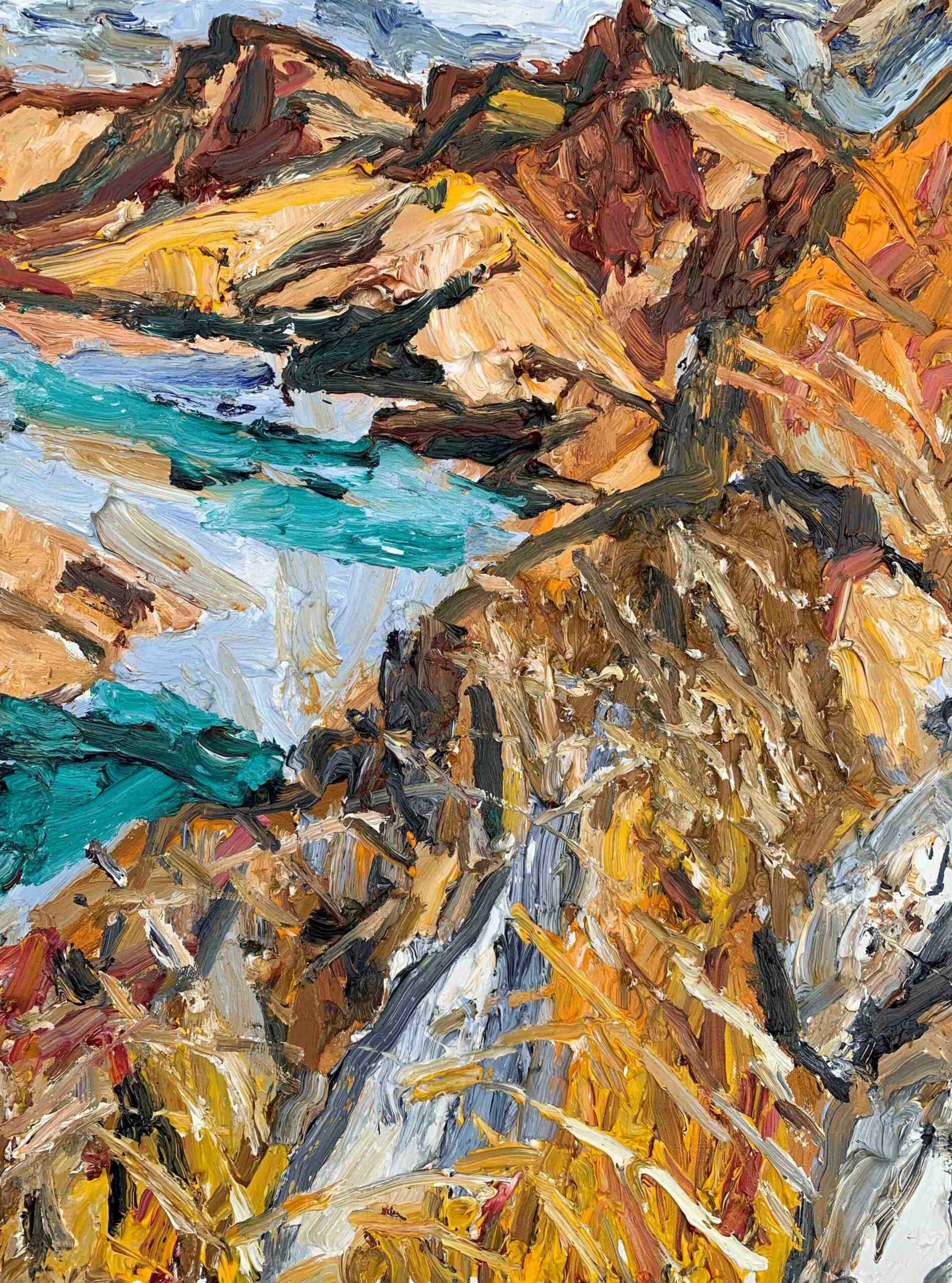
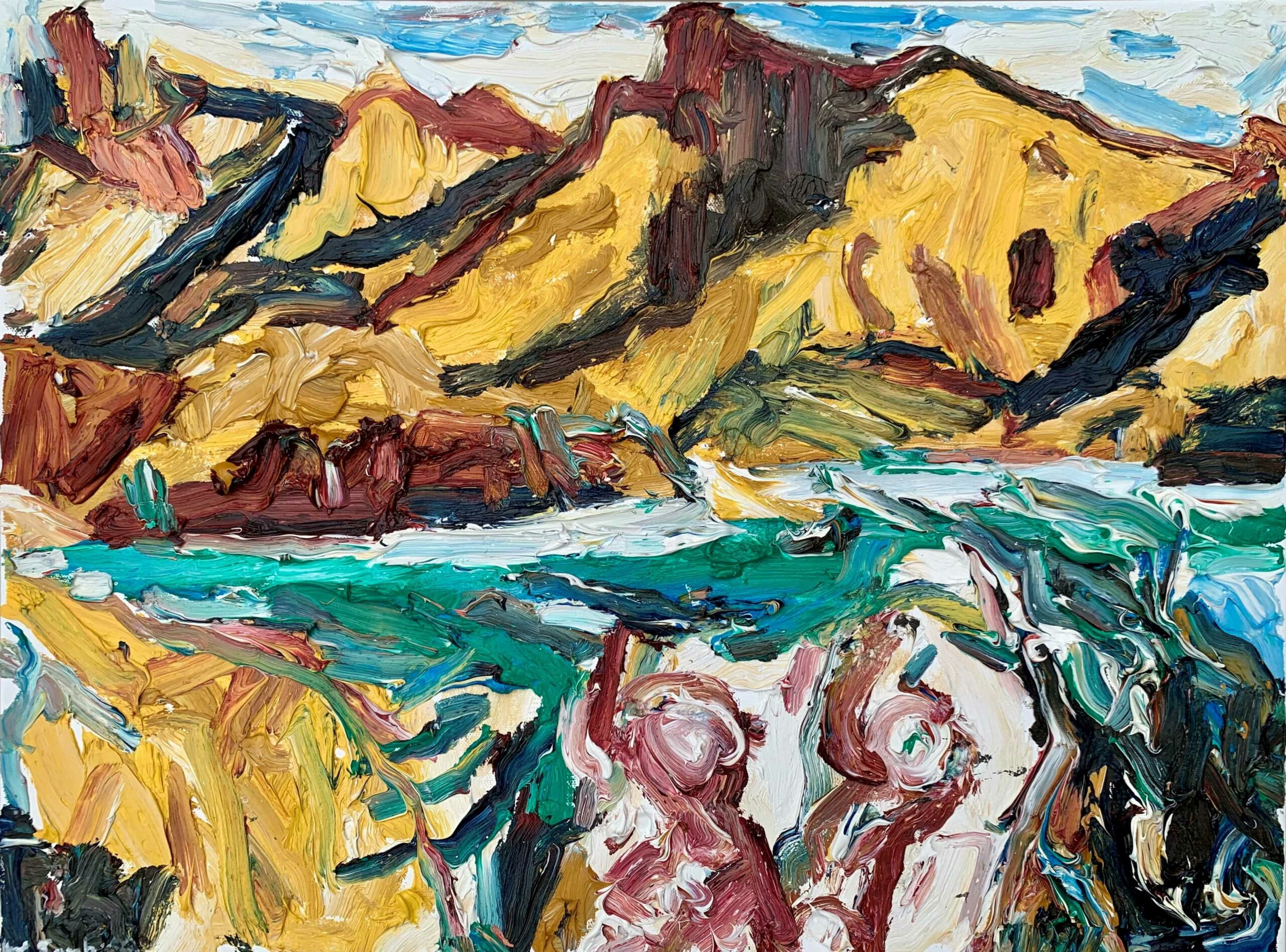
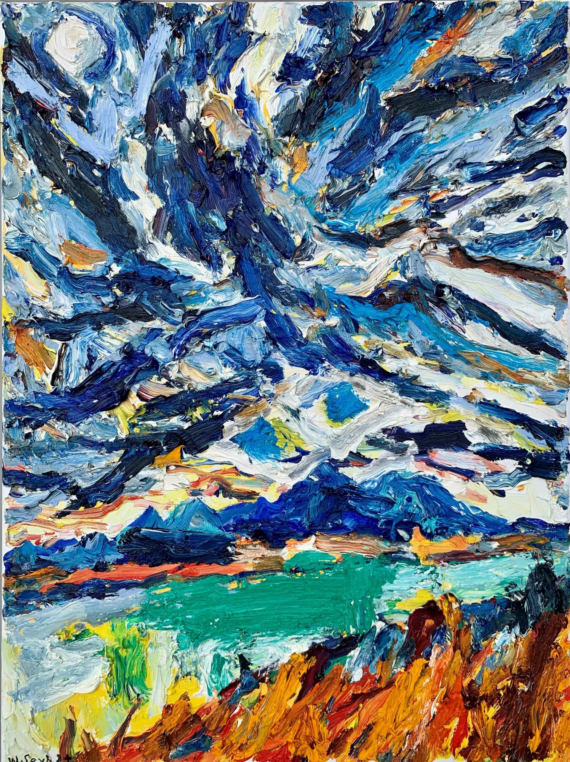
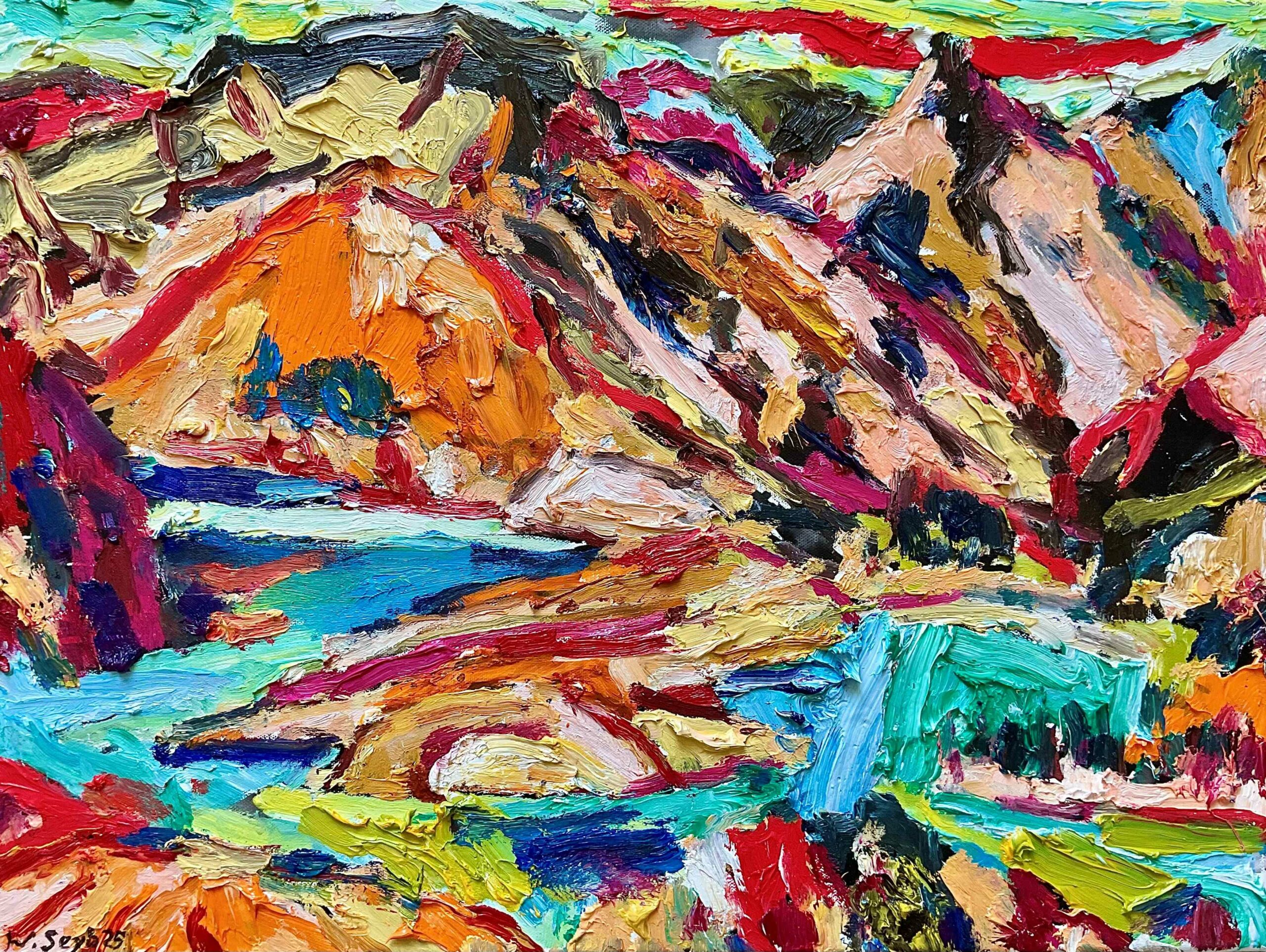
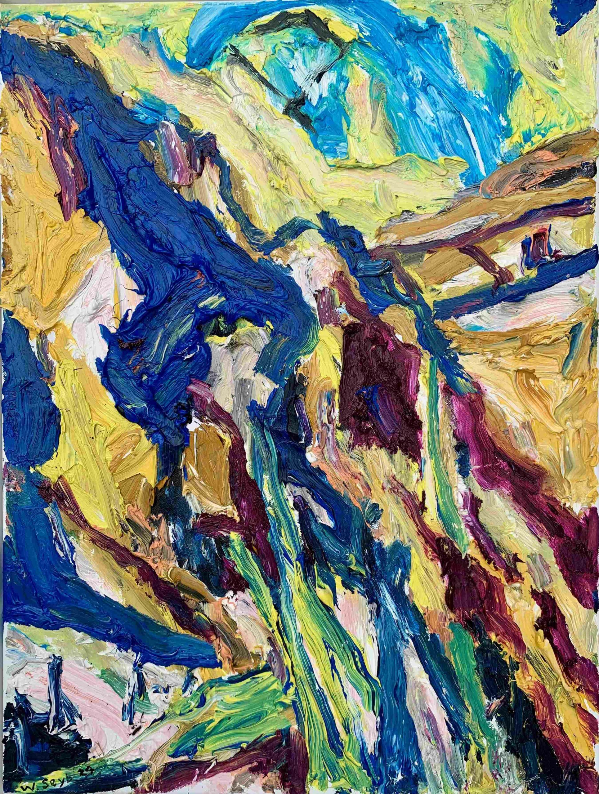
Wayne Seyb
About the Artist
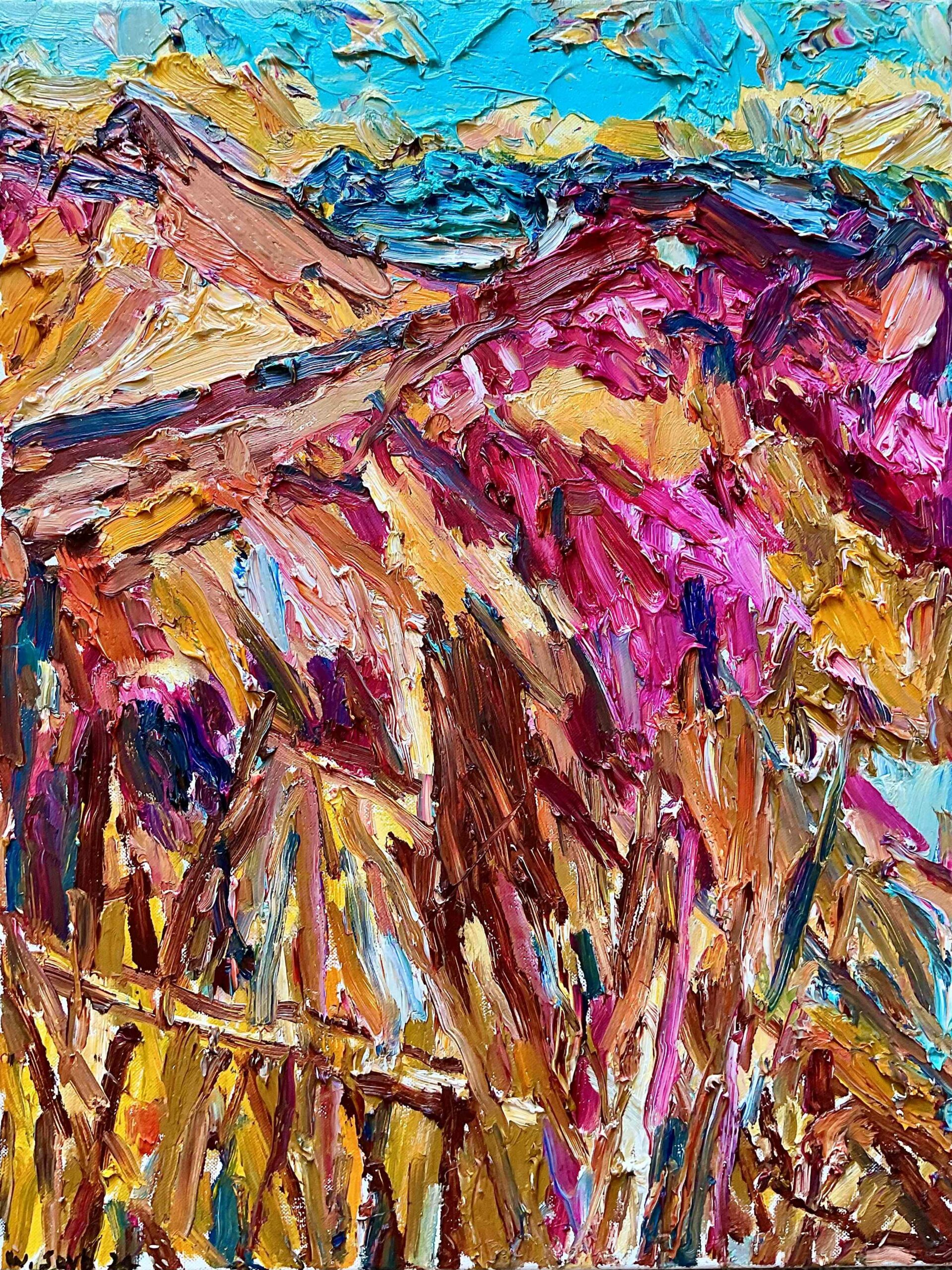
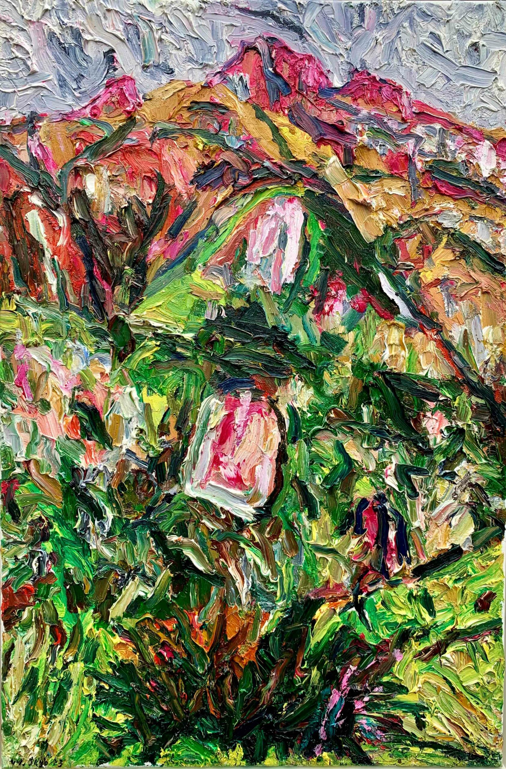
Wayne Seyb’s vigorous oil paintings often capture the raw energy of the New Zealand landscape, an expression of feeling of place rather than a literal interpretation. He typically uses intense colour applied boldly and thickly, in sweeping strokes to express his response the mountains, rivers and coastline of the South Island. Seyb has also worked on woodcuts throughout his career, and these prints have the typical energy, immediacy and expressiveness of his paintings, with an additional directness which derives from the precise demands of the medium.
Recent Works
In 2022, Seyb was the first recipient of the Margaret Stoddart Residency, spending time in the landscape of the Stoddart property at Purau on Banks Peninsula near Christchurch. The first landscapes, exhibited at The Diversion, captured the essence of light on the land and coast, and the intensity of the artist’s response to the landscape. More recently, he travelled up the gondola on the Peninsula over more than a year, capturing an essence of place, feeling, memory.
Of his landscapes, Seyb says you have to have an imaginative hook, to look at the landscape, Seyb says, because otherwise it is just the picturesque. “I like to look at it as something symbolic. It gives a more symbolic edge to the landscape which is what inspires me to paint.” Seyb is never self-conscious in creating paintings – it has always been about his instinctive and personal response to what is happening immediately around him, what he actually sees. Wherever he travels – around the country and overseas – he responds to the landscape, history, art history and literature of the place.
More About the Artist
Born in Temuka in 1961, Wayne Seyb studied formally for a year at Otago before leaving to pursue his individualist direction. He set up a co-operative gallery, Artattack, in 1981, and has since exhibited regularly in dealer and public galleries throughout New Zealand, and in Germany. Wayne Seyb and his family lived for a decade in Karitane near Dunedin, its landscape inspiring much of his painting. They moved to Christchurch in 1999, when the Port Hills, the Southern Alps and West Coast of the South Island became a new field of inspiration, although Otago and Southland continue to feature strongly in his paintings.
Seyb has also produced expressive woodcuts most of his career, especially in capturing human activity around him. Often he uses a different colour palette for each print of the small edition, each with a unique personality.
He travels to the USA regularly to see family, and this inspires vigorous responses to events, people, activity and culture. Please enquire if you would like to view works from these series.
-
Don Peebles
About the Artist
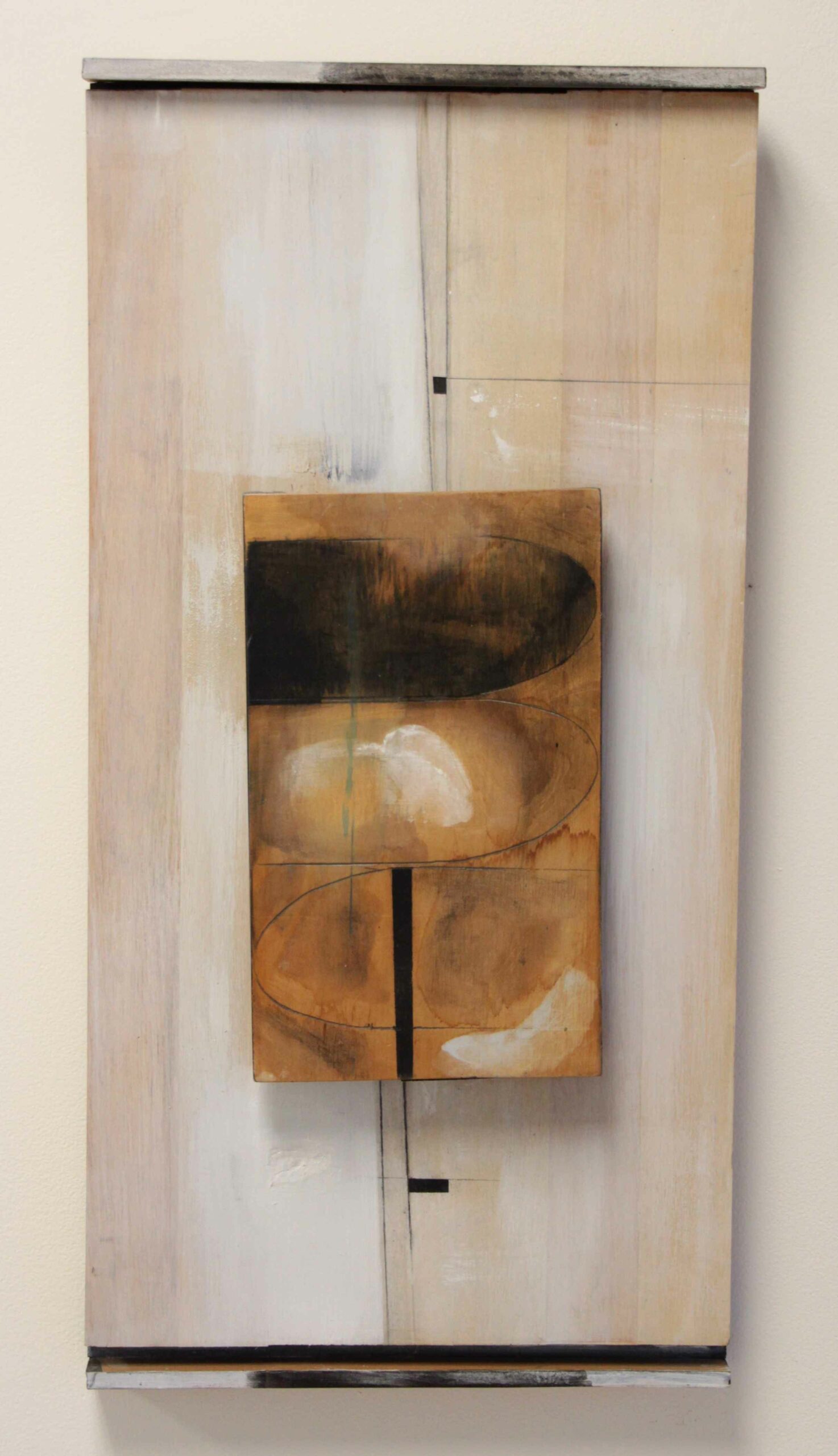
One of the major figures in New Zealand modernist art, Don Peebles was a pioneer of abstract art in this country and throughout a career that spanned over 60 years to his death in 2010, he remained a significant influence on his own and subsequent generations of New Zealand artists.
He constantly reinvented himself, bringing a freshness of ideas and form to each artwork. His work was often pared back to a deceptive simplicity, as he juxtaposed texture, harmonised colour and composition to the ultimate point of balance. Nothing in his relief constructions was random. While his work tended towards minimalism, it was only to the point where a sublime tension existed between the elements in the work – a true ‘harmony of opposites’.
His ideas often started somewhere in the landscape; it might be the colour of clay, or it might be a man-made structure creating an interesting effect – suggesting outlines which translated to an energy within a painting. But his paintings were not intended as interpretations of the landscape; these were just starting points, sparks of inspiration. His paintings explored the tension of balance, opposites and simply painting itself.
They are not easy works to describe, because they are not figurative or representational. The viewer has to spend a little time and find their own response – as the artist himself said, the question is not ‘what does it mean?’ but like listening to fine music, ‘how does it make you feel?’
A few works have been made available by the Peebles family for sale. Please contact Barbara Speedy directly on bspeedy@thediversion.co.nz for more information.
Peebles’ work is a must in any serious collection of abstract New Zealand art. His work is held in major public and private collections around New Zealand and is an essential ingredient in key surveys of contemporary, modernist or abstract NZ art – yet he remained among the more affordable of NZ’s senior artists.
More About the Artist
Born in Taneatua, Bay of Plenty, in 1922, Don Peebles studied fine art in Florence, Italy at the end of WWII; Wellington and Sydney; and was strongly influenced by the constructivism of Victor Pasmore while working in London in the early 1960s.
Don Peebles greatly influenced generations of NZ artists as a highly respected senior lecturer and Reader in Painting at the Canterbury University School of Fine Arts, while continuing his own art practice and quest for the ultimate point of balance in abstraction. He retired from teaching in 1986 to paint full-time, and continued to exhibit regularly throughout New Zealand.
Don Peebles received several prestigious awards and fellowships, and in 1999 was appointed an Officer of the New Zealand Order of Merit for services to the visual arts. The University of Canterbury conferred an Honorary Doctorate on this distinguished artist in 2003.
-
Christine Gregory
About the Artist
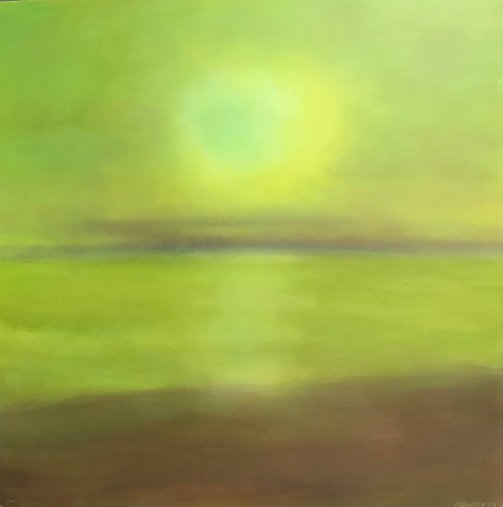
After a decade of exhibiting and teaching in London, Christine Gregory returned to New Zealand in the mid 2000s and exhibits periodically around the country. Best known for her superb ability to handle oil paint and colour, she works primarily in abstract with an essence of landscape still evident within the work. Formerly from Auckland, she now lives in Wellington, teaching and painting.
Recent Works
In a series of small paintings inspired by the landscape, Christine Gregory has used a thick resin glaze which intensifies the colours. She moves between vast and intimate scale with ease, her recent works atmospheric and redolent of swirling skies above the land.
-
Claire Beynon
About the Artist
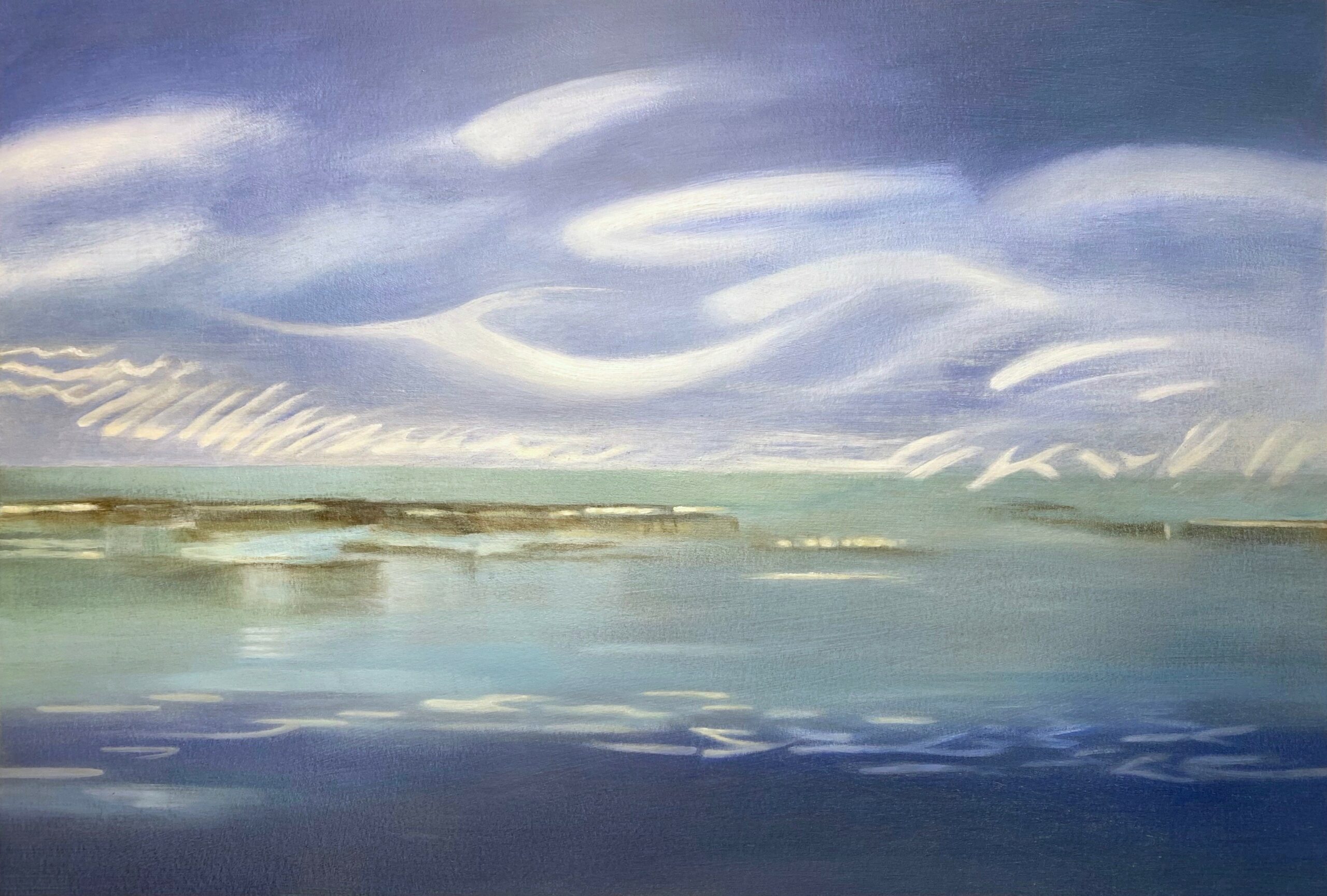
The work of Claire Beynon has a spiritual quality, and much of it centres around questions of sustainability, balance and our place on earth – or beyond. Also a writer, she has a strong following, exploring those issues, pointing to the ideas of other thinkers and artists, stimulating debate and thought.
Recent Works
Captured in her most recent jewellery pieces, Claire Beynon’s exploration of ‘Questions of Balance’ began in 2009, very much about questions to do with care of the planet, and climate change; yet these works seem perfectly poised for current times as we are thrown off balance by pandemic and social/political uncertainty. Her sculptures seem to anchor thought.
More About the Artist
Claire Beynon lives and works in Dunedin, having studied fine arts in South Africa and London. Although well known for her large scale pastels on paper, testing the boundaries of the medium, she also explores painting, printmaking, film and multi-media, sculpture, jewellery and writing, especially poetry. The thought-provoking work of this collectible artist has been exhibited widely throughout New Zealand and overseas.
-
Roy Good
A commitment to modernist abstraction
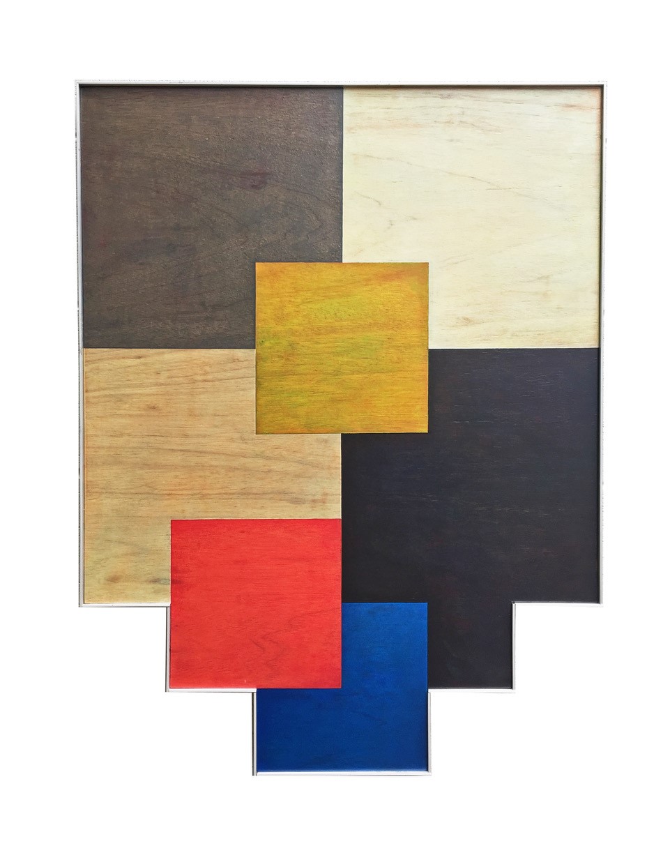
Roy Good’s abstract paintings are minimalist in form, but carry a sublime painterly subtlety when viewed at close hand. Within panels of each work, the colours are intensely worked, although the surface is often pared back so that from a distance it appears smooth. His use of colours creates planes which appear to advance and retreat against each other, although sometimes it is physical rather than illusion – he layers geometric forms so they literally project from the wall.
A signature feature is the way he takes the form out of the conventional square or rectangle, using a shaped stretcher with notches, angles, layers, and lintel shapes. The shapes catch at our awareness, draw the viewer back, through the element of the unexpected.
Good’s art engages the viewer in the complexities of the act of painting, shifting attention away from the experience of representation, to an awareness of the physicality, tangibility and spatial truths and deceptions of the painted surfaces in front of them. These are great paintings…’ – Warren Feeney, reviewing Roy Good’s Retrospective Exhibition, The Press, January 2011
Born in Timaru in 1945, Good studied at Ilam School of Fine Arts in Christchurch from 1963-65, before moving to Auckland. He was one of a group of abstract artists including Milan Mrkusich, Ian Scott, Geoff Thornley and Gordon Walters who in the 1970s rejected local subjects and pursued an international modernism. His work became very minimalist, using pure geometricism.
Retrospectives of his work were staged in Auckland in 2007 and Christchurch in 2011, attracting strong reviews.His life and work both as a painter and a designer was the subject of a documentary ‘Parallel Universe’ in the 2026 Resene Architecture and Design Film Festival which toured nationally. Roy Good was for many years head of design for Television New Zealand, and created some of the icons which form part of the nation’s visual identity. When he retired from that role, he was able once again to focus his time totally on his art making.
Recent Works
Roy Good’s paintings in the last decade feature planes of colour that advance and recede in juxtaposition to the adjacent colours. They explore the possiblities of formal shapes and elements, often creating an illusion of relative dimension, and always working towards an absolute balance of elements, often equal elements.
His forms are precisely determined, but within them the colour is applied instinctively, so that planes of colour appear to float or hover under and over each other. Close viewing reveals myriad colour exquisitely applied to further enhance the illusion of space.
Click through each image for details on the work and price.
-
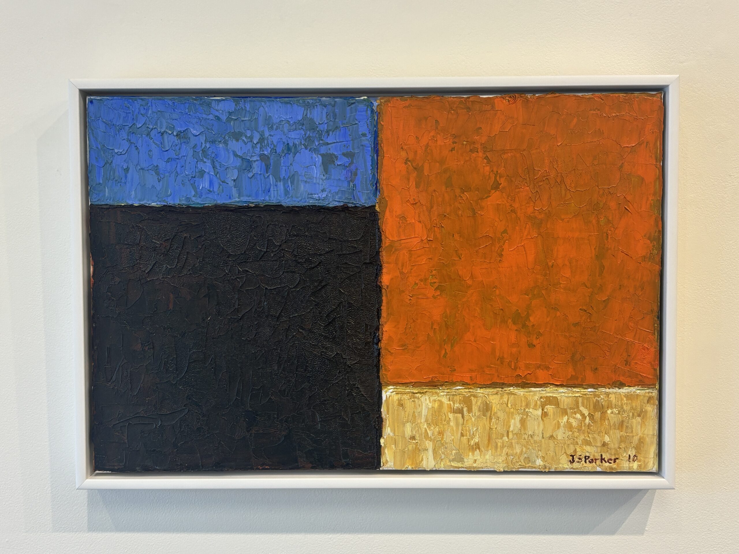
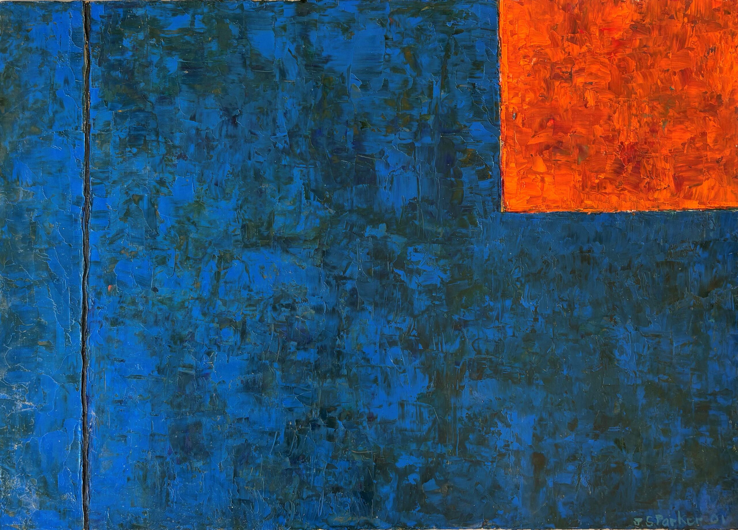
JS Parker
About the Artist
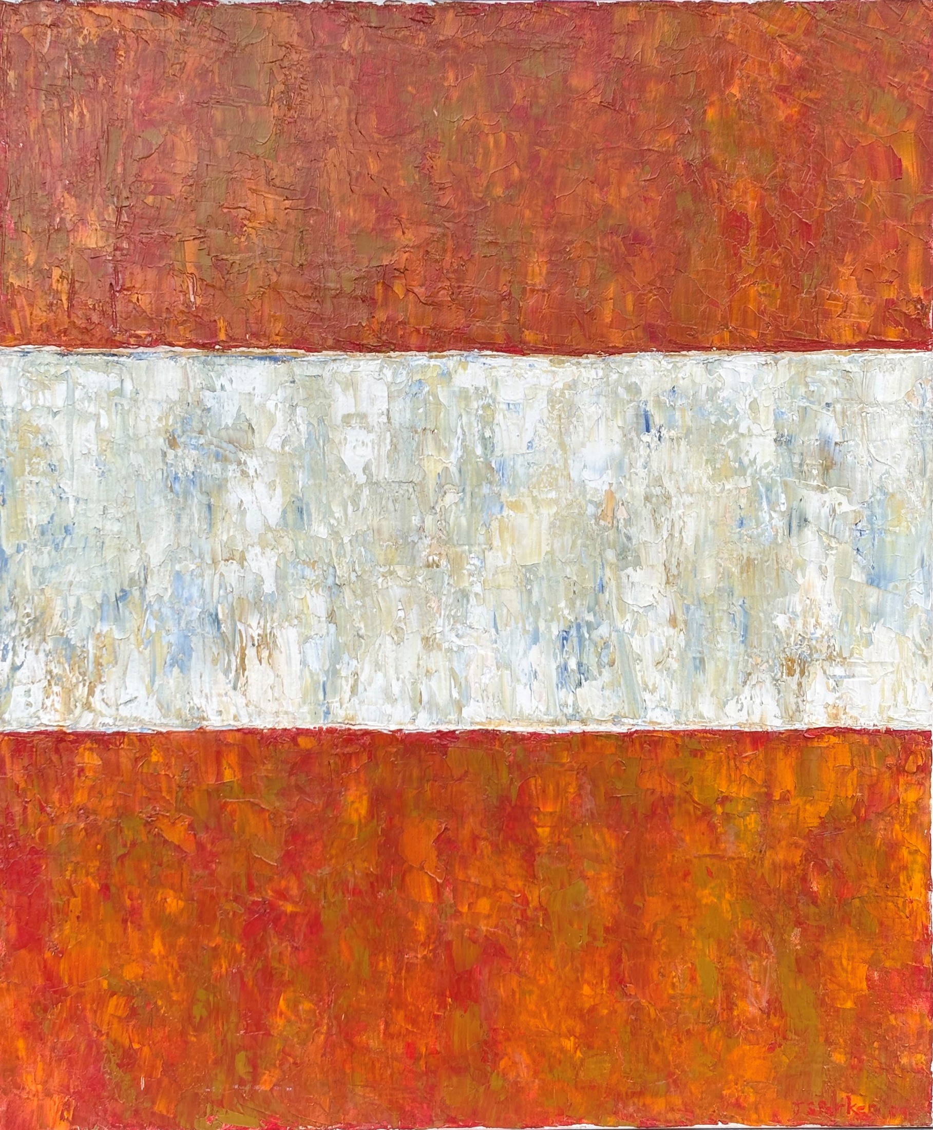
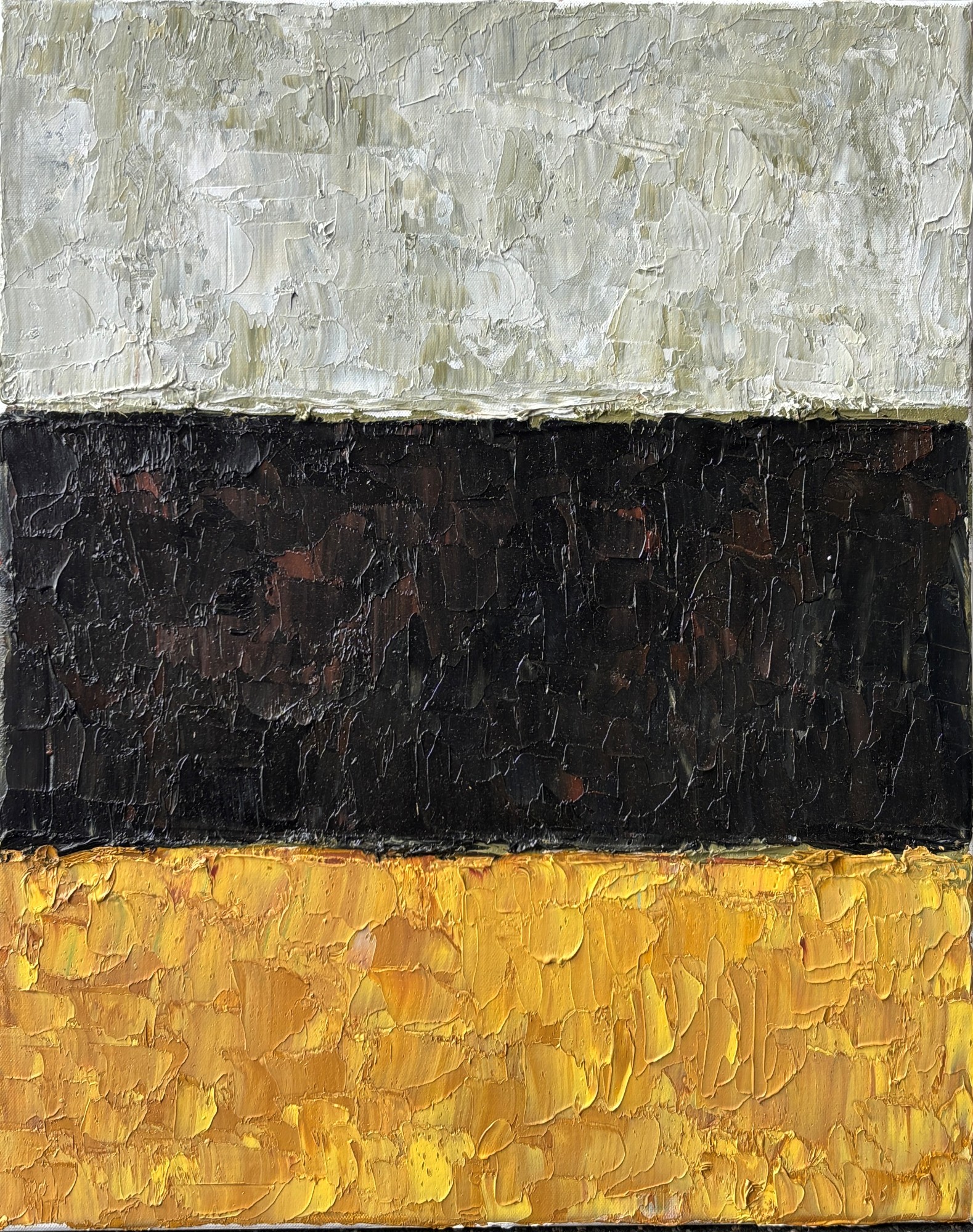
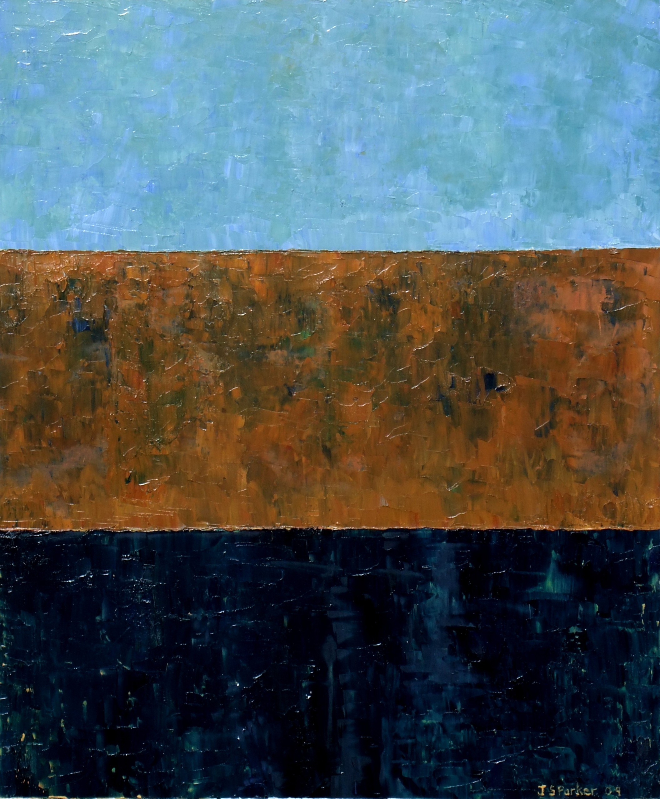
The rivers and reflections, dramatic skies and dust-blown hills of Marlborough and Canterbury found their way into many of the abstract paintings of leading NZ artist JS (John Shotton) Parker (1944-2017). Highly regarded by collectors nationally and internationally, JS Parker is best known for his large impasto paintings within a grid format, full of texture, rhythm and balance within his imposed framework, exploring juxtapositions of colour.
He worked in thick layers of oil applied with a palette knife, sweeps of paint which he would pare back to reveal hints of what lies beneath. A keen angler and walker, Parker derived much inspiration from the Wairau River and the Wairau Diversion (The Diversion Gallery is named after one of his paintings), particularly the colours of sky and land reflected in the ‘shifting mirror’ of the flowing water. He didn’t consciously set out to paint Marlborough, but his work captured a spiritual feeling about certain places, like the river or the sea at Rarangi (Cloudy Bay). ‘Or you look up to see what the weather is doing against the hills. Water and sky are the most ephemeral kind of elements.’
Based in Marlborough for much of his life, he exhibited nationally and his work is held in national public and private collections. Some of his final major works, full of energy and confidence, formed the anchor to the exhibition Colour & Surface in December 2017-January 2018, along with small studies he intended to translate to a larger scale.
For more details and price of the works here, please click on the image.
Recent Works
Some of the paintings released from the family collection relate strongly to the colours of Marlborough. Lines of Light and Space – Escholztias relates to the Californian poppies lining the summer riverbeds in Marlborough; Three Part Harmony – Landscape captures the subtle colours of one of his favoured areas of Marlborough, the warm earth tones of the riverbank near Rarangi where he frequently walked and fished. The same elements inform the dramatic large oil on paper Plain Song – Landscape.
Inevitably, though, the colours of the landscape, of water, sky, earth (and especially Marlborough), seep into Parker’s Plain Songs, a lifelong evocation of light in late afternoon, evening, on the sweeping plains and the golden dry hills beyond.
The major work Plain Song – Into the Ether (recently released from the family collection) is a sublime example of his works capturing the ineffable in paint. He sought to express a pure spiritual light, a lightness of being, in paint – almost a contradiction – especially finding that quality in lemon light against blue or silver, soft hues in the light of the skies, or of the soul.
A book about JS Parker is available from the gallery: JS Parker: Plain Song by Dr Damian Skinner – an excellent monograph, $35.
More About the Artist
Born in 1944, JS (John Shotton) Parker was described in the Allgemeines Kunsterlexicon international art dictionary as ‘one of the most substantial New Zealand painters of his generation. He stood out as one whose art centres on the pursuit of an approach where vigour has greater value than refinement’. Parker studied art at Ilam School of Fine Arts at Canterbury University and in 1975 was awarded the prestigious Frances Hodgkins Fellowship at Otago University (which is where his long friendship began with fellow painter Ralph Hotere). He ultimately settled in Marlborough and focused on the light and colours of the landscape, where he believed New Zealand’s greatest character lies. His contribution and steadfast vision was recognized in 2003 when he was awarded the Order of New Zealand Merit for 40 years of services to painting. He constantly refined his art towards a horizon of infinite possibility, and experimented with both form and colour – ‘you are not so much creating as discovering.’
The works of this leading New Zealand painter continued to explore the nuances of light and juxtapositions of colour, often inspired by the South Island land, waters and light, sometimes by a feeling of time and place. There is also an enthusiastic following for his unique ‘black and white’ paintings, some using tar alongside white oil paint in a juxtaposition of the staunch and the vulnerable, sometimes jolted with a spike of colour.
His Plain Songs refer not only to the South Island plains but also the formal structure of Gregorian chants within which there are variations on a theme. A music lover of wide taste, he was particularly inspired by blues, jazz and classical music; his work often shows a musical rhythm and balance, or a fine line like a high continuous note. His small Plain Song paintings have the freshness of discovery as Parker explored structures and linkages within a tight framework. He is best known however for his large scale paintings of about 1.2 to 2.5 metres.
-
Don Binney
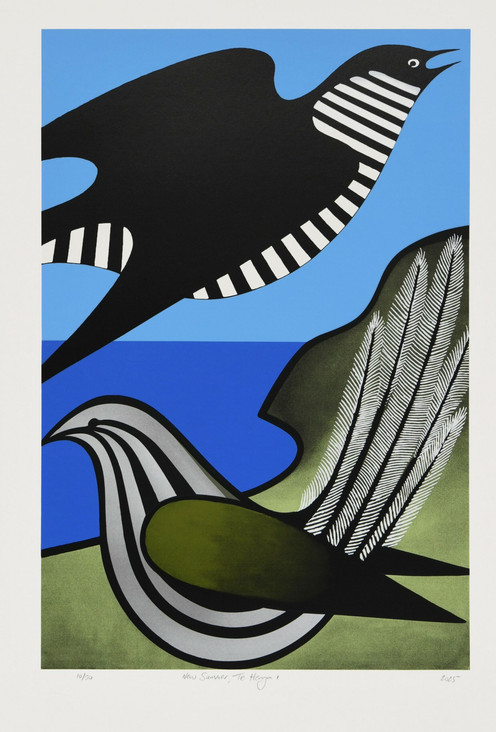
The Estate of Don Binney has released two new limited edition silk screenprints, based on his 1965 painting New Summer, Te Henga, using the same process and screenprinting specialist the artist used for his later limited edition works.
New Summer, Te Henga I uses the classic ‘Binney blues’ which the artist consciously chose for a number of his works; the second variation adopts the golden tones of his early Fern Bird paintings.
About the Artist
Don Binney needs little introduction to art lovers – or the New Zealand public – so distinctive are his iconic paintings and drawings of birds and landforms. In a career spanning more than 50 years, his commitment to ornithology, environmental issues and spiritual connection with the land drove his art practice.
Binney was Head of Painting at the Elam School of Fine Arts in Auckland, retiring in 1998 after 24 years of teaching. He exhibited continuously from the 1960s until his death in September 2012, aged 72. After retiring, he continued to focus full time on his art, travelling extensively, especially within New Zealand and to places of spiritual significance internationally. From 2002, he worked increasingly in charcoal and colour pencil because of its portability and simply because he loved the intimacy of the medium.
His perspective on landforms was as distinctive as the symbolism of his stylised birds. After becoming identified primarily for capturing the essence of endemic and some introduced birds in his art, he set them aside for many years as he investigated other media – including photography and collage – and diverse subjects. In later years he discovered there were still concepts to explore through this combination of his deep knowledge of ornithology and his art, and in 1999 he began to produce new bird series – as sought after as the early images.
In her book New Zealand Art – A Modern Perspective, Elva Bett described Binney as a pivotal artist ‘of unusual sensitivity and insight’, with clear light and sharp definition creating linear patterns to structure his compositions. That was in 1986. Although his paintings remained sought after through the 1980s and 1990s, there was a strong resurgence in collector interest in his final decade of work, including the finely crafted pencil drawings he favoured for their portability and the potential to work directly in the landscape. He is regarded among the most collectible names in New Zealand art.
The Diversion Gallery was principal agent for Don Binney in the six years before he passed away in 2012, and represents the Estate – with a small number of works for sale. Works from the Binney studio and family collection were released to initiate a project for a major book on Don Binney, ultimately resulting in Don Binney – Flight Path by Gregory O’Brien (AUP) in 2023, winning an Ockham Book Award in 2024.
We have copies of the beautiful volume Drawing the Waitakere Coast, (Random House) ($35) in which Don personally described in his own words, his journeys both artistic and literally over those pathways on the coast west of Auckland, which were his best known artistic territory. He created a suite of intimate drawings especially to illustrate the book, a non-selling show which toured regional public galleries from 2010 to 2012 and was shown in a tribute exhibition at his ‘alma mater’ Kings College in 2013.
Recent Works
In the last decade of his life and career, Don Binney increasingly used pencil, charcoal and colour pencil to capture the essence of landscape and birdlife with immediacy; occasionally working these up to the paintings for which he remains best known. He used colour pencil or pastel over heavy watercolour paper with deceptive simplicity, skimming over the tooth of the paper so the white of the paper conveyed the effect of light on water or foliage.
He focused on two regions in particular: the Waitakere Coast west of Auckland which was his best-known ‘territory’ throughout his career; and the Marlborough Sounds, which ‘began to reveal itself’ after his first Marlborough solo exhibition, Vintage Binney, at The Diversion Gallery in 2003, prompting several visits and an evolving series of both drawings and paintings. This was a breaking of new ground by a senior artist known for particular loyalty to places which touch his life deeply. It was evident here in his discovery of the barely populated landforms, the crouching islands, the changing moods of the Marlborough Sounds, the birdlife in bush and on water, the soft southern light.
He also visited the bird sanctuary Hauturu – Little Barrier Island – being the long-time patron of its Supporters’ Trust, and continued to produce works to aid conservation projects like this and Marlborough’s Kaipupu Point sanctuary, persisting despite ill health in the last weeks of his life, in his determination to lift the profile and financial support of environmental causes.
Limited Edition Prints
Don Binney only rarely produced limited edition lithographs and screenprints. We have a few available from the studio collection, including a striking 2004 lithograph Edward Kaiarara VII, from his Effigy series of crowned heads based on coin imagery, referring to colonial impact on the New Zealand landscape. The bird sanctuary of Little Barrier Island/Hauturu (Don Binney was patron of the Supporters’ Trust) notably sits above the crown – contrary to royal protocol where nothing is above the Crown.
The lithograph Beyond Wainamu was created to offer as a fundraiser for environmental projects; the singular print available has an unusual annotated signature, probably why Don Binney retained it in his studio collection; it has only recently been framed and made available.
More About the Artist
Career biographical notes 1995-2005:
1995: Awarded OBE for services to the Arts. Remuera Jug & Other Suites, Solo Show – Elaine Meyer/ASA, Auckland.
1996: Don Binney – Recent Works, A Selection, Fine Arts Gallery, University of Canterbury, Christchurch. Sabbatical leave to UK. Grace and Peace to you from God – stained glass window, St Thomas’ Anglican Church, Tamaki.
1997: Ancient Earth, Solo Show, Brooke-Gifford Gallery, Christchurch.
1998: Retired as Head of Painting, Elam School of Arts, University of Auckland, after twenty-four years’ teaching. Sites of Significance, Solo Show, Judith Anderson Gallery, Auckland.
1999: Revisiting, Solo Show, Brooke-Gifford Gallery, Christchurch. Preface to Highway One, photo-survey by Bret de Their. Millennium Medal, Waitakere City. The Dream Collectors, Te Papa Tongarewa, Museum of New Zealand, Wellington.
2000: Nga Motu, Solo Show, Milford Galleries, Auckland. 25th Anniversary Survey, Brooke-Gifford Gallery, Christchurch. 2001: Cross-Water, Solo Show, Milford Galleries Dunedin. Michaelmas, Solo Show, Brooke-Gifford Gallery, Christchurch.
2002: Paper presented: John Kinder: Founding Vision, Local Realities – Eighth annual Kinder Society Lecture, St John’s Theological College, Auckland. Landscape, Two-artist Show (with Gerda Leenards) Artis Gallery, Auckland. Vintage Binney, Solo Show, The Diversion Gallery, Grove Mill Winery, Marlborough.
2003: Nga Manu/Nga Motu, Monograph with 75 colour plates; Damian Skinner, Auckland University Press. 12: dialogues with time, Chrysalis Seed Trust Group Exhibition curated by John Stringer, Centre for Contemporary Art, Christchurch. Forty Years On, survey exhibition curated by Damian Skinner, Dowse Art Museum, Lower Hutt. Then and Now, Solo Show, Williams Gallery, Petone. ’63 to Sixty-three, Self-sourced Retrospective, Brooke-Gifford Gallery, Christchurch.
2004: Forty Years On, survey exhibition, Auckland Art Gallery, touring to Waikato and Manawatu. ‘63 to Sixty-three, Millennium Public Art Gallery, Blenheim. Representation and Reaction, curated by Peter Shaw, Sargeant Gallery, Wanganui; to tour Porirua and Auckland.2005: Forty Years On, ends tour at Hawkes Bay Museum and Art Gallery. Rakiura drawings, Dancing Star Foundation exhibit, Southland Museum and Art Gallery. There Before the Gulf, Solo Show, Artis Gallery, Auckland. 30th Anniversary Survey, Brooke-Gifford Gallery, Christchurch. Judge, Pumphouse Art Award, Takapuna. Deep Sounds, Solo Show, The Diversion Gallery, Marlborough.
2012: Ocean’s Edge, a survey exhibition incorporating the Drawing the Waitakere Coast Suite, at the Millennium Public Art Gallery, Blenheim co-curated by The Diversion Gallery.
People look at his coastal landscapes and ask: ‘Where is this place?’ Binney answered: ‘It is wherever resonates with you.’ It is undeniably New Zealand, and encourages us to ponder on who we are as New Zealanders. His last and largest screenprint, Mill Creek, Rakiura, was a case in point. Although literally of a favourite bay in Stewart Island, it represents different places to different viewers – some see Golden Bay in it, others the Otago coast, Taranaki, Marlborough, or Coromandel. It was always about resonance.
2018: Flight Path, works from the Binney studio collection and family collection, towards a major monograph by Gregory O’Brien on the artist.
2023: Earth, Sea, Light at The Diversion, including works released from the Binney Estate collection.
-
Graham Bennett
About the Artist
Graham Bennett is probably best known in New Zealand for two very high profile sculptures – Reasons for Voyaging, the soaring seven-pillar installation outside the Christchurch Art Gallery in Montreal St, and the Tribute to Firefighters he was asked to create in Christchurch from steel girders sent to him from the World Trade Center ruins in New York. However his practice is much wider, and in recent times focused particularly on issues of sustainability and our relationship with the planet.
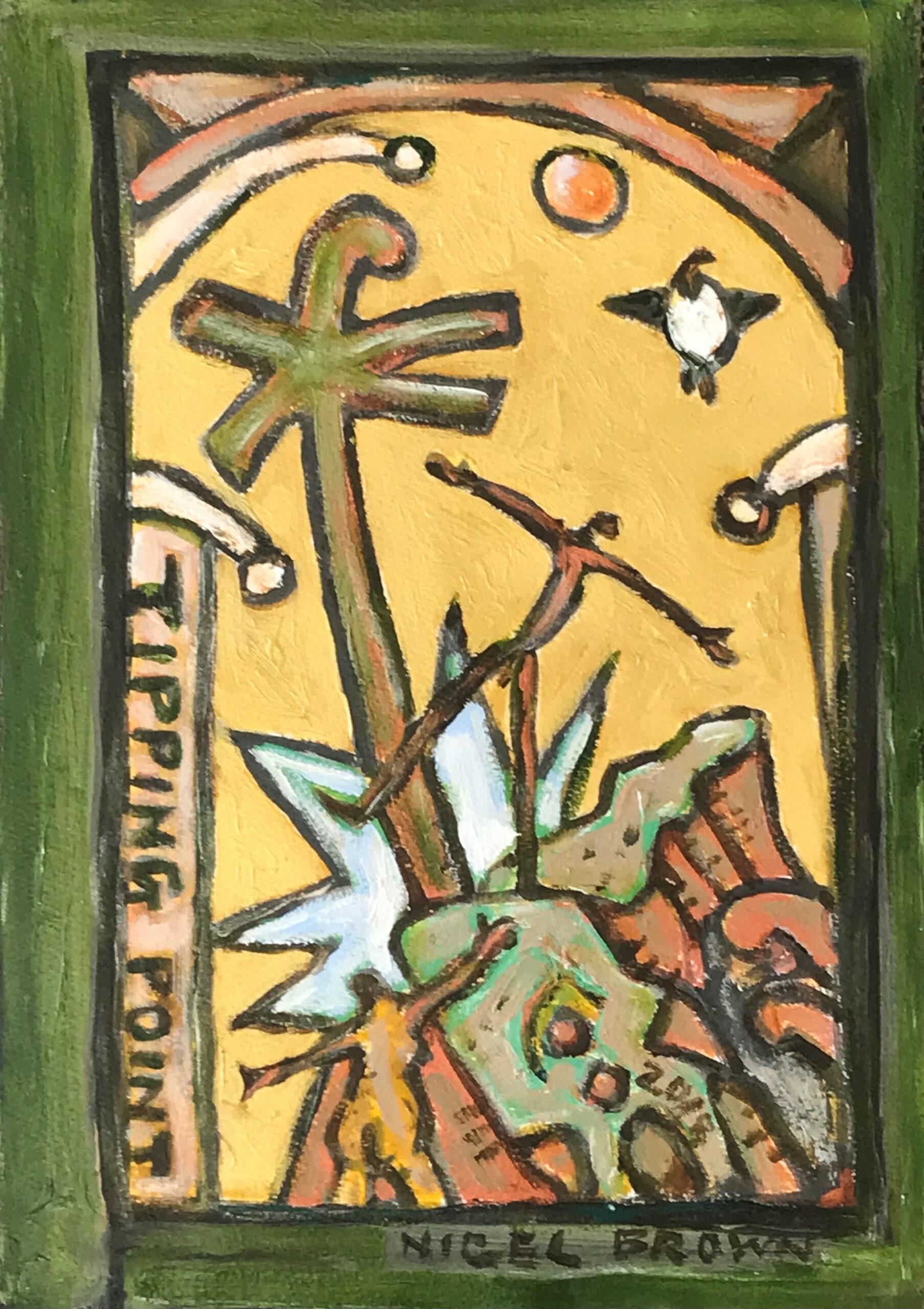
He featured as the cover story of the 2014 Winter edition of World Sculpture News, in an article focused particularly on the 10-year Survey Exhibition of his work, at The Suter Public Art Gallery in Nelson, NZ. This followed on from a residency in Seoul, South Korea, in which he created a towering outdoor sculpture Tipping Point now on permanent display. He also works in miniature, such as the meticulously worked Wait Watcher series, and in jewellery based on his sculptures, effectively sculpture for the body.
Bennett’s sculpture is an evolution of ideas and philosophies based on concepts of sustainability, and of voyaging, past present and future, connection between islands in the Pacific, connections between the primordial land and man’s temporary imposition on it, with our structures imposed on or cutting into the land, and particularly of connections and differences between cultures across the world.
He considers questions of identity, and our sense of place. His work often features lines of latitude and longitude, the phases of the moon and passages of planets across the Earth, as followed by explorers through the Pacific, such as the Transit of Venus.
He uses impermanent man-made materials – like steel – against natural materials like rock and wood, to express those ideas. He was born in Nelson, the geographic centre of New Zealand, near the natural rock formation the Boulder Bank, and this has influenced his work. Faultlines and geothermal lines project out from New Zealand to places across the Pacific, with the concept that the waters that lap our shores, also break on their coast, and thus connect us.
Recent Works
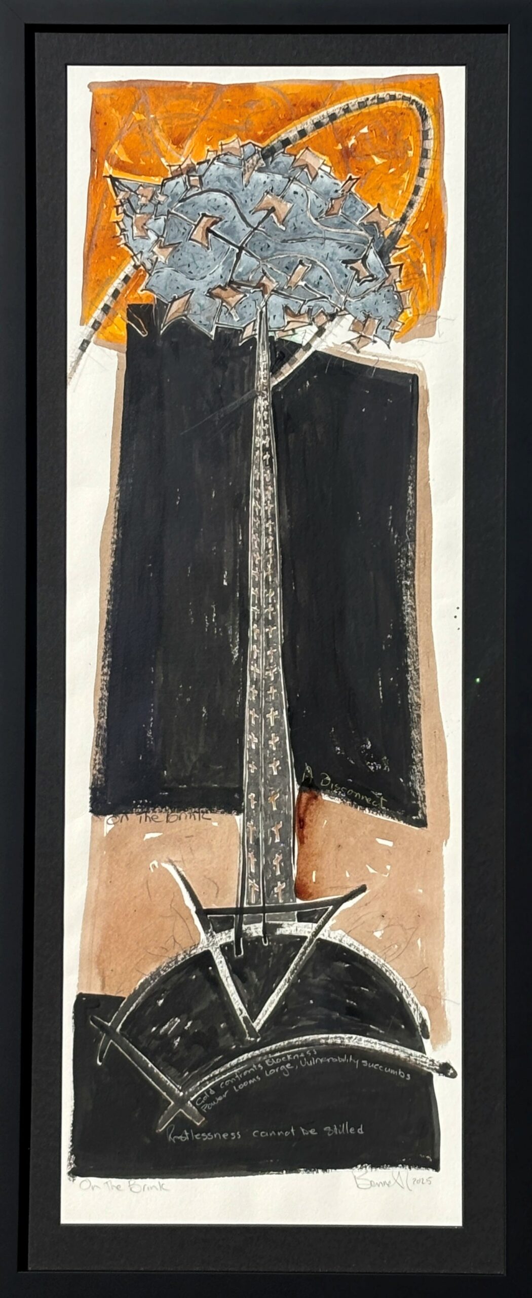
Bennett returned to Japan in 2024 for a significant residency, and explored new ideas about the fragility of our world and our impact on the environment, in paintings, sculpture and photography. He exhibited some of these in Japan, then later at The Diversion, and the exhibition and its underpinning concepts were the subject of a substantial feature in Art New Zealand in 2025. On the Brink and other works were made using natural materials, mostly derived from bamboo, painted with kakishibu, a dye made for centuries in Japan by fermenting persimmons for two years. Many sculptures feature a fragmented globe of the Earth, with segments pinned together to appear whole, yet perilously close to coming apart.
The Disrupt series features axes made of imported pine, and native timbers, each with their own story. The axe carries histories of colonisation, destruction of native forests, and of people. And now, a sense of peril to the earth and humanity.
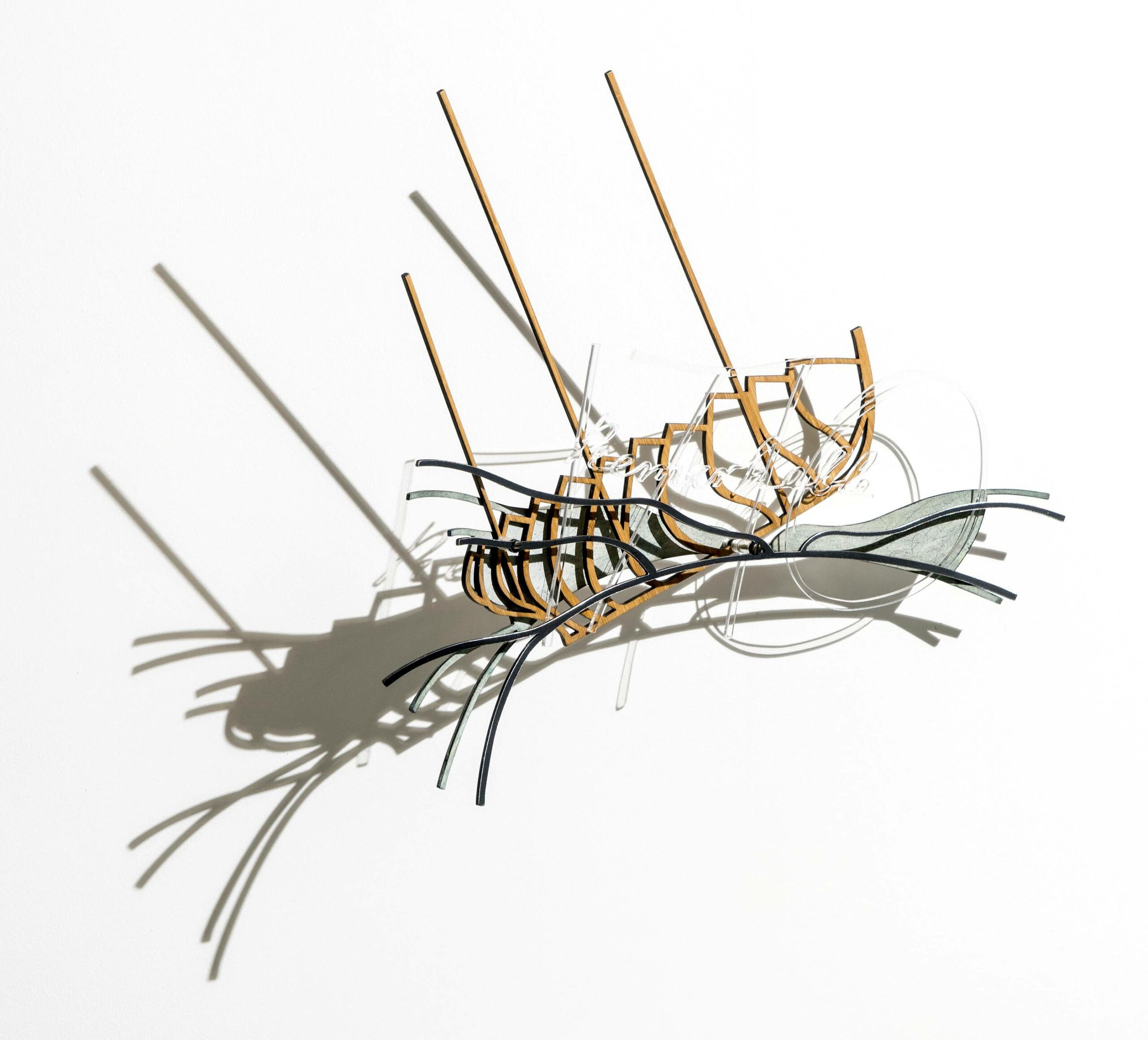
His Remarkable sculptures resulted from The Diversion Gallery’s Meretoto project around the early encounters between Maori and Europeans in Aotearoa New Zealand, specifically the connection between Maori and Captain Cook. Each has the bones of the ship Remarkable, the outline of the entrance to Cook Strait behind, and the word Remarkable in perspex overlaid. Bennett he described the concept in a poem:
‘... 3 masts, 3 histories, across 3 centuries in 3 layers; time, place, shapes, memories; a cast shadow…’
The major series WADE confronts us with the dire state of so many of our waterways, and the need for us to urgently address issues of pollution and the consequences of our poor land management, over irrigation and unsustainable practices. Bennett moved from using abstracted forms to digitally printed images of young women, referencing the central figures in Hieronymus Bosch’s Garden of Earthly Delights (circa 1500 AD), innocent women standing in a pond. He challenges us to not look away, but to engage and think about the significance of that painting, and questions of what inheritance we will pass to the next generation – and what needs to change.
A recurring motif is based on the ‘orange peel segment’ flattened map of the world. Each segment is also the shape of a canoe or vessel; when standing vertically his pieces sometimes further suggest a human element or vertebrae. Recent works bring together four of those segments to form a closed pod shape, reaching upwards and out.
Graham Bennett completes detailed studies on paper for each of his sculptures, but these are not so much plans for sculpture as paintings conveying the feeling as much as the dimension and scale of the intended works.
Lately his work focuses on questions of balance in our impact on the environment, and the idea we are moving dangerously close to the ‘tipping point’ of no return or remediation. A major commission in Seoul, South Korea, featured a human figure he calls the invisible man, arms outstretched, turning atop a five-metre pole structure. The figure casts a shadow below, suggestive of our impact on the environment. Watching the shadow move across the grid of paving stones, he developed ideas for a new series ‘Heavy Shadows’, laser cut in corten steel, the figure seemingly caught in a net of his own making or perhaps pulled in different directions. A small series of beautiful Echo wall works, focus as much or more on the figure’s shadow than the solid work itself.
After a major survey show of the last 10 years of Bennett’s work at the Suter Gallery, in Nelson, the artist released several of the works in that exhibition for sale, such as Hidden Depths, from his personal collection.
Hard to Swallow – a plea for the whales
In 2012, in conjunction with The National Whale Centre, The Diversion and Graham Bennett staged an exhibition entitled ‘Hard to Swallow’ with 267 small sculptures laser cut from tin plated steel, each one representing a whale killed in the Southern Ocean ‘harvest’ of 2011-2012. The intended kill of 990 was cut short by the Sea Shepherd protests and by storms. With heavy irony, Bennett used text and motifs from a real whale meat tin within the composition, including the base text saying ‘Be Careful not to cut your hand on the tin when opening’. The laser cut sculptures cast a shadow on the wall, our impact on the whales’ environment.
Each work is individually numbered and signed, and priced at just $267 + GST (the number of the whales killed); making them accessibly priced to encourage a kind of viral marketing of the idea, with each new owner telling the story to those who view their work.
More About the Artist
Born in Nelson, Graham Bennett graduated from the Canterbury School of Fine Arts in 1970. He has received numerous major NZ Arts awards including the Fellowship in Visual Arts from the NZ Arts Council in 1995 and the Asia 200 Foundation Grant the same year and in 1999. He was Principal Lecturer in the School of Art and Design at Christchurch Polytechnic for several years but has for some years been a full time artist with increasing demand for his work nationally and internationally.
His work is included in several major outdoor private and public sculpture parks, including Gibbs Farm, Brick Bay, Connell’s Bay, and Sculpture on the Gulf. He has participated in major sculpture events here and overseas. He has exhibited a dozen times in Japan, including two international exhibitions, and has a work in the New Zealand embassy in Tokyo. Some of the works we have available were exhibited in Hong Kong in 2009.
He has three times featured as the cover story in World Sculpture News, and his story is one of being a New Zealander and of identity in the context of a vast world, and finding a balance between our use of resources and sustainability of the environment.
In late 2020, a stunning book on his work was published by Ron Sang Publications – the latest of its prestigious series on leading New Zealand artists. This 300 page, beautifully produced volume is currently available in selected bookstores and galleries including The Diversion Gallery and gives a richness of context and thinking to consideration of Bennett’s work.
-
Richard Adams
About the Artist
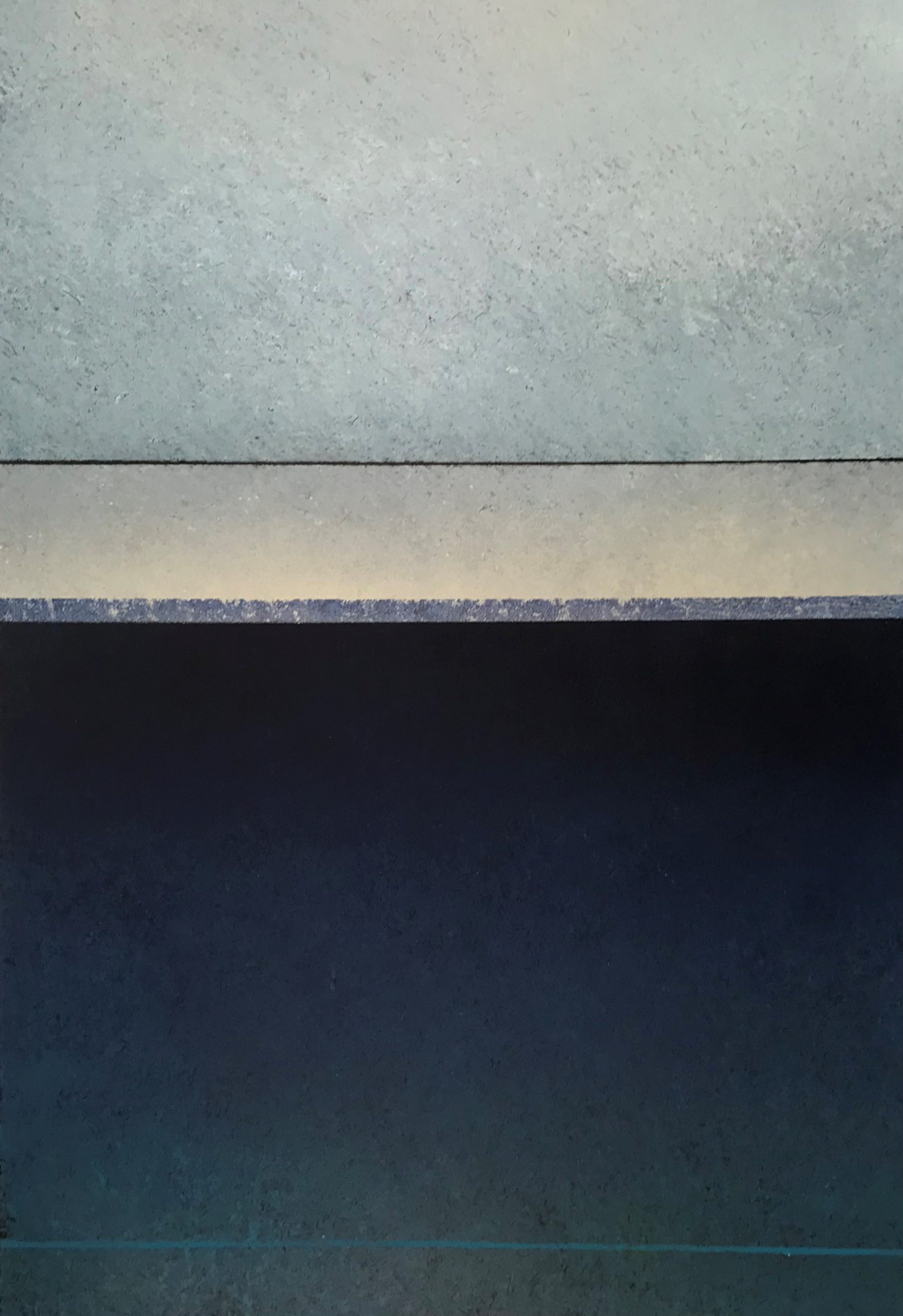
Auckland-based Richard Adams began exhibiting in 1982, abstract paintings in oil on paper or on canvas, finely balanced, often with the surface pared back, scraped away to reveal hidden layers.
Adams’ new works have a richness informed not only by his music – he is one of New Zealand’s best known jazz musicians with the Nairobi Trio – but also travels such as in Dubai, where he was inspired by the textures and aged surfaces, and fine colours from the subtle to the intense. In particular he was fascinated by the weathered paintwork on the dhows (boats) and how their history was exposed by a scratch or rubbed surface, revealing the colours of the boat’s earlier life.
He sees himself as the guide rather than the master of the brush, and allows the painting to evolve as he works.Richard Adams is well-known as the jazz violinist and frontman for the Nairobi Trio, NZ’s most popular acoustic jazz group, and naturally there’s a very musical rhythm in his work. The music and the painting inspire each other, he says, rather than existing in isolation. Although he has been painting for 20 years, it is in the last decade he has begun to make his mark as a sought-after abstract painter with regular exhibitions in galleries both in New Zealand and overseas.
Recent Works
Adams’ recent works seem to travel towards the light, and consciously explore ideas of early voyagers guided only by the sun and stars, travelling barely charted waters. Often there’s a deep ‘bass’ note in his paintings to balance the lighter elements, and lately he has drawn inspiration more from the intense colours of the New Zealand landscape such as in his Lake Hawea works.
His canvasses tend to convey a musical parallel, while his oils on heavy paper have a subtlety of pared-back expression.
More About the Artist
Richard Adams was born in London in 1957, and worked in film in the 1970s and 1980s in New Zealand. After publishing a book of poems and etchings in 1979, he began exhibiting his paintings in 1982 in Wellington. He has since exhibited in New York, Tokyo, Sydney, London, Dubai as well as around New Zealand in dealer galleries. He co-founded the jazz ensemble The Nairobi Trio – one of New Zealand’s most popular jazz groups which continues to tour this country and overseas on a hectic schedule. However, since the late 1980s he has pursued his painting with increasing dedication and ihas established a growing exhibition profile and following for his work among collectors, viewers and significant art publications.
-
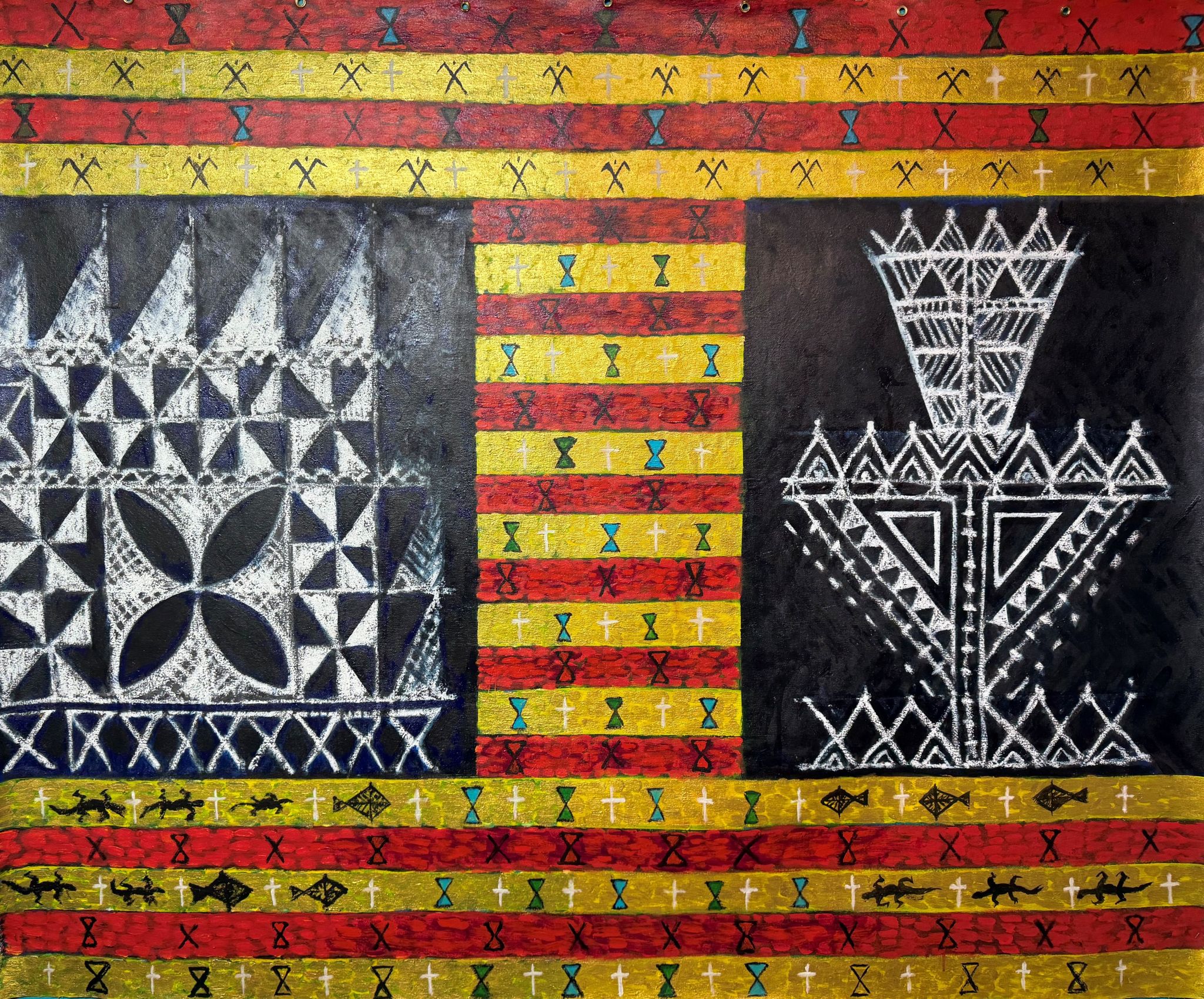
Fatu Feu’u
About the Artist
Fatu Feu’u – Background
In speaking about his art practice, Feu’u asserts an intention to mediate an understanding of Samoan culture and history. What is equally apparent is that Samoan culture is the filter through which Feu’u interprets all that is around him. From national issues of race relations in New Zealand, and international conservation concerns, to very personal themes of a child’s struggles and personal estrangements, all are worked through a very Samoan world view.
– Art New Zealand, 2004
Fatu Feu’u explores motifs of Pacific and particularly his Samoan culture but with a strong modernist interpretation, in paintings, limited editions and dramatic sculptures. His love of Picasso and the early 20th century modernists is also evident, but he has established a distinctive style which sees him recognised as one of the leading New Zealand Pacific artists.
Fatu Feu’u was born in Samoa in 1946 and moved to New Zealand at the age of 20, working in textile design before becoming a full-time artist in his early 40s – encouraged by his friends and mentors Pat Hanly, Tony Fomison and Philip Clairmont, all major artists of the 20th Century. He now works between New Zealand and Samoa, and is known for work that blends traditional imagery with Western influences.
He has won major art awards including the Wallace (1995) and the Pacific Islands Artists Award (1996). His work is held in major collections including New Caledonia, Australia, New York and Germany, and he has undertaken significant commissions for works throughout the Pacific. He was awarded the Order of New Zealand Merit in 2001 for services to the arts and was founding patron of the Tautai Pacific Arts Trust.
His work draws inspiration from ancient designs and patterns – from tapa cloth, lapita pottery, and tattoo – which were informed by cultural values of balance, symmetry, and reciprocity. However, he adds his own personal meanings and metaphors.
Over the past decade, Fatu Feu’u has developed a series of works based on the Samoan tradition of ‘ifoga’ or reconciliation/rebuilding after a terrible event or action. The central letter ‘I’ as a motif captures this, with different colours coming together, meeting half way.
Recent Works
A new series of significant paintings meld traditional Feu’u motifs such as atua, tagaloa, long-nosed god, and symbols of voyaging, with his recent expressive abstract technique, creating an overlay relating to issues of conservation and sustainability and impact of climate change on the Pacific.
The Tapui works, unique handpainted woodcuts on heavy paper, carry a powerful central motif of tapu areas ‘protected’ by squares with a cross through them, with suggestions of sails and traditional motifs in the background. The sails are sometimes faintly defined, implying spiritual guardians of the ocean resources. Tapui effectively means a protection over a place or object of major significance.
We also have in stock selected earlier limited edition prints by Fatu Feu’u, some the last of edition. Maui Tikitiki and Hinemoa Springs are from a series of handworked woodcuts focused on water and its legends. The colours red and yellow are signifiers of the place of the high chief and the orator respectively, and appear frequently in his paintings and sculptures.
Sculpture and medallions
Feu’u is known for his powerful sculptures from large scale to domestic works, and the intimacy of bronze medallions like touchstones, carrying his familiar motifs.
Click on each artwork image for medium, background and price.
-
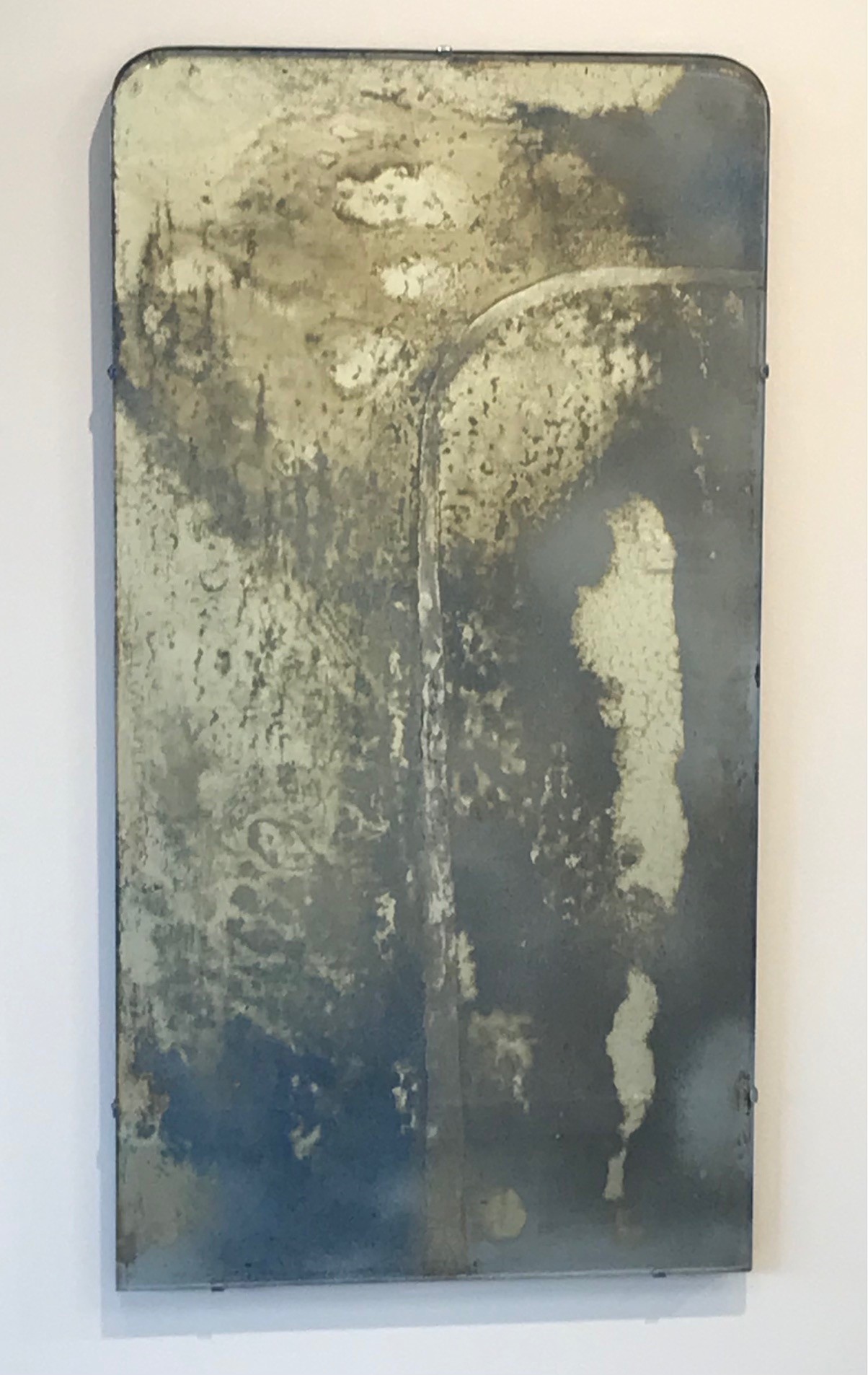
Mary McFarlane
About the Artist
Mary McFarlane developed a strong following for her transformations of mirrors, especially vintage pieces, into glimmering artworks full of mystery and memory, intensely personal to herself and to the viewer, created using her unique, evolved techniques.
Some centre on the Waterfall motif, founded in trips to Fiordland throughout her life; these connect to New Zealand’s history of contemporary art from William Hodges’ 18th Century Fiordland paintings through to Colin McCahon’s influence on the waterfall becoming part of our visual identity. She is also known for her acclaimed Moon series, based on the feeling the full moon inspires, full of portent; at times this has segued into a series of ‘sunshower’ works, initially inspired by a glimmering sunshower at the time of a significant family event. Her actual process, working into the back of vintage mirrors, remains as mysterious as the moons themselves, as David Eggleton described in a review in Art New Zealand: ‘McFarlane has learnt how to endow her mirrors with magic, alluding to the aura of inner beauty, to the dark side of the self.’
-
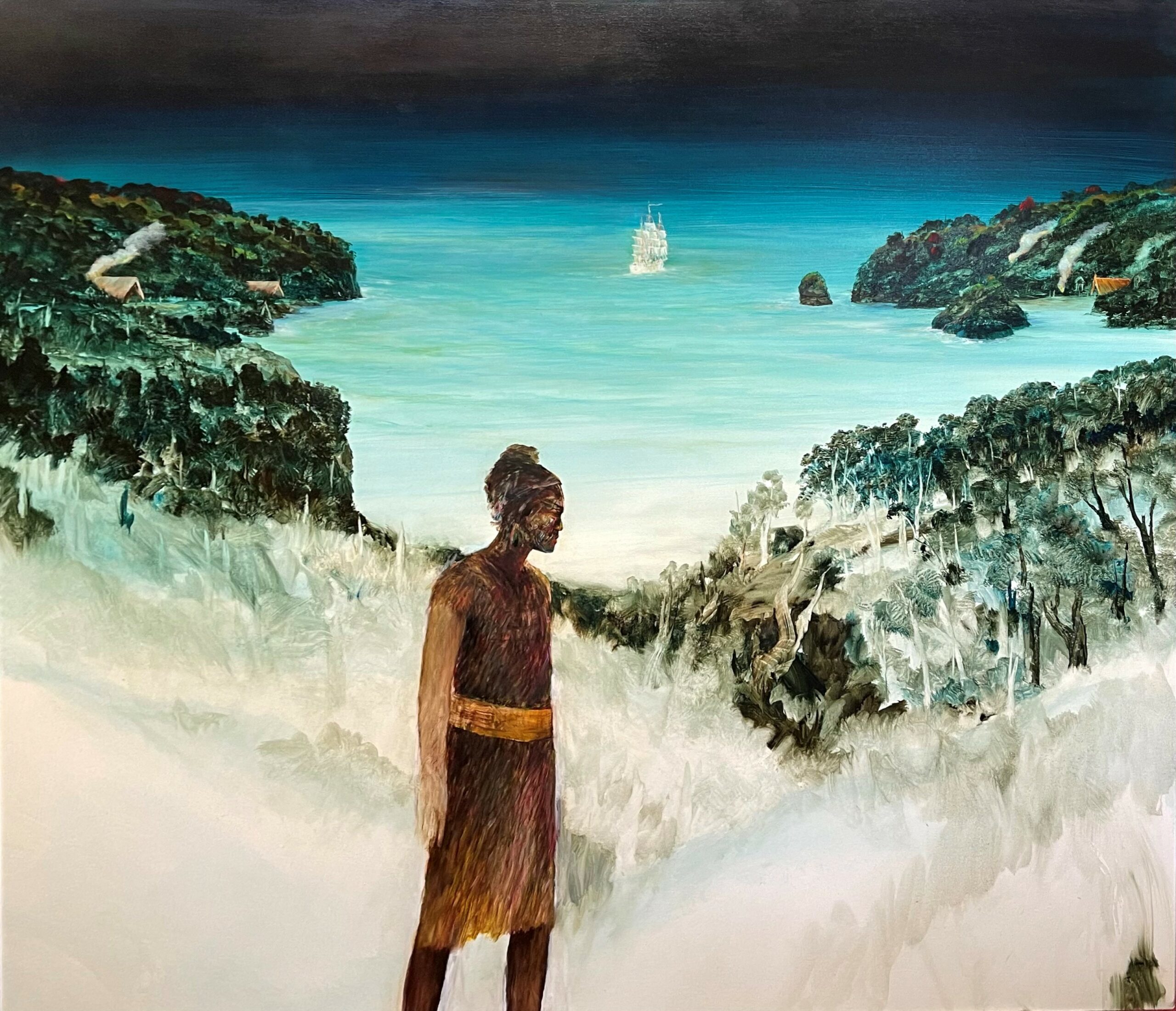
John Walsh
About the Artist
Born 1954 in Tolaga Bay, John Walsh is of Aitanga a Hauiti and New Zealand Irish descent. Although largely self-taught, he studied art at Ilam, Canterbury University in 1973-74. After many years primarily exhibiting around his home region of Gisborne and Te Tai Rawhiti, John Walsh had his first major solo exhibition when he was nearly 40 years old, and quickly established a reputation for a mythical realism, founded in the landscape but often featuring mythological figures questing within, moving through or above the land. Walsh rose quickly to prominence, with works on an increasingly large scale. Often his works are in response to contemporary incidents, with a subtle thread of underlying humour, or more serious issues to do with human connection with the land, also influenced by Maori mythology, incorporating ancestral and legendary figures.
He lives and works in Wellington and Te Tai Rawhiti.
Recent Works
The major painting by John Walsh, And Then They Left, arose from his trip to Meretoto/Ship Cove in the Marlborough Sounds as part of the gallery’s First Contact project (as did the Mythical Creatures paintings). He previously visited Fiordland in 2010 with three other artists at the invitation of documentary maker Peta Carey, to film their artistic responses to the places visited by Captain James Cook and painter William Hodges. You can view the documentary The Waterfall on YouTube. John Walsh also created an etching & aquatint for the National Whale Centre artist project.
-
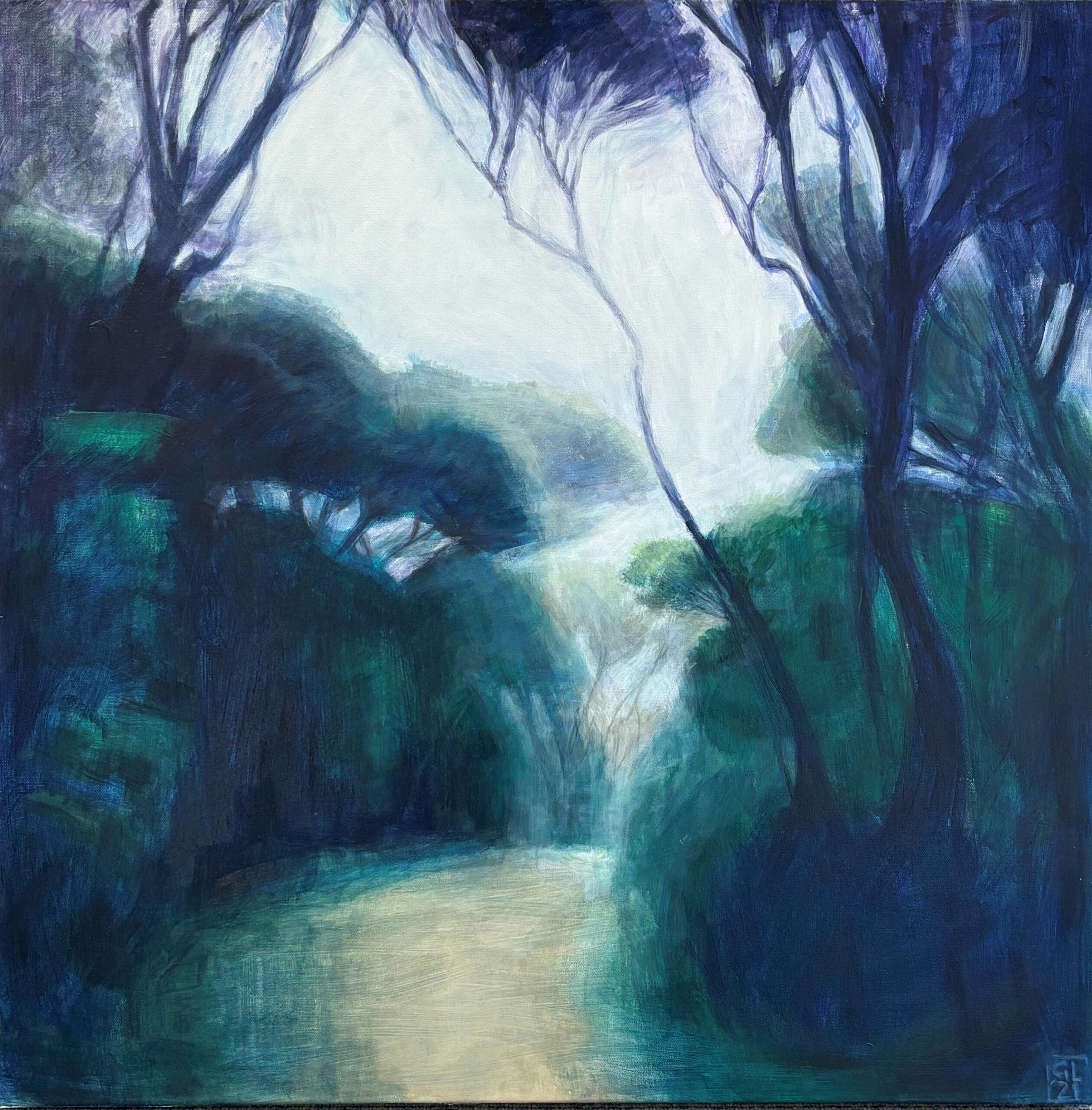
Gerda Leenards
About the Artist
Gerda Leenards grasps fleeting moments, the transience of light and weather in paintings of infinite subtlety. Her works may appear to be landscape, yet are not – Leenards actually paints the light, the weather and echoes of memory, rather than the landforms, and is intrigued by ideas about the transformation of the land and water by the swiftly changing light.
Born in the Netherlands, Leenards emigrated to New Zealand at the age of 10, and her Dutch heritage and awareness of the European masters does influence her work. She is often identified as one of New Zealand’s leading landscape artists, but doesn’t see these paintings as ‘landscapes’ as such. ‘Often landscape is handled in a very stationary way: here are two cabbage trees and a roadway. It’s very descriptive of the road and the trees.’
She is conscious of the way painters like Turner and Constable explored the effects of weather. But she points out those painters were working at an exciting time when scientists were just beginning to understand weather and cloud formation. ‘There was a feeling then that the earth was permanent. Now everything is changing very fast.’ Issues such as global warming and the fragility of the earth interest her, and while she doesn’t paint it literally, this awareness has an influence on her painting of the transience of nature.
Gerda Leenards lives and works in the Wellington region. A graduate of Ilam School of Fine Arts in Christchurch in the 1960s, she has exhibited in the major public galleries in New Zealand and was three times a Visa Gold Award finalist. She has works in most public collections in New Zealand including Te Papa, the National Museum. Her work The Nature of Culture toured in the national show Inheriting the Netherlands. Gerda Leenards is featured in respected New Zealand art publications, including Lands & Deeds, Gregory O’Brien’s book on significant artists contributing to the landscape tradition in New Zealand art.
Recent Works
Gerda Leenards is known for her intense engagement with landscape, and often references to underlying concerns or issues have been subtle and understated. Her work Inferno is more direct: addressing concern about climate change and the wildfires raging through Canada, Australia and Europe – even, potentially New Zealand.
Her recent paintings of Waitohi (Picton) and the Marlborough Sounds arose from residencies and trips to Marlborough over several years; she consciously researched the history of the original names of these places, such as Tukurehu – the island that floats from the mist – known to many Waitohi-Picton locals as Mabel Island, it was given the new name by a NZ Governor in 1859, after his eldest daughter.
She says many of this series were inspired by the idea of journeys – arrival, departure, safe harbour – reaching back into her memory of the excitement of voyaging to New Zealand in the 1950s.
-
Don Driver
About the Artist
It’s like capturing a moving target, trying to define this provocative artist who crossed so many boundaries in art in his observation of our world, societies, cultures and modern art itself.
Don Driver, who died in 2011, was one of New Zealand’s most senior and respected artists, and his works are an important part of this country’s major public and private collections.
He often used ‘found’ materials – the trappings of suburban or agricultural life, or objects discarded by our material society – but the mundane became mysterious, unsettling, provocative or humorous when he brought these objects together with his own artistic magic. (He was once a keen amateur magician).
Frequently he incorporated implements with a sharp edge – literally – farm or garden implements which suggest a dangerous edge to an apparently civilised society relatively recently emerged from colonialism.Don Driver is widely acclaimed as New Zealand’s master of assemblage art. He notably asked: “why paint?” when there is a world full of existing materials and objects of intense colour or loaded with meanings, which he brought together to tell our stories, challenge us to think about New Zealand and the world, and simply create works of unexpected harmony or compositional balance.
However, he incorporated painting, and other media, into his work. Many were prompted by his passion for aircraft, alongside works focused on social and historical commentary, the youth culture and the quest for meaning in life.
Recent Works
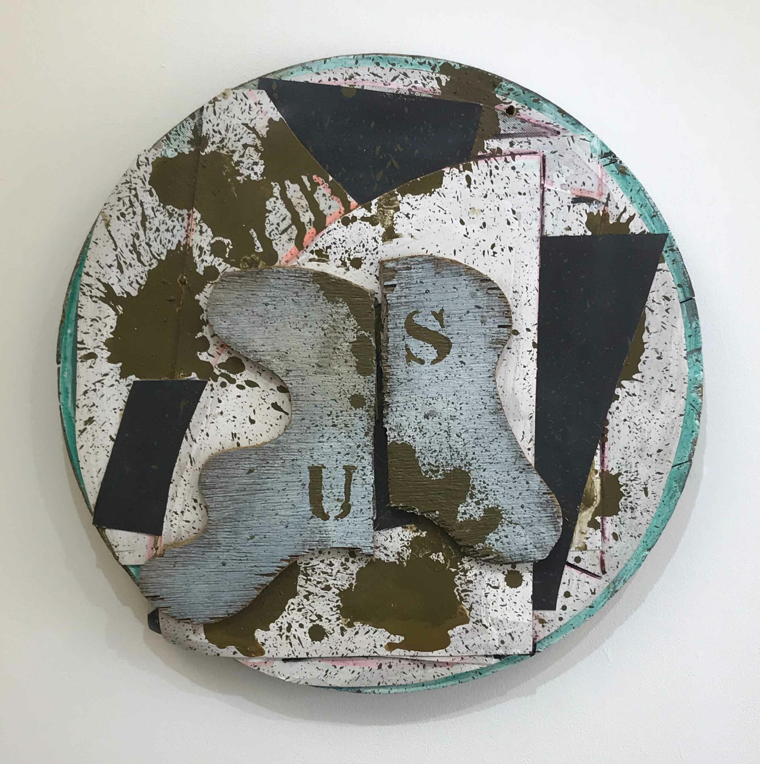
We retain a small number of works by Don Driver in the stockroom – including hangings and one of his sought-after tondoes. Please enquire for images and details.
More About the Artist
Don Driver was born in Hastings, New Zealand, in 1930. He moved with his family in 1943 to New Plymouth, where he lived and worked for most of his career. In the 1940s he became actively interested in magic, a fascination which flowed into his art works, and his desire to create many levels of meaning, mystery unfolding.
In the mid-1970s he had a stroke which paralysed his right side, forcing him to learn again to speak, walk and use his right hand. Undaunted, he continued to work, with assistance from his wife Joyce (a musician and teacher). His communication became channelled through his art. He was the subject of a major retrospective exhibition With Spirit, which toured New Zealand’s leading public galleries in 2000-2001.
Critic Allan Smith said in the book With Spirit “he makes the ordinary world look exotic”… From road signs, discarded brightly coloured clothing, drainage pipe, dolls, or tools, to paint pots, bath mats and old sacks – he used these in assemblages and wall hangings, presenting a view of society and abstraction at the same time. He was fascinated by texture, form and juxtaposition of colour.
There has rightly been a surge of enthusiasm for Driver’s work in the past decade – his ideas and energy remained as fresh and original as a young artist’s, throughout his career, but with all the knowledge of 50 years of art practice. His work would not be out of place in New York, London or Paris.
-
Philip Trusttum
About the Artist
It is with great sadness we acknowledge the passing of Philip Trusttum in March 2026. He was a huge force in contemporary New Zealand art, vigorous, expressive, intense, and was a mentor and support to many other artists.
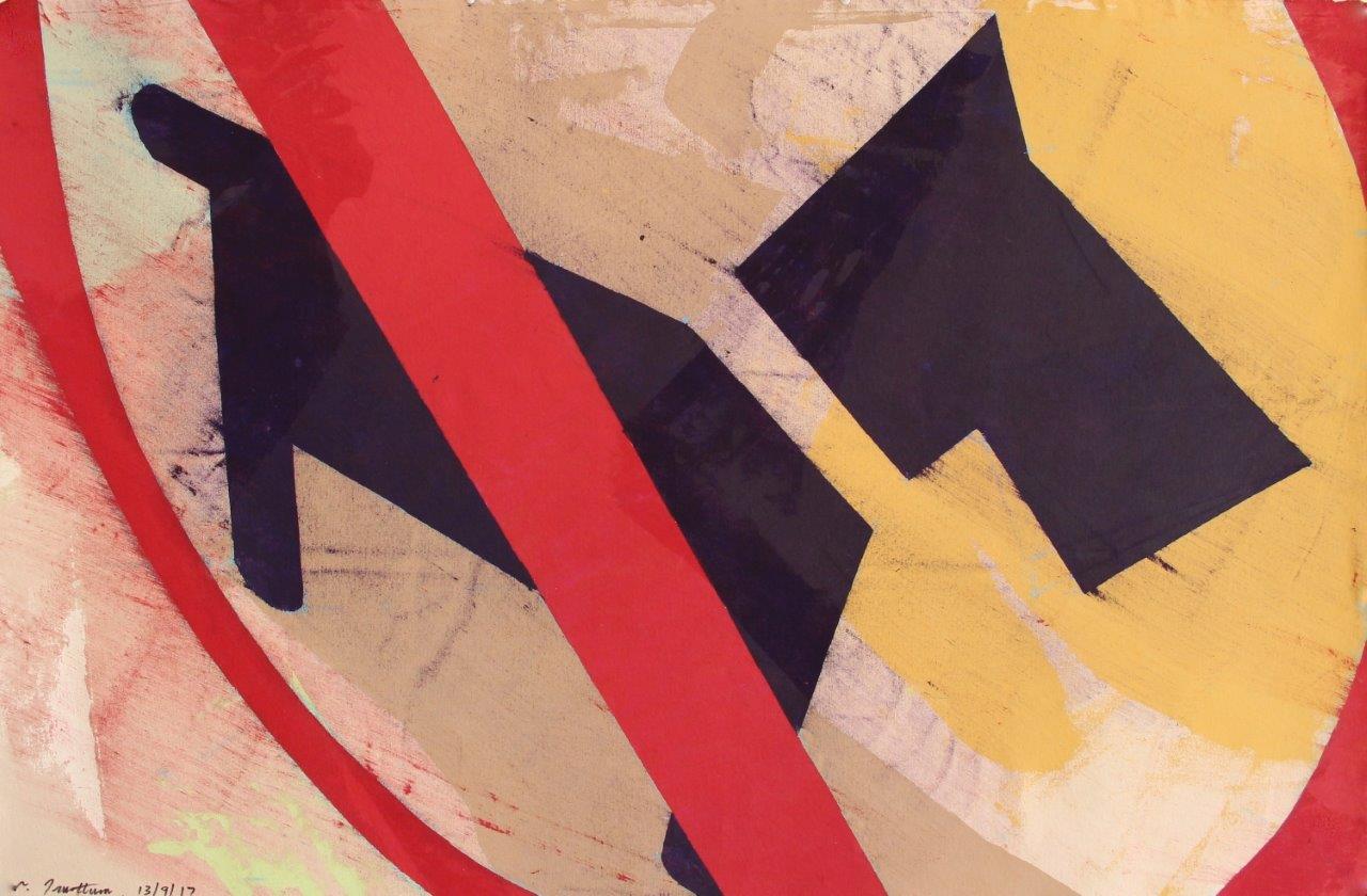
A selection of his works are now available through The Diversion Gallery from the Trusttum estate, including a few of his significant Alphabet series, one rare work from his Rugby World Cup suite, and his more recent Signs series, a commentary on the signage banning access for dogs, cyclists and others as Christchurch rebuilt itself after the earthquakes.
Philip Trusttum is recognised as one of the major expressive painters of his generation, known particularly for his large works full of energy, colour, and vigour, inspired by the everyday world as he engaged with it, whether politics, events, family, stories, and objects.
Philip Trusttum graduated with a Diploma in Fine Arts from the University of Canterbury in 1964. In 1967 he travelled on a Queen Elizabeth II Arts Council scholarship, and worked in Europe and North America. He was part of ANZART at the Edinburgh Arts Festival, 1984 – the same year he exhibited on New York’s 57th Street at the Jill Kornblee Gallery. He has shown in Sydney, New York, Melbourne, Auckland, Wellington, Dunedin and Christchurch, and is represented in all major public and private collections within New Zealand.
Details on the Works
His Signs series offered a subversive commentary on the domestic prohibitions around Christchurch—at the entrance to parks, roads, building sites, pathways. These paintings have the pared-back colour and lighter touch of long experience, while still retaining Trusttum’s trademark energy and edgy humour.
Cyclists appear determined to ride out of the red circle of prohibition, small eager dogs strain as the leash against the strong red diagonal insisting ‘No Go!’ Trusttum’s viewpoint is typically skewed, with the signs viewed from oblique angles, a sense of squashed space, making everyday street language into something strange and disruptive, a push back against authority. Of the first Signs works exhibited in 2016, reviewer Edward Hanfling observed:
‘One registers the sensation of fleeting glimpses, as if from someone actualy riding a bike, of movement and shifting qualities of light, fragments and ruptures, glances down, and things suddenly looming close… Trusttum’s paintings are different from many other forms of contemporary art in that they are so damned delicious.’ – Art New Zealand issue 164
More About the Artist
Trusttum’s Alphabet series were works on a very accessible domestic scale, evolving initially from a single letter as a starting point. By the end of this series, they had evolved to the point the letter was often quite obscure, as other aesthetic interests took over in the composition.
In 2011 he produced a major series focused on rugby players, their movements and forms, presented in the manner of puppet forms. He arranged the limbs in different ways on the wall, photographed these against different backgrounds and created one-off monoprints on aluminium panels. These were the last of his Rugby World Cup series, the depiction of falling players influenced by the Christchurch earthquakes.
Click on the image for more information on each work, and price.
-
Bing Dawe
About the Artist
Bing Dawe (born North Otago, 1952) is acknowledged as one of New Zealand’s most prominent sculptors, his work strongly driven by a deep concern for the environment and human impact on it, especially the damage caused unthinkingly to creatures often overlooked, like eels, small fish or birds overlooked or wrongly believed to be common or safe from threat. He graduated from the University of Canterbury, School of Fine Arts (Ilam) in the mid 1970s, and has exhibited extensively throughout New Zealand and overseas, including a major survey exhibition at the Robert McDougall Art Gallery in Christchurch. He has won numerous awards including the prestigious Wallace Visa Gold Award in 1999.
For more details and other works, please contact Barbara Speedy, Gallery Director info@thediversion.co.nz or call on 0274 408 121.
Recent Works
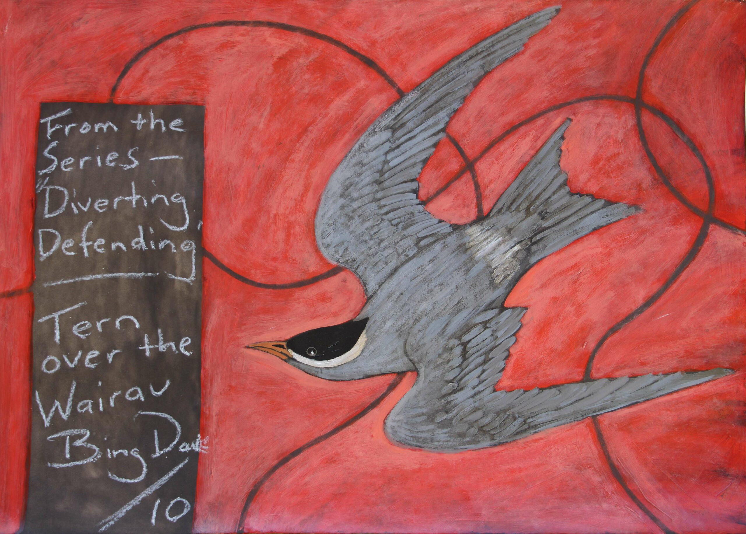
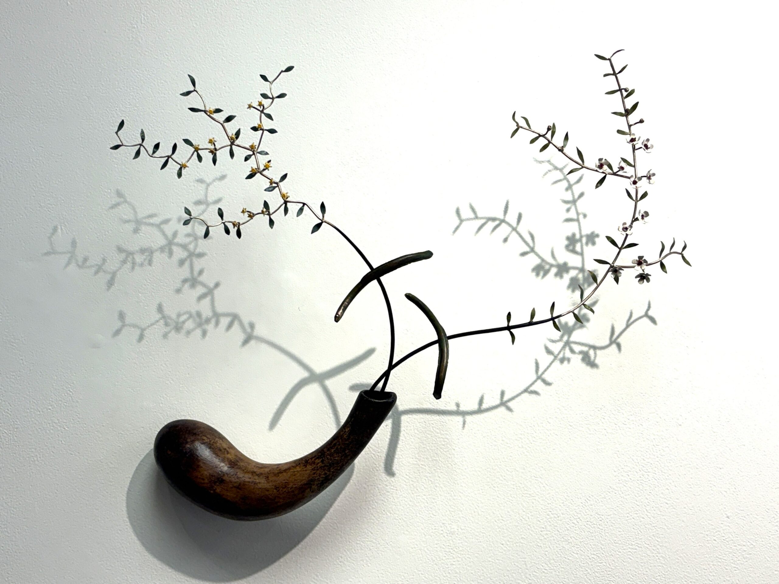
Dawe is well known as a champion of eels, using his art to highlight the fact that these creatures are struggling for existence as waterways are dammed and diverted for agricultural irrigation and electricity generation, with no facility for the eels to return to their upriver growing and maturing grounds, no way to avoid the traps. Now, the peril facing the eels is more widely recognised, and Dawe must take some credit for raising that awareness in decades of work focused on the humble eel.
His Galaxiidae series features the tiny fish commonly known as whitebait. They got the name Galaxiidae because their speckled markings resemble the Galaxies. Dawe references this in the use of constellations within the hemispheres and circles of his sculptures.
He highlights kokopu including those harvested young as whitebait, vulnerable particularly to degrading water quality in our rivers and dramatically reduced flows caused by irrigation and electricity generation. Wickedly curved steel wires imply a threat, whether direct (hunting, traps) or indirectly (the wires of electricity generation for instance). He lays down a challenge regarding their presence and impending absence in the positive sculpture vs negative space in these beautiful elegant works.
Beautifully painted studies in acrylic & oil on paper add another layer of insight to Dawe’s exquisite sculptures, finely crafted commentaries on New Zealand’s rare, vulnerable and sometimes overlooked wildlife.
More About the Artist
Bing Dawe’s work is represented in many public and private collections, both in New Zealand and overseas, and he has completed public commissions for all the major cities in this country.
Dawe also influenced subsequent generations of sculptors while tutor and Programme Co-ordinator for the Diploma of Craft Design (now Bachelor of Design) at the Christchurch Polytechnic Institute of Technology. Throughout his career, he has explored political and environmental concerns both global and local, through finely worked sculptures and paintings which invite an intense connection on an aesthetic level.
-
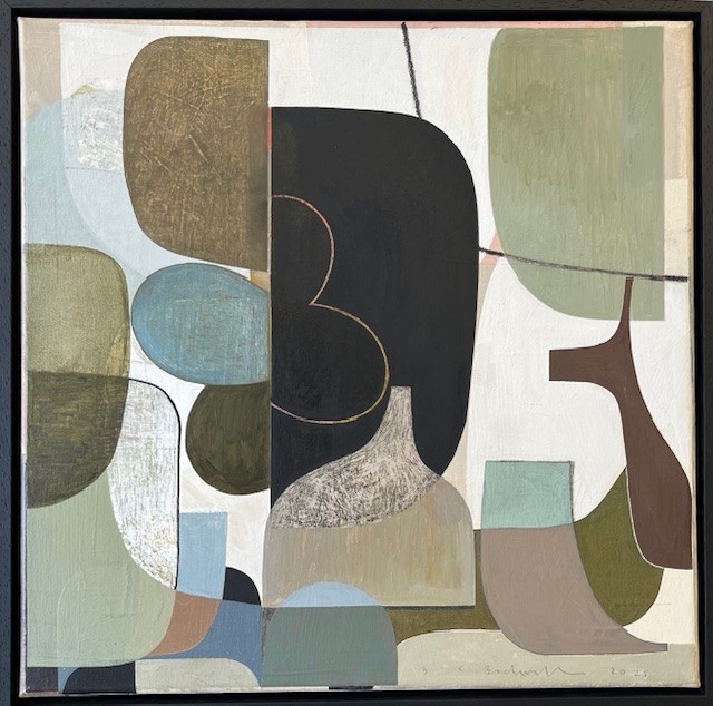
Bridget Bidwill
About the Artist
“One of my primary aims is to use the medium of painting to provoke feeling and thought. Just as instrumental and classical music needs no lyrics to create atmosphere and meaning, abstract painting does not need to copy reality to prove its intellectual and aesthetic worth.”
Bridget Bidwill was born in the Wairarapa in 1956. She studied at Ilam School of Arts at Canterbury University, graduating with a Diploma of Fine Arts in Painting in 1977. After travelling and living in Europe for three years, Bridget Bidwill returned to New Zealand and began painting in 1983. Since then she has exhibited regularly in Wellington and Auckland where she lived until 1995, before moving to Marlborough. Her paintings are in corporate, public and private collections here and abroad.
Bidwill’s work has a shadowy likeness to European and British traditions of modernist painting and yet have their own contemporary awareness. Reference to Still-Life and more recently landscape remain evident even in her most abstract works. Her paintings create an aura which seems foreign yet familiar – where glimpses of the abstract and the real world converge. She paints mostly in oils on canvas, board and primed paper.
Recent Works
Bridget Bidwill uses subtle tonal contrasts to create a sense of atmosphere and space in works which are abstract but suggestive of elements of reality. She uses freeform shapes such as vessels, bottles, leaves, ovals, which suggest ‘still life’ but are intended to create a meditative space that evokes feeling and thought.
She uses an understated palette, sometimes with fields of colour hinting at the natural world, accented with rich deep reds and blues, working towards a balance; with subtle contrasts so the painting has a sense of movement or poetry.
Bidwill’s recent work has an increasing use of texture either through painting onto layered or collaged canvas or onto textured wood panels, as well as using more thickly applied paint to create variations in surface. The vessels and forms float within the space, but sometimes reveal the layers of work which lie beneath. -
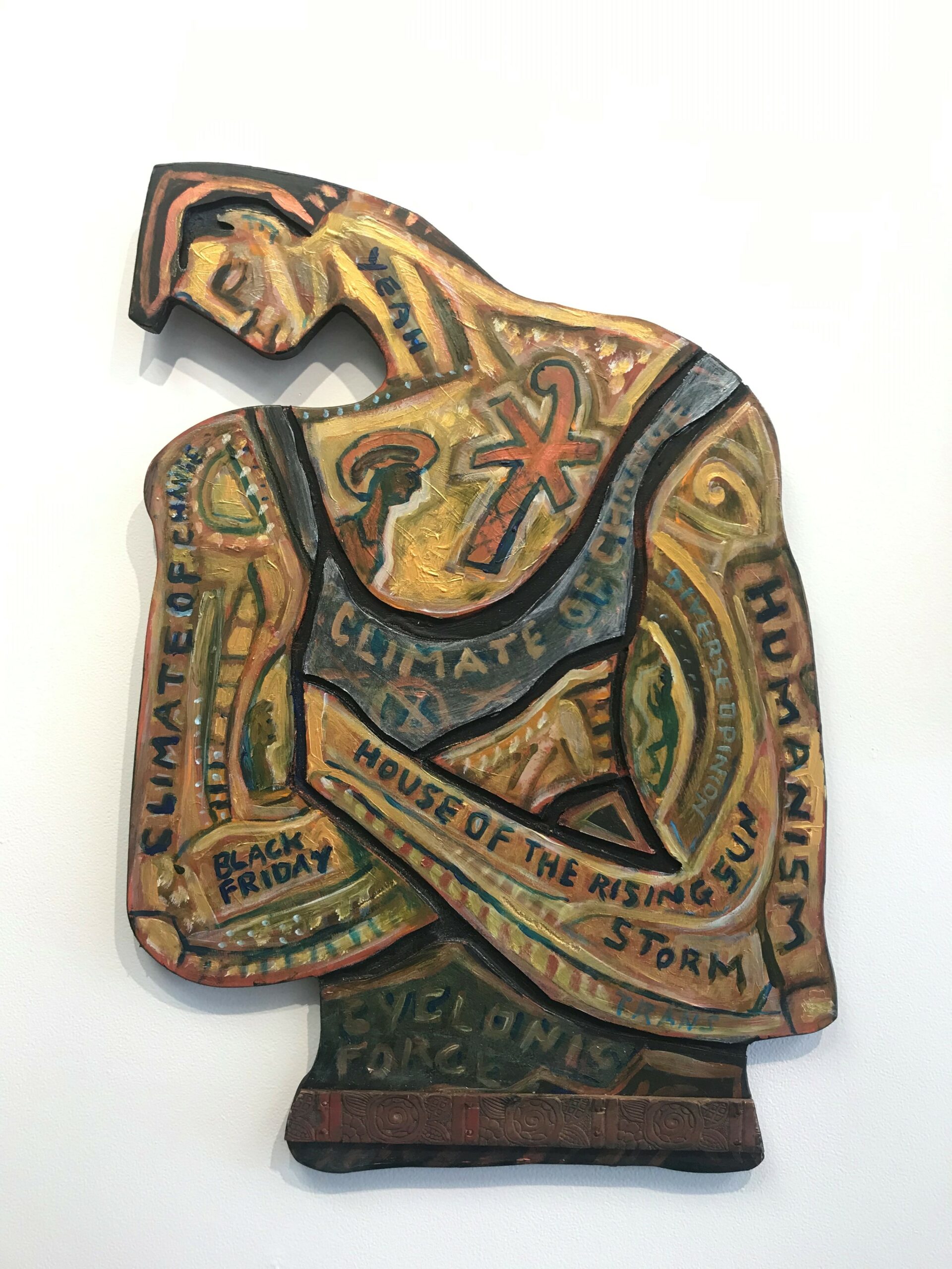
Nigel Brown
About the Artist
Born in 1949, Nigel Brown is widely acknowledged as one of our most important figurative artists and most significant narrative painter. He lived in the North Island for many years before returning to the southernmost coast of the South Island with partner Sue McLaughlin in 2001, then to Dunedin in 2016. He graduated from Elam School of Fine Arts in Auckland in 1971, has exhibited nationally and internationally, and his works are held in important public and private collections including several in the National Collection at Te Papa, the Museum of New Zealand. Nigel Brown has received three Queen Elizabeth II Art Council grants, and been awarded the Order of New Zealand Merit. While viewers often respond to his content or intent, his distinctive style and handling of paint are part of the cut-through and reality of his message. Many works bring into question the way we live – issues of sustainability, and of finding intuitive rather than strictly scientific solutions – with his sharply ironic humour underpinning the delivery of his ideas. Among Brown’s best-known works are paintings challenging the notion of the ‘New Zealand man’, the ‘real Kiwi’, staunch in the black singlet, man of the land, arms folded, uncompromising. A period in Russia on an arts residency reinforced his interest in ‘icons’ of our identity – such as the New Zealand man, Captain Cook – but also of icons of our environment – the birds, the ponga as tree of life, the landforms – and legendary figures like the poet James K Baxter or Brown’s own motif, the man-woman couple. His recent works focus very strongly on living sustainably in the landscape, especially the intuitive way birds live, as opposed to the scientific classification of the world exemplified through Cook. He uses the kererū in an emblematic way much as artists in ancient cultures did, viewing the world through the eyes of the creature; he tells stories of a ‘Climate of Change’ – socially and environmentally. ‘I have wanted to get closer to kererū, not in the sense of zoom lenses and fine details, but in a more ancient, psychic and emblematic sense’.
Recent Works
The ungainly but beautiful kererū lumber into the skies carrying hope, urging an intuitive approach. Sustainability and the need for the workers of the land (often represented by his iconic ‘black singlet’ man) to become nurturer are central to recent paintings, often with a gilt sky emphasising ‘icon’ status of certain motifs and figures, including the kererū, the ponga or tree of life, the black singlet man. Brown is also keen to escape the constraints of the ‘rectangle’ format: his painted plywood cutouts counter ‘the cool smooth slickness of our techno society with a rough homemade authenticity’. A black singlet figure remains as a kind of physical labourer needing to evolve into a nurturer. He hopefully needs to be seen as an ongoing painting device or a vehicle for the subconscious rather than as a number eight wire anachronism stuck in the past. Only viewed in this way can he measure up to the challenges facing the planet…
More About the Artist
Nigel Brown was a founding member of VAANA – Visual Artists against Nuclear Arms – and with the strong connection his art made with New Zealanders, he used it to challenge views on social and environmental issues. He continues to use his paintings as a vehicle to challenge ideas about the environment, and about the way we connect with each other. Nigel Brown challenges the viewer to think harder about notions of identity, history, and also about conservation and social issues. His sharp-edged, often ironic humour engages the viewer before he delivers the challenge, but he is well aware there is more than one side to every argument, and leaves room for interpretation and cogitation.
His Climate of Change series often uses his motif of the ‘black singlet man’ or Joe Taihape, but now with head bent in a pose of passive care, nurturing the land and the birds within it, a symbol of how humankind, as the users (sometimes abusers) of the land, must now become its nurturers.
Meretoto/Cook series: Nigel Brown continues to challenge the myths and truths of Captain James Cook’s engagement with New Zealand. Latterly Brown has been involved in a project of artistic encounters with Ship Cove/Meretoto in Tōtaranui/Queen Charlotte Sound, Cook’s preferred anchorage in Aotearoa. His sense of the ironic is often directed at the ‘iconic’: the kererū, the whare, the kiwi, the ponga tree, the dramatic landscape.